Update: more in depth coverage is available in this tutorial, including R code:
A practical introduction to the bootstrap: a versatile method to make inferences by using data-driven simulations
For a very short introduction focused on the R implementation of the bootstrap, see this other tutorial:
The percentile bootstrap: a primer with step-by-step instructions in R
To make inferences about the population mean, the percentile bootstrap can perform poorly; instead use the bootstrap-t technique.
“The bootstrap is a computer-based method for assigning measures of accuracy to statistical estimates.” Efron & Tibshirani, An introduction to the bootstrap, 1993
“The central idea is that it may sometimes be better to draw conclusions about the characteristics of a population strictly from the sample at hand, rather than by making perhaps unrealistic assumptions about the population.” Mooney & Duval, Bootstrapping, 1993
Like all bootstrap methods, the percentile bootstrap relies on a simple & intuitive idea: instead of making assumptions about the underlying distributions from which our observations could have been sampled, we use the data themselves to estimate sampling distributions. In turn, we can use these estimated sampling distributions to compute confidence intervals, estimate standard errors, estimate bias, and test hypotheses (Efron & Tibshirani, 1993; Mooney & Duval, 1993; Wilcox, 2012). The core principle to estimate sampling distributions is resampling, a technique pioneered in the 1960’s by Julian Simon (particularly inspiring is how he used dice and cards to teach resampling in statistics classes). The technique was developed & popularised by Brad Efron as the bootstrap.
Let’s consider an example, starting with this small set of 10 observations:
1.2 1.1 0.1 0.8 2.6 0.7 0.2 0.3 1.9 0.4
To take a bootstrap sample, we sample n observations with replacement. That is, given the 10 original observations above, we sample with replacement 10 observations from the 10 available. For instance, one bootstrap sample from the example above could be (sorted for convenience):
0.4 0.4 0.4 0.8 0.8 1.1 1.2 2.6 2.6 2.6
a second one:
0.1 0.3 0.4 0.8 1.1 1.2 1.2 1.9 1.9 1.9
a third one:
0.1 0.4 0.7 0.7 1.1 1.1 1.1 1.1 1.9 2.6
etc.
As you can see, in some bootstrap samples, certain observations were sampled once, others more than once, and yet others not at all. The resampling process is akin to running many experiments.

Figure 1. Bootstrap philosophy.
Essentially, we are doing fake experiments using only the observations from our sample. And for each of these fake experiments, or bootstrap sample, we can compute any estimate of interest, for instance the median. Because of random sampling, we get different medians from different draws, with some values more likely than other. After repeating the process above many times, we get a distribution of bootstrap estimates, let say 1,000 bootstrap estimates of the sample median. That distribution of bootstrap estimates is a data driven estimation of the sampling distribution of the sample median. Similarly, we can use resampling to estimate the sampling distribution of any statistics, without requiring any analytical formula. This is the major appeal of the bootstrap.
Let’s consider another example, using data from figure 5 of Harvey Motulsky’s 2014 article. We’re going to reproduce his very useful figure and add a 95% percentile bootstrap confidence interval. The data and Matlab code + pointers to R code are available on github. The file pb_demo.m will walk you through the different steps of bootstrap estimation, and can be used to recreate the figures from the rest of this post.
With the bootstrap, we estimate how likely we are, given the data, to obtain medians of different values. In other words, we estimate the sampling distribution of the sample median. Here is an example of a distribution of 1,000 bootstrap medians.

Figure 2. Kernel density distribution of the percentile bootstrap distribution of the sample median.
The distribution is skewed and rather rough, because of the particular data we used and the median estimator of central tendency. The Matlab code let you estimate other quantities, so for instance using the mean as a measure of central tendency would produce a much smoother and symmetric distribution. This is an essential feature of the bootstrap: it will suggest sampling distributions given the data at hand and a particular estimator, without assumptions about the underlying distribution. Thus, bootstrap sampling distributions can take many unusual shapes.
The interval, in the middle of the bootstrap distribution, that contains 95% of medians constitutes a percentile bootstrap confidence interval of the median.
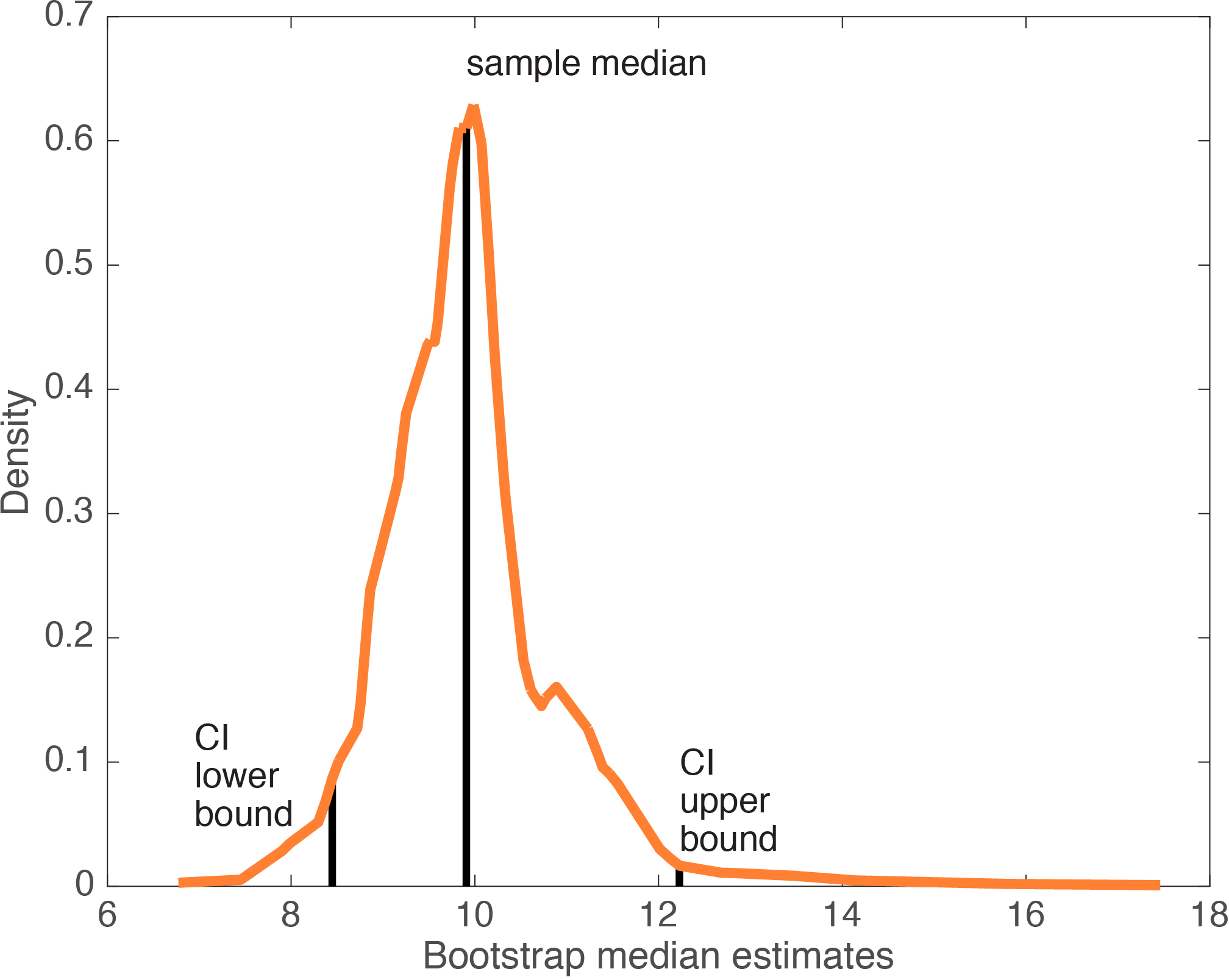
Figure 3. Percentile bootstrap confidence interval of the median. CI = confidence interval.
Because the bootstrap sample distribution above is skewed, it might be more informative to report a highest-density interval – a topic for another post.
To test hypotheses, we can reject a point hypothesis if it is not included in the 95% confidence interval (a p value can also be obtained – see online code). Instead of testing a point hypothesis, or in addition, it can be informative to report the bootstrap distribution in a paper, to illustrate likely sample estimates given the data.
Now that we’ve got a 95% percentile bootstrap confidence interval, how do we know that it is correct? In particular, how many bootstrap samples do we need? The answer to this question depends on your goal. One goal might be to achieve stable results: if you repeatedly compute a confidence interval using the same data and the same bootstrap technique, you should obtain very similar confidence intervals. Going back to our example, if we take a sub-sample of the data, and compute many confidence intervals of the median, we sometimes get very different results. The figure below illustrates 7 confidence intervals of the median using the same small dataset. The upper boundaries of the different confidence intervals vary far too much:

Figure 4. Repeated calculations of the percentile bootstrap confidence interval of the median for the same dataset.
The variability is due in part to the median estimator, which introduces strong non-linearities. This point is better illustrated by looking at 1,000 sorted bootstrap median estimates:

Figure 5. Sorted bootstrap median estimates.
If we take another series of 1,000 bootstrap samples, the non-linearities will appear at slightly different locations, which will affect confidence interval boundaries. In that particular case, one way to solve the variability problem is to increase the number of bootstrap samples – for instance using 10,000 samples produces much more stable confidence intervals (see code). Using more observations also improves matters significantly.
If we get back to the question of the number of bootstrap samples needed, another goal is to achieve accurate probability coverage. That is, if you build a 95% confidence interval, you want the interval to contain the population value 95% of the time in the long run. Concretely, if you repeat the same experiment over and over, and for each experiment you build a 95% confidence interval, 95% of these intervals should contain the population value you are trying to estimate if the sample size is large enough. This can be achieved by using a conjunction of 2 techniques: a technique to form the confidence interval (for instance a percentile bootstrap), and a technique to estimate a particular quantity (for instance the median to estimate the central tendency of the distribution). The only way to find out which combo of techniques work is to run simulations covering a lot of hypothetical scenarios – this is what statisticians do for a living, and this is why every time you ask one of them what you should do with your data, the answer will inevitably be “it depends”. And it depends on the shape of the distributions we are sampling from and the number of observations available in a typical experiment in your field. Needless to say, the best approach to use in one particular case is not straightforward: there is no one-size-fits-all technique to build confidence intervals; so any sweeping recommendation should be regarded suspiciously.
The percentile bootstrap works very well, and in certain situations is the only (frequentist) technique known to perform satisfactorily to build confidence intervals of or to compare for instance medians and other quantiles, trimmed means, M estimators, regression slopes estimates, correlation coefficients (Wilcox 2012). However, the percentile bootstrap
does not perform well with all quantities, in particular with the mean (Wilcox & Keselman, 2003). You can still use the percentile bootstrap to illustrate the variability in the sample at hand, without making inferences about the underlying population. We do this in the figure below to see how the percentile bootstrap confidence interval compares to other ways to summarise the data.

Figure 6. Updated version of Motulsky’s 2014 figure 5.
This is a replication of Motulsky’s 2014 figure 5, to which I’ve added a 95% percentile bootstrap confidence interval of the mean. This figure makes a critical point: there is no substitute for a scatterplot, at least for relatively small sample sizes. Also, using the mean +/- SD, +/- SEM, with a classic confidence interval (using t formula) or with a percentile bootstrap confidence interval can provide very different impressions about the spread in the data (although it is not their primary objective). The worst representation clearly is mean +/- SEM, because it provides a very misleading impression of low variability. Here, because the sample is skewed, mean +/- SEM does not even include the median, thus providing a wrong estimation of the location of the bulk of the observations. It follows that results in an article reporting only mean +/- SEM cannot be assessed unless scatterplots are provided, or at least estimates of skewness, bi-modality and complementary measures of uncertainty for comparison. Reporting a boxplot or the quartiles does a much better job at conveying the shape of the distribution than any of the other techniques. These representations are also robust to outliers. In the next figure, we consider a subsample of the observations from Figure 6, to which we add an outlier of increasing size: the quartiles do not move.

Figure 7. Outlier effect on the quartiles. The y-axis is truncated.
Contrary to the quartiles, the classic confidence interval of the mean is not robust, so it provides very inaccurate results. In particular, it assumes symmetry, so even though the outlier is on the right side of the distribution, both sides of the confidence interval get larger. The mean is also pulled towards the outlier, to the point where it is completely outside the bulk of the observations. I cannot stress this enough: you cannot trust mean estimates if scatterplots are not provided.

Figure 8. Outlier effect on the classic confidence interval of the mean.
In comparison, the percentile bootstrap confidence interval of the mean performs better: only its right side, the side affected by the outlier, expends as the outlier gets larger.

Figure 9. Outlier effect on the percentile bootstrap confidence interval of the mean.
Of course, we do not have to use the mean as a measure of central tendency. It is trivial to compute a percentile bootstrap confidence interval of the median instead, which, as expected, does not change with outlier size:

Figure 10. Outlier effect on the percentile bootstrap confidence interval of the median.
Conclusion
The percentile bootstrap can be used to build a confidence interval for any quantity, whether its sampling distribution can be estimated analytically or not. However, there is no guarantee that the confidence interval obtained will be accurate. In fact, in many situations alternative methods outperform the percentile bootstrap (such as percentile-t, bias corrected, bias corrected & accelerated (BCa), wild bootstraps). With this caveat in mind, I think the percentile bootstrap remains an amazingly simple yet powerful tool to summarise the accuracy of an estimate given the variability in the data. It is also
the only frequentist tool that performs well in many situations – see Wilcox 2012 for an extensive coverage of these situations.
Finally, it is important to realise that the bootstrap does make a very strong & unwarranted assumption: only the observations in the sample can ever be observed. For this reason, for small samples the bootstrap can produce rugged sampling distributions, as illustrated above. Rasmus Bååth wrote about the limitations of the percentile bootstrap and its link to Bayesian estimation in a blog post I highly recommend; he also provided R code for the bootstrap and the Bayesian bootstrap in another post.
References
Efron, B. & Tibshirani Robert, J. (1993) An introduction to the bootstrap. Chapman & Hall, London u.a.
Mooney, C.Z. & Duval, R.D. (1993) Bootstrapping : a nonparametric approach to statistical inference. Sage Publications, Newbury Park, Calif. ; London.
Motulsky, H.J. (2014) Common misconceptions about data analysis and statistics. J Pharmacol Exp Ther, 351, 200-205.
Wilcox, R.R. (2012) Introduction to robust estimation and hypothesis testing. Academic Press, Amsterdam ; Boston.
Wilcox, R.R. & Keselman, H.J. (2003) Modern Robust Data Analysis Methods: Measures of Central Tendency. Psychological Methods, 8, 254-274.

Pingback: how to fix erroneous error bars for percent correct data | basic statistics
Hello, first of all: nice post!
Is there maybe a label-mix in figure 6? I think the mean + CI should be symmetric, but the bootstrapped one shouldn’t.
I’m very sympathetic to plot all data points, use median and robust estimators. But your point that mean+SE cannot be interpreted is a bit strong:
“[…] It follows that results in an article reporting only mean +/- SEM, notably in a bar graph, without scatterplots, cannot be assessed”
Mean + SE still contains information about the data. It also not the “task” of the SE to assert variability in the data (as stated before), but uncertainty about the parameter estimate (mean here) – of course those two measures (variability aka SD* and uncertainty aka SE*) are directly linked.
One could further argue, that if we want to assume normality here (because we a-priori expected a normal distribution) then mean+SE is still the appropriate (most powerful) measure to take. The skeweness of our empirical data simply resulted of a *weird* sample.
This is a bit nitpicky for sure. Of course, if researcher do not report skeweness or bi-modality of their data, then everything is lost. I heavily promote showing the scatter plots and percentile bootstraps for all graphs/errorbars.
Thanks for the post.
Best,
Benedikt
* Normal assumption applies, of course in your example with skewed data this might not be appropriate
LikeLike
Hi Benedikt,
thanks for spotting the error in the figure. The Matlab script linked to the post returns the correct figure, which I have now uploaded. I’m also correcting the statement about mean +/- SE, which should be put into context, as you suggest.
LikeLike
Hi Guillaume,
Great blogpost, very informative as always!
I think there is a little typo in one of your citations.
“However, the percentile bootstrap does not perform well with all quantities, in particular with the mean (Wilcox & Keselman 1993).”
Did you mean Wilcox & Keselman, 2003?
LikeLike
Correct – it’s 2003!
LikeLike
Pingback: How to chase ERP monsters hiding behind bars | basic statistics
Pingback: the shift function: a powerful tool to compare two entire distributions | basic statistics
Pingback: How to quantify typical differences between distributions | basic statistics
Pingback: The Harrell-Davis quantile estimator | basic statistics
Pingback: How to illustrate a 2×2 mixed ERP design | basic statistics
Pingback: Bayesian shift function | basic statistics
Pingback: Correlations in neuroscience: are small n, interaction fallacies, lack of illustrations and confidence intervals the norm? | basic statistics
Pingback: Power estimation for correlation analyses | basic statistics
Pingback: Hierarchical shift function: a powerful alternative to the t-test | basic statistics
Thanks for this post. It is quite clear and helpful. You have a terrific blog!
LikeLike
Pingback: When is a 95% confidence interval not a 95% confidence interval? | basic statistics
Pingback: The bootstrap-t technique | basic statistics