Category Archives: simple steps

You get the symptoms of a replication crisis even when there isn’t one: considering power

Many methods have been proposed to assess the success of a replication (Costigan et al. 2024; Cumming & Maillardet 2006; Errington et al. 2021; LeBel et al. 2019; Ly et al. 2019; Mathur & VanderWeele 2020; Muradchanian et al., 2021; Patil et al. 2016; Spence & Stanley 2024; Verhagen & Wagenmakers 2014). The most common method, also used to determine if results from similar experimental designs are consistent across studies, is consistency in statistical significance: do the two studies report a p value less than some (usually) arbitrary threshold? This approach can be misleading for many reasons, for instance when two studies report the same group difference, but different confidence intervals: one including the null, the other one excluding it. Even though the group differences are the same, sampling error combined with statistical significance would lead us to conclude that the two studies disagree. There is a very nice illustration of the issue in Figure 1 of Amrhein, Greenland & McShane (2019).

More generally:

“if the alternative is correct and the actual power of two studies is 80%, the chance that the studies will both show P ≤ 0.05 will at best be only 0.80(0.80) = 64%; furthermore, the chance that one study shows P ≤ 0.05 and the other does not (and thus will be misinterpreted as showing conflicting results) is 2(0.80)0.20 = 32% or about 1 chance in 3.”
Greenland et al. 2016 (see also Amrhein, Trafimow & Greenland 2019)

So, in the long run, even if two studies always sample from the same population (even assuming all unmeasured sources of variability are the same across labs; Gelman et al. 2023), the literature would look like there is a replication crisis when none exists.

Let’s expand the single values from the example by Greenland et al. (2016) and plot the probability of finding consistent and inconsistent results as a function of power:

When deciding about consistency between experiments using the statistical significance criterion, the probability to reach the correct decision depends on power, and unless power is very high, we will often be wrong.

In the previous figure, why consider power as low as 5%? If that seems unrealistic, a search for n=3 or n=4 in Nature and Science magazines will reveal recent experiments carried out with very small sample sizes in the biological sciences. Also, in psychology, interactions require much larger sample sizes than typically used, for instance when comparing correlation coefficients (Rousselet, Pernet & Wilcox, 2023). So very low power is still a real concern.

In practice, the situation is probably worse, because power analyses are typically performed assuming parametric assumptions are met; so the real power of a line of research will be lower than expected — see simulations in Rousselet & Wilcox (2020); Wilcox & Rousselet (2023); Rousselet, Pernet & Wilcox (2023).

To provide an illustration of the effect of skewness on power, and in turn, on replication success based on statistical significance, let’s use g-and-h distributions — see details in Rousselet & Wilcox (2020) and Yan & Genton (2019). Here we consider h=0 and vary g from 0 (normal distribution) to 1 (shifted lognormal distribution):

Now, let’s do a simulation in which we vary g, take samples of n=20, and perform a one-sample t-test on means, 10% trimmed means and 20% trimmed means. The code is on GitHub. To assess power, a constant is added to each sample, assuming a power of 80% when sampling from a standard normal population (g=h=0). Alpha is set to the arbitrary value of 0.05. The simulation includes 100,000 iterations.

Here are the results for false positives, showing a non-linear increase as a function g, with the one-sample t-test much more affected when using means than trimmed means:

And the true positive results, showing lower power for trimmed means under normality, but much more resilience to increasing skewness than the mean.

These results are well known (see for instance Rousselet & Wilcox, 2020).
Now the novelty is to consider in turn the impact on the probability of a positive outcome in both experiments.

If we assume normality and determine our sample size to achieve 80% power in the long run, skewness can considerably lower the probability of observing two studies both showing p<0.05 if we employ a one-sample t-test on means. Trimmed means are much less affected by skewness. Other robust methods will perform even better (Wilcox & Rousselet, 2023).

In the same setting, here is the probability of a positive outcome in one experiment and a negative outcome in the other one:

Let’s consider h = 0.1, so that outliers are more likely than in the previous simulation:

In the presence of outliers, false positives increase even more with g for the mean:

And power is overall reduced for all methods:

This reduction in power leads to even lower probability of consistent results than in the previous simulation:

And here are the results on the probability of observing inconsistent results:

So in the presence of skewness and outliers, the situation is overall even worse than suggested by Greenland et al. (2016). For this and other reasons, consistency in statistical significance should not be used to infer the success of a replication.

References

Amrhein, V., Greenland, S., & McShane, B. (2019). Scientists rise up against statistical significance. Nature, 567(7748), 305. https://doi.org/10.1038/d41586-019-00857-9

Amrhein, V., Trafimow, D., & Greenland, S. (2019). Inferential Statistics as Descriptive Statistics: There Is No Replication Crisis if We Don’t Expect Replication. The American Statistician, 73(sup1), 262–270. https://doi.org/10.1080/00031305.2018.1543137

Costigan, S., Ruscio, J., & Crawford, J. T. (2024). Performing Small-Telescopes Analysis by Resampling: Empirically Constructing Confidence Intervals and Estimating Statistical Power for Measures of Effect Size. Advances in Methods and Practices in Psychological Science, 7(1), 25152459241227865. https://doi.org/10.1177/25152459241227865

Cumming, G., & Maillardet, R. (2006). Confidence intervals and replication: Where will the next mean fall? Psychological Methods, 11(3), 217–227. https://doi.org/10.1037/1082-989X.11.3.217

Errington, T. M., Mathur, M., Soderberg, C. K., Denis, A., Perfito, N., Iorns, E., & Nosek, B. A. (2021). Investigating the replicability of preclinical cancer biology. eLife, 10, e71601. https://doi.org/10.7554/eLife.71601

Gelman, A., Hullman, J., & Kennedy, L. (2023). Causal Quartets: Different Ways to Attain the Same Average Treatment Effect. The American Statistician. https://www.tandfonline.com/doi/full/10.1080/00031305.2023.2267597

Greenland, S., Senn, S. J., Rothman, K. J., Carlin, J. B., Poole, C., Goodman, S. N., & Altman, D. G. (2016). Statistical tests, P values, confidence intervals, and power: A guide to misinterpretations. European Journal of Epidemiology, 31(4), 337–350. https://doi.org/10.1007/s10654-016-0149-3

LeBel, E. P., Vanpaemel, W., Cheung, I., & Campbell, L. (2019). A Brief Guide to Evaluate Replications. Meta-Psychology, 3. https://doi.org/10.15626/MP.2018.843

Ly, A., Etz, A., Marsman, M., & Wagenmakers, E.-J. (2019). Replication Bayes factors from evidence updating. Behavior Research Methods, 51(6), 2498–2508. https://doi.org/10.3758/s13428-018-1092-x

Mathur, M. B., & VanderWeele, T. J. (2020). New Statistical Metrics for Multisite Replication Projects. Journal of the Royal Statistical Society Series A: Statistics in Society, 183(3), 1145–1166. https://doi.org/10.1111/rssa.12572

Muradchanian, J., Hoekstra, R., Kiers, H., & van Ravenzwaaij, D. (2021). How best to quantify replication success? A simulation study on the comparison of replication success metrics. Royal Society Open Science, 8(5), 201697. https://doi.org/10.1098/rsos.201697

Patil, P., Peng, R. D., & Leek, J. T. (2016). What should we expect when we replicate? A statistical view of replicability in psychological science. Perspectives on Psychological Science : A Journal of the Association for Psychological Science, 11(4), 539–544. https://doi.org/10.1177/1745691616646366

Rousselet, G., Pernet, C. R., & Wilcox, R. R. (2023). An introduction to the bootstrap: A versatile method to make inferences by using data-driven simulations. Meta-Psychology, 7. https://doi.org/10.15626/MP.2019.2058

Rousselet, G. A., & Wilcox, R. R. (2020). Reaction Times and other Skewed Distributions: Problems with the Mean and the Median. Meta-Psychology, 4. https://doi.org/10.15626/MP.2019.1630

Spence, J. R., & Stanley, D. J. (2024). Tempered Expectations: A Tutorial for Calculating and Interpreting Prediction Intervals in the Context of Replications. Advances in Methods and Practices in Psychological Science, 7(1), 25152459231217932. https://doi.org/10.1177/25152459231217932

Verhagen, J., & Wagenmakers, E.-J. (2014). Bayesian tests to quantify the result of a replication attempt. Journal of Experimental Psychology. General, 143(4), 1457–1475. https://doi.org/10.1037/a0036731

Wilcox, R. R., & Rousselet, G. A. (2023). An Updated Guide to Robust Statistical Methods in Neuroscience. Current Protocols, 3(3), e719. https://doi.org/10.1002/cpz1.719

Yan, Y., & Genton, M. G. (2019). The Tukey g-and-h distribution. Significance, 16(3), 12–13. https://doi.org/10.1111/j.1740-9713.2019.01273.x

Illustration of continuous distributions using quantiles

In this post I’m going to show you a few simple steps to illustrate continuous distributions. As an example, we consider reaction time data, which are typically positively skewed and can differ in different ways. Reaction time distributions are also a rich source of information to constrain cognitive theories and models. So unless the distributions are at least illustrated, this information is lost (which is typically the case when distributions are summarised using a single value like the mean). Other approaches not covered here include explicit mathematical models of decision making and fitting functions to model the shape of the distributions (Balota & Yap, 2011).

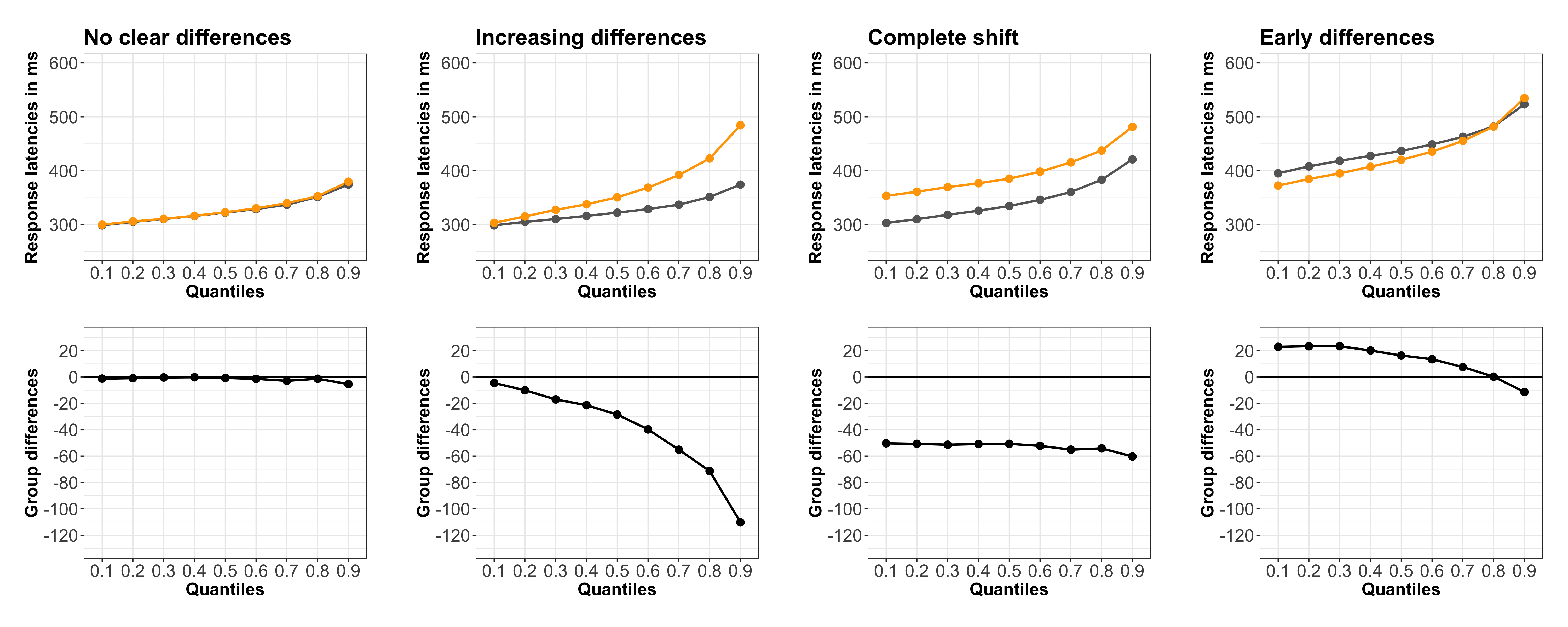
For our current example, I made up data for 2 independent groups with four patterns of differences:

  • no clear differences;

  • uniform shift between distributions;

  • mostly late differences;

  • mostly early differences.

The R code is on GitHub.

Scatterplots

For our first visualisation, we use geom_jitter() from ggplot2. The 1D scatterplots give us a good idea of how the groups differ but they’re not the easiest to read. The main reason is probably that we need to estimate local densities of points in different regions and compare them between groups.

figure_scatter

For the purpose of this exercise, each group (g1 and g2) is composed of 1,000 observations, so the differences in shapes are quite striking. With smaller sample sizes the evaluation of these graphs could be much more challenging.

Kernel density plots

Relative to scatterplots, I find that kernel density plots make the comparisons between groups much easier.

figure_kde

Improved scatterplots

Scatterplots and kernel density plots can be combined by using beeswarm plots. Here we create scatterplots shaped by local density using the geom_quasirandom() function from the ggbeeswarm package. Essentially, the function creates violin plots in which the constituent points are visible. 

figure_scat_quant

To make the plots even more informative, I’ve superimposed quantiles – here deciles computed using the Harrell-Davis quantile estimator. The deciles are represented by vertical black lines, with medians shown with thicker lines. Medians are informative about the location of the bulk of the observations and comparing the lower to upper quantiles let us appreciate the amount of asymmetry within distributions. Comparing quantiles between groups give us a sense of the amount of relative compression/expansion on each side of the distributions. This information would be lost if we only compared the medians. 

Quantile plots

If we remove the scatterplots and only show the quantiles, we obtain quantile plots, which provide a compact description of how distributions differ (please post a comment if you know of older references using quantile plots). Because the quantiles are superimposed, they are easier to compare than in the previous scatterplots. To help with the group comparisons, I’ve also added plots of the quantile differences, which emphasise the different patterns of group differences.

figure_qplot

Vincentile plots

An alternative to quantiles are Vincentiles, which are computed by sorting the data and splitting them in equi-populated bins (there is the same number of observations in each bin). Then the mean is computed for each bin (Balota et al. 2008; Jiang et al. 2004). Below means were computed for 9 equi-populated bins. As expected from the way they are computed, quantile plots and Vincentile plots look very similar for our large samples from continuous variables.

figure_vinc

Group quantile and Vincentile plots can be created by averaging quantiles and Vincentiles across participants (Balota & Yap, 2011; Ratcliff, 1979). This will be the topic of another post.

Delta plots

Related to quantile plots and Vincentile plots, delta plots show the difference between conditions, bin by bin (for each Vincentile) along the y-axis, as a function of the mean across conditions for each bin along the x-axis (De Jong et al., 1994). Not surprisingly, these plots have very similar shapes to the quantile difference plots we considered earlier. 

figure_delta

Negative delta plots (nDP, delta plots with a negative slope) have received particular attention because of their theoretical importance (Ellinghaus & Miller, 2018; Schwarz & Miller, 2012).

Shift function

Delta plots are related to the shift function, a powerful tool introduced in the 1970s: it consists in plotting the difference between the quantiles of two groups as a function of the quantiles in one group, with some measure of uncertainty around the difference (Doksum, 1974; Doksum & Sievers, 1976; Doksum, 1977). It was later refined by Rand Wilcox (Rousselet et al. 2017). This modern version is shown below, with deciles estimated using the Harrell-Davis quantile estimator, and percentile bootstrap confidence intervals of the quantile differences. The sign of the difference is colour-coded (purple for negative, orange for positive).

figure_shift

Unlike other graphical quantile techniques presented here, the shift function affords statistical inferences because of it’s use of confidence intervals (the shift function also comes in a few Bayesian flavours). It is probably one of the easiest ways to compare entire distributions, without resorting to explicit models of the distributions. But the shift function and the other graphical methods demonstrated in this post are not meant to compete with hierarchical models. Instead, they can be used to better understand data patterns within and between participants, before modelling attempts. They also provide powerful alternatives to the mindless application of t-tests and bar graphs, helping to nudge researchers away from the unique use of the mean (or the median) and towards considering the rich information available in continuous distributions.

References

Balota, D.A. & Yap, M.J. (2011) Moving Beyond the Mean in Studies of Mental Chronometry: The Power of Response Time Distributional Analyses. Curr Dir Psychol Sci, 20, 160-166.

Balota, D.A., Yap, M.J., Cortese, M.J. & Watson, J.M. (2008) Beyond mean response latency: Response time distributional analyses of semantic priming. J Mem Lang, 59, 495-523.

Clarke, E. & Sherrill-Mix, S. (2016) ggbeeswarm: Categorical Scatter (Violin Point) Plots.

De Jong, R., Liang, C.C. & Lauber, E. (1994) Conditional and Unconditional Automaticity – a Dual-Process Model of Effects of Spatial Stimulus – Response Correspondence. J Exp Psychol Human, 20, 731-750.

Doksum, K. (1974) Empirical Probability Plots and Statistical Inference for Nonlinear Models in the two-Sample Case. Ann Stat, 2, 267-277.

Doksum, K.A. (1977) Some graphical methods in statistics. A review and some extensions. Statistica Neerlandica, 31, 53-68.

Doksum, K.A. & Sievers, G.L. (1976) Plotting with Confidence – Graphical Comparisons of 2 Populations. Biometrika, 63, 421-434.

Ellinghaus, R. & Miller, J. (2018) Delta plots with negative-going slopes as a potential marker of decreasing response activation in masked semantic priming. Psychol Res, 82, 590-599.

Jiang, Y., Rouder, J.N. & Speckman, P.L. (2004) A note on the sampling properties of the Vincentizing (quantile averaging) procedure. J Math Psychol, 48, 186-195.

Ratcliff, R. (1979) Group Reaction-Time Distributions and an Analysis of Distribution Statistics. Psychol Bull, 86, 446-461.

Rousselet, G.A., Pernet, C.R. & Wilcox, R.R. (2017) Beyond differences in means: robust graphical methods to compare two groups in neuroscience. The European journal of neuroscience, 46, 1738-1748.

Schwarz, W. & Miller, J. (2012) Response time models of delta plots with negative-going slopes. Psychon B Rev, 19, 555-574.

How to compare dependent correlations

In this post we’re going to compare two robust dependent correlation coefficients using a frequentist approach. The approach boils down to computing a confidence interval for the difference between correlations. There are several solutions to this problem, and we’re going to focus on what is probably the simplest one, using a percentile bootstrap, as described in Wilcox 2016 & implemented in his R functions twoDcorR() and twoDNOV(). These two functions correspond to two cases:

  • Case 1: overlapping correlations
  • Case 2: non-overlapping correlations

Case 1: overlapping correlations

Case 1 corresponds to the common scenario in which we look for correlations, across participants, between one behavioural measurement and activity in several brain areas. For instance, we could look at correlations between percent correct in one task and brain activity in two regions of interest (e.g. parietal and occipital). In this scenario, often papers report a significant brain-behaviour correlation in one brain area, and a non-significant correlation in another brain area. Stopping the analyses at that stage leads to a common interaction fallacy: because correlation 1 is statistically significant and correlation 2 is not does not mean that the two correlations differ (Nieuwenhuis et al. 2011). The interaction fallacy is also covered in a post by Jan Vanhove. Thom Baguley also provides R code to compare correlations, as well as a cautionary note about using correlations at all.

To compare the two correlation coefficients, we proceed like this:

  • sample participants with replacement
  • use the participant indices to create bootstrap samples for each group (concretely, for 3 groups, we sample triads of observations, preserving the dependency among observations)
  • compute the two correlation coefficients based on the bootstrap samples
  • save the difference between correlations
  • execute the previous steps at least 500 times
  • use the distribution of bootstrap differences to derive a confidence interval: a 95% confidence interval is defined as the 2.5th and 97.5th quantiles of the bootstrap distribution.

A Matlab script implementing the procedure is on github. To run the code you will need the Robust Correlation Toolbox. First we generate data and illustrate them.

fig1_comp2dcorr

Figure 1

% Then we bootstrap the data
Nb = 500;
bootcorr1 = zeros(Nb,1);
bootcorr2 = zeros(Nb,1);

for B = 1:Nb

bootsample = randi(Np,1,Np);
bootcorr1(B) = Spearman(a(bootsample),b(bootsample),0);
bootcorr2(B) = Spearman(a(bootsample),c(bootsample),0);

end

% Cyril Pernet pointed out on Twitter that the loop is unnecessary.
% We can compute all bootstrap samples in one go:
% bootsamples = randi(Np,Np,Nb);
% bc1 = Spearman(a(bootsamples),b(bootsamples),0);
% bc2 = Spearman(a(bootsamples),c(bootsamples),0);
% The bootstrap loop does make the bootstrap procedure more intuitive
% for new users, especially if they are also learning R or Matlab!

In the example above we used Spearman’s correlation, which is robust to univariate outliers (Pernet, Wilcox & Rousselet, 2012). To apply the technique to Pearson’s correlation, the boundaries of the confidence interval need to be adjusted, as described in Wilcox (2009). However, Pearson’s correlation is not robust so it should be used cautiously (Rousselet & Pernet 2012). Also, as described in Wilcox (2009), Fisher’s z test to compare correlation coefficients is inappropriate.

Confidence intervals are obtained like this:

alpha = 0.05; % probability coverage - 0.05 for 95% CI

hi = floor((1-alpha/2)*Nb+.5);
lo = floor((alpha/2)*Nb+.5);

% for each correlation
boot1sort = sort(bootcorr1);
boot2sort = sort(bootcorr2);
boot1ci = [boot1sort(lo) boot1sort(hi)]; 
boot2ci = [boot2sort(lo) boot2sort(hi)]; 

% for the difference between correlations
bootdiff = bootcorr1 - bootcorr2;
bootdiffsort = sort(bootdiff);
diffci = [bootdiffsort(lo) bootdiffsort(hi)];

We get:

corr(a,b) = 0.52 [0.34 0.66]
corr(a,c) = 0.79 [0.68 0.86]
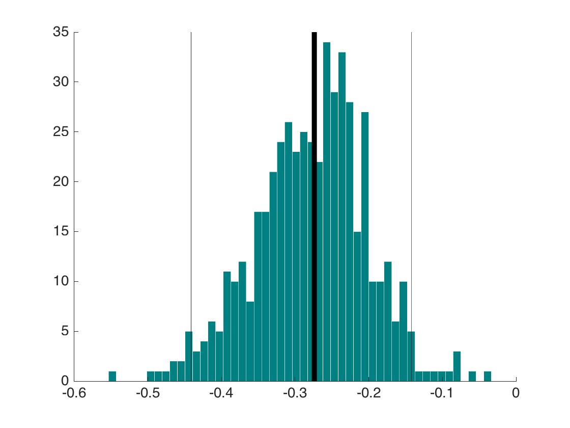
difference = -0.27 [-0.44 -0.14]

The bootstrap distribution of the differences between correlation coefficients is illustrated below.

fig2_comp2dcorr

Figure 2

The bootstrap distribution does not overlap with zero, our null hypothesis. In that case the p value is exactly zero, which is calculated like this:

pvalue = mean(bootdiffsort < 0);
pvalue = 2*min(pvalue,1-pvalue);

The original difference between coefficients is marked by a thick vertical black line. The 95% percentile bootstrap confidence interval is illustrated by the two thin vertical black lines.

Case 2: non-overlapping correlations

Case 2 corresponds to a before-after scenario. For instance the same participants are tested before and after an intervention, such as a training procedure. On each occasion, we compute a correlation, say between brain activity and behaviour, and we want to know if that correlation changes following the intervention.

This case 2 is addressed using a straightforward modification of case 1. Here are example data:

fig3_comp2dcorr

Figure 3

The bootstrap is done like this:

Nb = 500;
bootcorr1 = zeros(Nb,1);
bootcorr2 = zeros(Nb,1);

for B = 1:Nb

bootsample = randi(Np,1,Np);
bootcorr1(B) = Spearman(a1(bootsample),b1(bootsample),0);
bootcorr2(B) = Spearman(a2(bootsample),b2(bootsample),0);

end

alpha = 0.05; % probability coverage - 0.05 for 95% CI
hi = floor((1-alpha/2)*Nb+.5);
lo = floor((alpha/2)*Nb+.5);

% for each correlation
boot1sort = sort(bootcorr1);
boot2sort = sort(bootcorr2);
boot1ci = [boot1sort(lo) boot1sort(hi)]; 
boot2ci = [boot2sort(lo) boot2sort(hi)]; 

% for the difference between correlations
bootdiff = bootcorr1 - bootcorr2;
bootdiffsort = sort(bootdiff);
diffci = [bootdiffsort(lo) bootdiffsort(hi)];

We get:

corr(a1,b1) = 0.52 [0.34 0.66]
corr(a2,b2) = 0.56 [0.39 0.68]
difference = -0.04 [-0.24 0.17]

The difference is very close to zero and its confidence interval includes zero. So the training procedure is associated with a very weak change in correlation.

Instead of a confidence interval, we could also report a highest density interval, which will be very close to the confidence interval if the bootstrap distribution is symmetric – the Matlab script on github shows how to compute a HDI. We could also simply report the difference and its bootstrap distribution. This provides a good summary of the uncertainty we have about the difference, without committing to a binary description of the results as significant or not.

fig4_comp2dcorr

Figure 4

Conclusion

The strategies described here have been validated for Spearman’s correlation and the Winzorised correlation (Wilcox, 2016). The skipped correlation led to too conservative confidence intervals, meaning that in simulations, the 95% confidence intervals contained the true value more than 95% of the times. This illustrates an important idea: the behaviour of a confidence interval is always estimated in the long run, using simulations, and it results from the conjunction of an estimator and a technique to form the confidence interval. Finally, a very similar bootstrap approach can be used to compare regression coefficients (Wilcox 2012), for instance to compare the slopes of robust linear regressions in an overlapping case (Bieniek et al. 2013).

References

Bieniek, M.M., Frei, L.S. & Rousselet, G.A. (2013) Early ERPs to faces: aging, luminance, and individual differences. Frontiers in psychology, 4, 268.

Nieuwenhuis, S., Forstmann, B.U. & Wagenmakers, E.J. (2011) Erroneous analyses of interactions in neuroscience: a problem of significance. Nat Neurosci, 14, 1105-1107.

Pernet, C.R., Wilcox, R. & Rousselet, G.A. (2012) Robust correlation analyses: false positive and power validation using a new open source matlab toolbox. Front Psychol, 3, 606.

Wilcox, R.R. (2009) Comparing Pearson Correlations: Dealing with Heteroscedasticity and Nonnormality. Communications in Statistics-Simulation and Computation, 38, 2220-2234.

Wilcox, R.R. (2012) Introduction to robust estimation and hypothesis testing. Academic Press, San Diego, CA.

Wilcox, R.R. (2016) Comparing dependent robust correlations. Brit J Math Stat Psy, 69, 215-224.

A few simple steps to improve the description of neuroscience group results


This post is a draft of an editorial letter I’m writing for the European Journal of Neuroscience. It builds on previous posts on visualisation of behavioural and ERP data.


Update 2016-09-16: the editorial is now accepted:

Rousselet, G. A., Foxe, J. J. and Bolam, J. P. (2016), A few simple steps to improve the description of group results in neuroscience. Eur J Neurosci. Accepted Author Manuscript. doi:10.1111/ejn.13400

The final illustrations are available on Figshare: Rousselet, G.A. (2016): A few simple steps to improve the description of group results in neuroscience. figshare. https://dx.doi.org/10.6084/m9.figshare.3806487


There are many changes necessary to improve the quality of neuroscience research. Suggestions abound to increase openness, promote better experimental designs and analyses, and educate researchers about statistical inferences. These changes are necessary and will take time to implement. As part of this process, here, we would like to propose a few simple steps to improve the assessment of statistical results in neuroscience, by focusing on detailed graphical representations.

Despite a potentially sophisticated experimental design, in a typical neuroscience experiment, raw continuous data tend to undergo drastic simplifications. As a result, it is common for the main results of an article to be summarised in a few figures and a few statistical tests. Unfortunately, graphical representations in many scientific journals, including neuroscience journals, tend to hide underlying distributions, with their excessive use of line and bar graphs (Allen et al., 2012; Weissgerber et al., 2015). This is problematic because common basic summary statistics, such as mean and standard deviation are not robust and do not provide enough information about a distribution, and can thus give misleading impressions about a dataset, particularly for the small sample sizes we are accustomed to in neuroscience (Anscombe, 1973; Wilcox, 2012). As a consequence of poor data representation, there can be a mismatch between the outcome of statistical tests, their interpretations, and the information available in the raw data distributions.

Let’s consider a general and familiar scenario in which observations from two groups of participants are summarised using a bar graph, and compared using a t-test on means. If the p value is inferior to 0.05, we might conclude that we have a significant effect, with one group having larger values than the other one; if the p value is not inferior to 0.05, we might conclude that the two distributions do not differ. What is wrong with this description? In addition to the potentially irrational use of p values (Gigerenzer, 2004; Wagenmakers, 2007; Wetzels et al., 2011), the situation above highlights many caveats in current practices. Indeed, using bar graphs and an arbitrary p<0.05 cut-off turns a potentially rich pattern of results into a simplistic, binary outcome, in which effect sizes and individual differences are ignored. For instance, a more fruitful approach to describing a seemingly significant group effect would be to answer these questions as well:

  • how many participants show an effect in the same direction as the group? It is possible to get significant group effects with very few individual participants showing a significant effect themselves. Actually, with large enough sample sizes you can pretty much guarantee significant group effects (Wagenmakers, 2007);

  • how many participants show no effect, or an effect in the opposite direction as the group?

  • is there a smooth continuum of effects across participants, or can we identify sub-clusters of participants who appear to behave differently from the rest?

  • how large are the individual effects?

These questions can only be answered by using scatterplots or other detailed graphical representations of the results, and by reporting other quantities than the mean and standard deviation of each group. Essentially, a significant t-test is neither necessary nor sufficient to understand how two distributions differ (Wilcox, 2006). And because t-tests and ANOVAs on means are not robust (for instance to skewness & outliers), failure to reach the 0.05 cut-off should not be used to claim that distributions do not differ: first, the lack of significance (p<0.05) is not the same as evidence for the lack of effect (Kruschke, 2013); second, robust statistical tests should be considered (Wilcox, 2012); third, distributions can potentially differ in their left or right tails, but not in their central tendency, for instance when only weaker animals respond to a treatment (Doksum, 1974; Doksum & Sievers, 1976; Wilcox, 2006; Wilcox et al., 2014). Essentially, if an article reports bar graphs and non-significant statistical analyses of the mean, not much can be concluded at all. Without detailed and informative illustrations of the results, it is impossible to tell if the distributions truly do not differ.

Let’s consider the example presented in Figure 1, in which two groups of participants were tested in two conditions (2 independent x 2 dependent factor design). Panel A illustrates the results using a mean +/- SEM bar graph. An ANOVA on these data reveals a non-significant group effect, a significant main effect of condition, and a significant group x condition interaction. Follow-up paired t-tests reveal a significant condition effect in group 1, but not in group 2. These results seem well supported by the bar graph in Figure 1A. Based on this evidence, it is very common to conclude that group 1 is sensitive to the experimental manipulation, but not group 2. The discussion of the article might even pitch the results in more general terms, making claims about the brain in general.

figure1

Figure 1. Different representations of the same behavioural data. Results are in arbitrary units. A Bar graph with mean +/- SEM. B Stripcharts (1D scatterplots) of difference scores. C Stripcharts of linked observations. D Scatterplot of paired observations. The diagonal line has slope 1 and intercept 0. This figure is licensed CC-BY and available on Figshare, along with data and R code to reproduce it (Rousselet 2016a).

Although the scenario just described is very common in the literature, the conclusions are unwarranted. First, the lack of significance (p<0.05) does not necessarily provide evidence for the lack of effect (Wetzels et al., 2011; Kruschke, 2013). Second, without showing the content of the bars, no conclusion should be drawn at all. So let’s look inside the bars. Figure 1B shows the results from the two independent groups: participants in each group were tested in two conditions, so the pairwise differences are illustrated to reveal the effect sizes and their distributions across participants. The data show large individual differences and overlap between the two distributions. In group 2, except for 2 potential outliers showing large negative effects, the remaining observations are within the range observed in group 1. Six participants from group 2 have differences suggesting an effect in the same direction as group 1, two are near zero, three go in the opposite direction. So, clearly, the lack of significant difference in group 2 is not supported by the data: yes group 2 has overall smaller differences than group 1, but if group 1 is used as a control group, then most participants in group 2 appear to have standard effects. Or so it seems, until we explore the nature of the difference scores by visualising paired observations in each group (Figure 1C). In group 1, as already observed, results in condition 2 are overall larger than in condition 1. In addition, participants with larger scores in condition 1 tend to have proportionally larger differences between conditions 1 and 2. Such relationship seems to be absent in group 2, which suggests that the two groups differ not only in the overall sensitivity to the experimental manipulation, but that other factors could be at play in group 1, and not in group 2. Thus, the group differences might actually be much subtler than suggested by our first analyses. The group dichotomy is easier to appreciate in Figure 1D, which shows a scatterplot of the paired observations in the two groups. In group 1, the majority of paired observations are above the unity line, demonstrating an overall group effect; there is also a positive relationship between the scores in condition 2 and the scores in condition 1. Again, no such relationship seems to be present in group 2. In particular, the two larger negative scores in group 2 are not associated with participants who scored particularly high or low in condition 1, giving us no clue as to the origin of these seemingly outlier scores.

At this stage, we’ve learnt a great deal more about our dataset using detailed graphical representations than relying only on a bar graph and an ANOVA. However, we would need many more than n = 11 participants in both groups to quantify the effects and understand how they differ across groups. We have also not exhausted all the representations that could help us make sense of the results. There is also potentially more to the data, because we haven’t considered the full distribution of single-trials/repetitions. For instance, it is very common to summarise a reaction time distribution of potentially hundreds of trials using a single number, which is then used to perform group analyses. An alternative is to study these distributions in each participant, to understand exactly how they differ between conditions. This single-participant approach would be necessary here to understand how the two groups of participants respond to the experimental manipulation.

In sum, there is much more to the data than what we could conclude from the bar graphs and the ANOVA and t-tests. Once bar graphs and their equivalents are replaced by scatterplots (or boxplots etc.) the story can get much more interesting, subtle, convincing, or the opposite… It depends what surprises the bars are holding. Showing scatterplots is the start of a discussion about the nature of the results, an invitation to go beyond the significant vs. non-significant dichotomy. For the particular results presented in Figure 1, it is rather unclear what is gained by the ANOVA at all compared to detailed graphical representations. Instead of blind statistical significance testing, it would of course be beneficial to properly model the data to make predictions (Kuhn & Johnson, 2013), and to allow integration across subsequent experiments and replication attempts – a critical step that requires Bayesian inference (Verhagen & Wagenmakers, 2014).

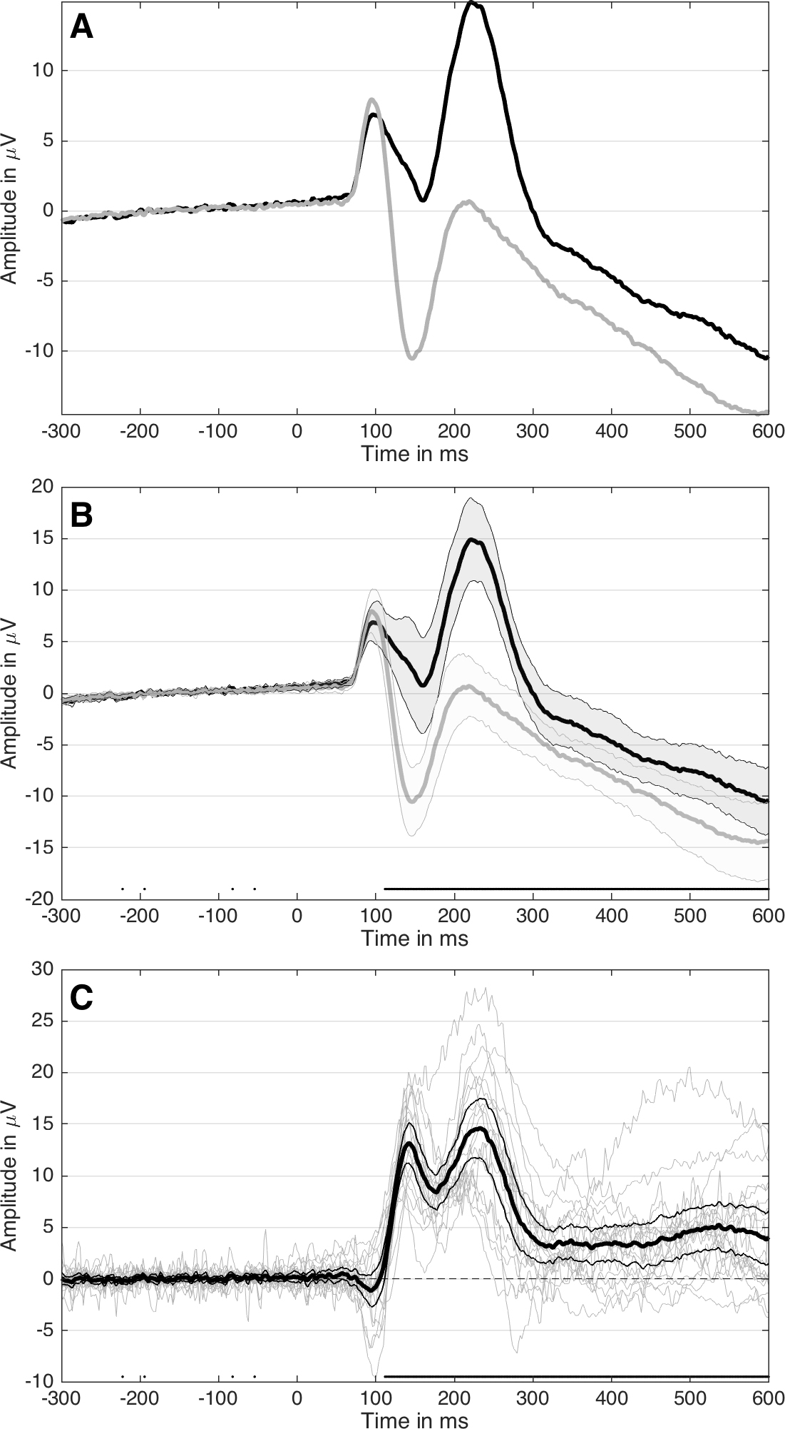
The problems described so far are not limited to relatively simple one dimensional data: they are present in more complex datasets as well, such as EEG and MEG time-series. For instance, it is common to see EEG and MEG evoked responses illustrated using solely the mean across participants (Figure 2A). Although common, this representation is equivalent to a bar graph without error bars/whiskers, and is therefore unacceptable. At a minimum, some measure of uncertainty should be provided, for instance so-called confidence intervals (Figure 2B). Also, because it can be difficult to mentally subtract two time-courses, it is important to illustrate the time-course of the difference as well (Figure 2C). In particular, showing the difference helps to consider all the data, not just large peaks, to avoid underestimating potentially large effects occurring before or after the main peaks. In addition, Figure 2C illustrates ERP differences for every participant – an ERP version of a scatterplot. This more detailed illustration is essential to allow readers to assess effect sizes, inter-participant differences, and ultimately to interpret significant and non-significant results. For instance, in Figure 2C, there is a non-significant group negative difference 100 ms, and a large positive difference 120 to 280 ms. What do they mean? The individual traces reveal a small number of participants with relatively large differences 100 ms despite the lack of significant group effect, and all participants have a positive difference 120 to 250 ms post-stimulus. There are also large individual differences at most time points. So Figure 2C, although certainly not the ultimate representation, offers a much richer and compelling description than the group averages on their own; Figure 2C also suggests that more detailed group analyses would be beneficial, as well as single-participant analyses (Pernet et al., 2011; Rousselet & Pernet, 2011).

MATLAB Handle Graphics

MATLAB Handle Graphics

Figure 2. Different representations of the same ERP data.  Paired design in which the same participants saw two image categories. A Standard ERP figure showing the mean across participants for two conditions. B Mean ERPs with 95% confidence intervals. The black dots along the x-axis mark time points at which there is a significant paired t-test (p<0.05).  C Time course of the ERP differences. Differences from individual participants are shown in grey. The mean difference is superimposed using a thick black curve. The thinner black curves mark the mean’s 95% confidence interval. This figure is licensed CC-BY and available on Figshare, along with data and Matlab code to reproduce it (Rousselet 2016b).

To conclude, we urge authors, reviewers and editors to promote and implement these guidelines to achieve higher standards in reporting neuroscience research:

  • as much as possible, do not use line and bar graphs; use scatterplots instead, or, if you have large sample sizes, histograms, kernel density plots, or boxplots;

  • for paired designs, show distributions of pairwise differences, so that readers can assess how many comparisons go in the same direction as the group, their size, and their variability; this recommendation also applies to brain imaging data, for instance MEEG and fMRI BOLD time-courses;

  • report how many participants show an effect in the same direction as the group;

  • only draw conclusions about what was assessed: for instance, if you perform a t-test on means, you should only conclude about differences in means, not about group differences in general;

  • don’t use a star system to dichotomise p values: p values do not measure effect sizes or the amount of evidence against or in favour of the null hypothesis (Wagenmakers, 2007);

  • don’t agonise over p values: focus on detailed graphical representations and robust effect sizes instead (Wilcox, 2006; Wickham, 2009; Allen et al., 2012; Wilcox, 2012; Weissgerber et al., 2015);

  • consider Bayesian statistics, to get the tools to align statistical and scientific reasoning (Cohen, 1994; Goodman, 1999; 2016).

Finally, we cannot ignore that using detailed illustrations for potentially complex designs, or designs involving many group comparisons, is not straightforward: research in that direction, including the creation of open-access toolboxes, is of great value to the community, and should be encouraged by funding agencies.

References

Allen, E.A., Erhardt, E.B. & Calhoun, V.D. (2012) Data visualization in the neurosciences: overcoming the curse of dimensionality. Neuron, 74, 603-608.

Anscombe, F.J. (1973) Graphs in Statistical Analysis. Am Stat, 27, 17-21.

Cohen, D. (1994) The earth is round (p<.05). American Psychologist, 49, 997-1003.

Doksum, K. (1974) Empirical Probability Plots and Statistical Inference for Nonlinear Models in the two-Sample Case. Annals of Statistics, 2, 267-277.

Doksum, K.A. & Sievers, G.L. (1976) Plotting with Confidence – Graphical Comparisons of 2 Populations. Biometrika, 63, 421-434.

Gigerenzer, G. (2004) Mindless statistics. Journal of Behavioral and Experimental Economics (formerly The Journal of Socio-Economics), 33, 587-606.

Goodman, S.N. (1999) Toward evidence-based medical statistics. 1: The P value fallacy. Ann Intern Med, 130, 995-1004.

Goodman, S.N. (2016) Aligning statistical and scientific reasoning. Science, 352, 1180-1181.

Kruschke, J.K. (2013) Bayesian estimation supersedes the t test. J Exp Psychol Gen, 142, 573-603.

Kuhn, M. & Johnson, K. (2013) Applied predictive modeling. Springer, New York.

Pernet, C.R., Sajda, P. & Rousselet, G.A. (2011) Single-trial analyses: why bother? Frontiers in psychology, 2, doi: 10.3389-fpsyg.2011.00322.

Rousselet, G.A. & Pernet, C.R. (2011) Quantifying the Time Course of Visual Object Processing Using ERPs: It’s Time to Up the Game. Front Psychol, 2, 107.

Rousselet, G. (2016a). Different representations of the same behavioural data. figshare.
https://dx.doi.org/10.6084/m9.figshare.3504539

Rousselet, G. (2016b). Different representations of the same ERP data. figshare.
https://dx.doi.org/10.6084/m9.figshare.3504566

Verhagen, J. & Wagenmakers, E.J. (2014) Bayesian tests to quantify the result of a replication attempt. J Exp Psychol Gen, 143, 1457-1475.

Wagenmakers, E.J. (2007) A practical solution to the pervasive problems of p values. Psychonomic bulletin & review, 14, 779-804.

Weissgerber, T.L., Milic, N.M., Winham, S.J. & Garovic, V.D. (2015) Beyond bar and line graphs: time for a new data presentation paradigm. PLoS Biol, 13, e1002128.

Wetzels, R., Matzke, D., Lee, M.D., Rouder, J.N., Iverson, G.J. & Wagenmakers, E.J. (2011) Statistical Evidence in Experimental Psychology: An Empirical Comparison Using 855 t Tests. Perspectives on Psychological Science, 6, 291-298.

Wickham, H. (2009) ggplot2 : elegant graphics for data analysis. Springer, New York ; London.

Wilcox, R.R. (2006) Graphical methods for assessing effect size: Some alternatives to Cohen’s d. Journal of Experimental Education, 74, 353-367.

Wilcox, R.R. (2012) Introduction to robust estimation and hypothesis testing. Academic Press, San Diego, CA.

Wilcox, R.R., Erceg-Hurn, D.M., Clark, F. & Carlson, M. (2014) Comparing two independent groups via the lower and upper quantiles. J Stat Comput Sim, 84, 1543-1551.

How to chase ERP monsters hiding behind bars

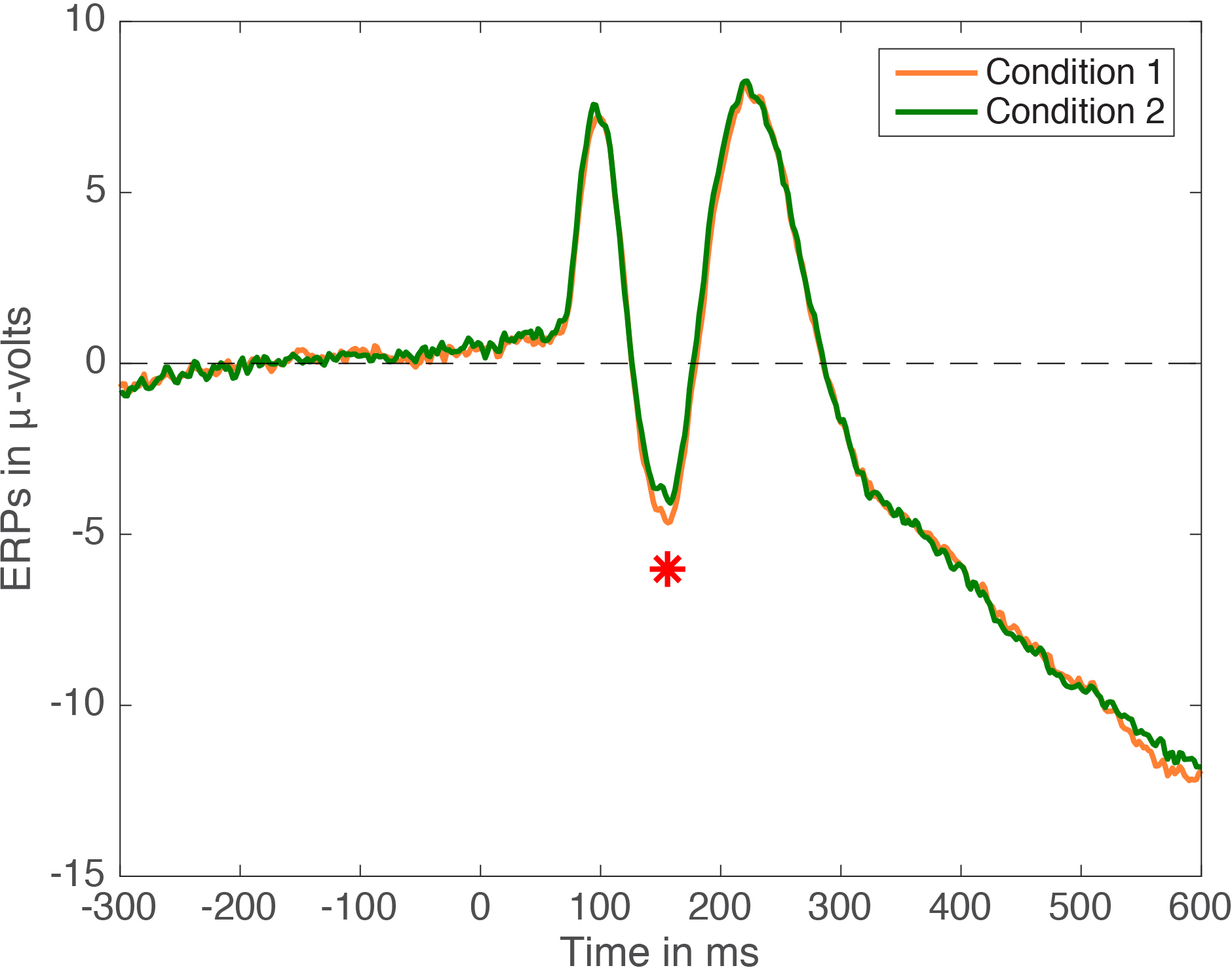
I think detailed and informative illustrations of results is the most important step in the statistical analysis process, whether we’re looking at a single distribution, comparing groups, or dealing with more complex brain imaging data. Without careful illustrations, it can be difficult, sometimes impossible, to understand our results and to convey them to an audience. Yet, from specialty journals to Science & Nature, the norm is still to hide rich distributions behind bar graphs or one of their equivalents. For instance, in ERP (event-related potential) research, the equivalent of a bar graph looks like this:

figure1

Figure 1. ERP averages in 2 conditions. Paired design, n=30, cute little red star indicates p<0.05.

All the figures in this post can be reproduced using Matlab code available on github.

Figure 1 is very much standard in the field. It comes with a little star to attract your attention to one time point that has reached the magic p<0.05 threshold. Often, the ERP figure will be complemented with a bar graph:

figure1b

Figure 1b. Bar graph of means +/- SEM for conditions 1 & 2.

Ok, what’s wrong with this picture? You might argue that the difference is small, and that the statistical tests have probably not been corrected for multiple comparisons. And in many cases, you would be right. But many ERP folks would reply that because they focus their analyses on peaks, they do not need to correct for multiple comparisons. Well, unless you have a clear hypothesis for each peak, then you should at least correct for the number of peaks or time windows of interest tested if you’re willing to flag any effect p<0.05. I would also add that looking at peaks is wasteful and defeats the purpose of using EEG: it is much more informative to map the full time-course of the effects across all sensors, instead of throwing valuable data away (Rousselet & Pernet, 2011).

Another problem with Figure 1 is the difficulty in mentally subtracting two time-courses, which can lead to underestimating differences occurring between peaks. So, in the next figure, we show the mean difference as well:

figure2

Figure 2. Mean ERPs + mean difference. The black vertical line marks the time of the largest absolute difference between conditions.

Indeed, there is a modest bump in the difference time-course around the time of the significant effect marked by the little star. The effect looks actually more sustained than it appears by just looking at the time-courses of the two original conditions – so we learn something by looking at the difference time-course. The effect is much easier to interpret by adding some measure of accuracy, for instance a 95% confidence interval:

figure3

Figure 3. Mean ERPs + mean difference + confidence interval.

We could also show confidence intervals for condition 1 and condition 2 mean ERPs, but we are primarily interested in how they differ, so the focus should be on the difference. Figure 3 reveals that the significant effect is associated with a confidence interval only very slightly off the zero mark. Although p<0.05, the confidence interval suggests a weak effect, and Bayesian estimation might actually suggest no evidence against the null (Wetzels et al. 2011). And this is why the focus should be on robust effect sizes and their illustration, instead of binary outcomes resulting from the application of arbitrary thresholds. How do we proceed in this case? A simple measure of effect size is to report the difference, which in our case can be illustrated by showing the time-course of the difference for every participant (see a nice example in Kovalenko et al. 2012). And what’s lurking under the hood here? Monsters?

figure4

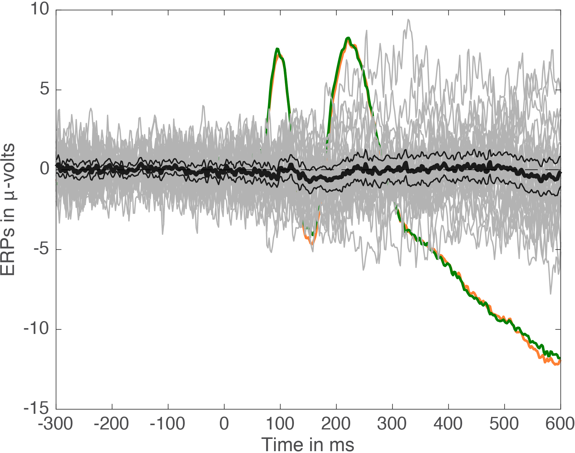
Figure 4. Mean ERPs + mean difference + confidence interval + individual differences.

Yep, it’s a mess of spaghetti monsters!

After contemplating a figure like that, I would be very cautious about my interpretation of the results. For instance, I would try to put the results into context, looking carefully at effect sizes and how they compare to other manipulations, etc. I would also be very tempted to run a replication of the experiment. This can be done in certain experimental situations on the same participants, to see if effect sizes are similar across sessions (Bieniek et al. 2015). But I would certainly not publish a paper making big claims out of these results, just because p<0.05.

So what can we say about the results? If we look more closely at the distribution of differences at the time of the largest group difference (marked by a vertical line in Figure 2), we can make another observation:

figure5

Figure 5. Distribution of individual differences at the time of the maximum absolute group difference.

About 2/3 of participants show an effect in the same direction as the group effect (difference < 0). So, in addition to the group effect, there are large individual differences. This is not surprising. What is surprising is the usual lack of consideration for individual differences in most neuroscience & psychology papers I have come across. Typically, results portrayed in Figure 1 would be presented like this:

“We measured our favourite peak in two conditions. It was larger in condition 1 than in condition 2 (p<0.05), as predicted by our hypothesis. Therefore, when subjected to condition 1, our brains process (INSERT FAVOURITE STIMULUS, e.g. faces) more (INSERT FAVOURITE PROCESS, e.g. holistically).”

Not only this is a case of bad reverse inference, it is also inappropriate to generalise the effect to the entire human population, or even to all participants in the sample – 1/3 showed an effect in the opposite direction after all. Discrepancies between group statistics and single-participant statistics are not unheard of, if you dare to look (Rousselet et al. 2011).

Certainly, more subtle and honest data description would go a long way towards getting rid of big claims, ghost effects and dodgy headlines. But how many ERP papers have you ever seen with figures such as Figure 4 and Figure 5? How many papers contain monsters behind bars? Certainly, “my software does not have that option” doesn’t cut it; these figures are easy to make in Matlab, R or Python. If you don’t know how, ask a colleague, post questions on online forums, there are plenty of folks eager to help. For Matlab code, you could start here for instance.

Now: the final blow. The original ERP data used for this post are real and have huge effect sizes (check Figure A2 here for instance). However, the effect marked by a little star in Figure 1 is a false positive: there are no real effects in this dataset! The current data were generated by sampling trials with replacement from a pool of 7680 trials, to which pink noise was added, to create 30 fake participants and 2 fake conditions. I ran the fake data making process several times and selected the version that gave me a significant peak difference, because, you know, I love peaks. So yes, we’ve been looking at noise all along. And I’m sure there is plenty of noise out there in published papers. But it is very difficult to tell, because standard ERP figures are so poor.

How do we fix this?

  • make detailed, honest figures of your effects;
  • post your data to an online repository for other people to scrutinise them;
  • conclude honestly about what you’ve measured (e.g. “I only analyse the mean, I don’t know how other aspects of the distributions behave”), without unwarranted generalisation (“1/3 of my participants did not show the group effect”);
  • replicate new effects;
  • report p values if you want, but do not obsess over the 0.05 threshold, it is arbitrary, and continuous distributions should not be dichotomised (MacCallum et al. 2002);
  • focus on effect sizes.

References

Bieniek, M.M., Bennett, P.J., Sekuler, A.B. & Rousselet, G.A. (2015) A robust and representative lower bound on object processing speed in humans. The European journal of neuroscience.

Kovalenko, L.Y., Chaumon, M. & Busch, N.A. (2012) A pool of pairs of related objects (POPORO) for investigating visual semantic integration: behavioral and electrophysiological validation. Brain Topogr, 25, 272-284.

MacCallum RC, Zhang S, Preacher KJ, Rucker DD. 2002. On the practice of dichotomization of quantitative variables. Psychological Methods 7: 19-40

Rousselet, G.A. & Pernet, C.R. (2011) Quantifying the Time Course of Visual Object Processing Using ERPs: It’s Time to Up the Game. Front Psychol, 2, 107.

Rousselet, G.A., Gaspar, C.M., Wieczorek, K.P. & Pernet, C.R. (2011) Modeling Single-Trial ERP Reveals Modulation of Bottom-Up Face Visual Processing by Top-Down Task Constraints (in Some Subjects). Front Psychol, 2, 137.

Wetzels, R., Matzke, D., Lee, M.D., Rouder, J.N., Iverson, G.J. & Wagenmakers, E.J. (2011) Statistical Evidence in Experimental Psychology: An Empirical Comparison Using 855 t Tests. Perspectives on Psychological Science, 6, 291-298.

how to fix erroneous error bars for percent correct data

Have you ever seen accurate bar graphs portrayed for percent correct data? For other bounded quantities, such as average scores from an ordinal scale (for instance a 1-9 Likert scale)? It is entirely possible that you have never seen accurate bar graphs of these quantities, because most of these graphs rely on the wrong tools: typically, the mean +/- SD or SEM is shown, or a classic confidence interval of the mean. Why are these techniques wrong? First, they use the mean, which is a non-robust estimator of central tendency; second, they use the variance, a non-robust estimator of dispersion; third, they assume symmetry; fourth, the results are not bounded, such that they can span impossible values, for instance percent correct beyond 100%. This is simply impossible: participants cannot be more than 100% correct. Yet, I regularly see articles with error bars beyond 100% correct, and authors, reviewers and editors seem to be ok with that.

How do we fix the problem? They are four simple answers, and one more elaborate:

  1. Do not use bar graphs, use scatterplots instead. There is absolutely no reason why you should have to report means + error bars and hide your data.
  2. Use a percentile bootstrap confidence interval – it will not produce boundaries with impossible values and will accommodate asymmetric distributions. If there is skewness or outliers, the mean will produce misleading results – use a robust estimator of central tendency instead, for instance the median or a trimmed mean (Wilcox & Keselman, 2003).
  3. Use a binomial proportion confidence interval such as the Jeffreys interval. A quick google search indicates it is available in several R packages.
  4. Compute d’ instead of percent correct: you will get a measure of sensitivity independent of bias, and on a continuous scale amenable to regular confidence interval calculations.
  5. Use a generalised mixed model, for instance a logit mixed model (Jaeger, 2008).

References

Jaeger, T.F. (2008) Categorical Data Analysis: Away from ANOVAs (transformation or not) and towards Logit Mixed Models. J Mem Lang, 59, 434-446.

Wilcox, R.R. & Keselman, H.J. (2003) Modern Robust Data Analysis Methods: Measures of Central Tendency. Psychological Methods, 8, 254-274.

Simple steps for more informative ERP figures

I read, review and edit a lot of ERP papers. A lot of these papers have in common shockingly poor figures. Here I’d like to go over a few simple steps that can help to produce much more informative figures. The data and the code to reproduce all the examples are available on github.

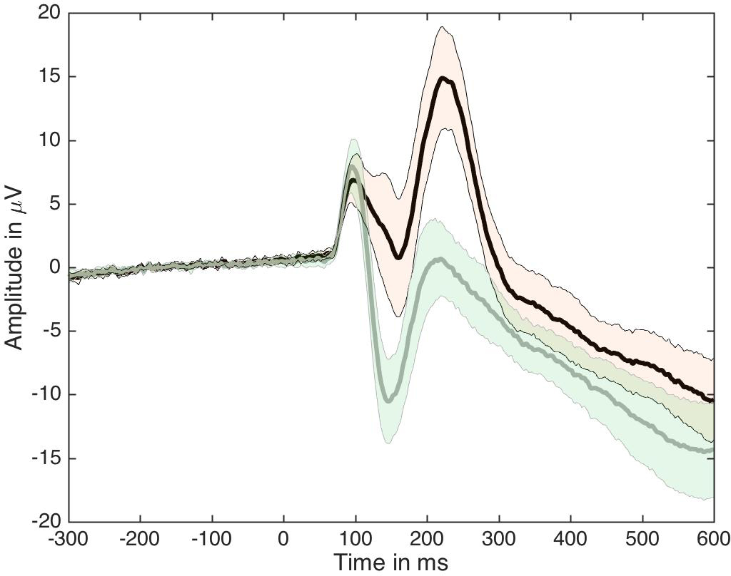
Let’s first consider what I would call the standard ERP figure, the one available in so many ERP papers (Figure 1). It presents two paired group averages for one of the largest ERP effect on the market: the contrast between ERP to noise textures (in black) and ERP to face images (in grey). This standard figure is essentially equivalent to a bar graph without error bars: it is simply unacceptable. At least, in this one, positive values are plotted up, not down, as can still be seen in some papers.

fig1_standard

Figure 1. Standard ERP figure.

How can we improve this figure? As a first step, one could add some symbols to indicate at which time points the two ERPs differ significantly. So in Figure 2 I’ve added red dots marking time points at which a paired t-test gave p<0.05. The red dots appear along the x-axis so their timing is easy to read. This is equivalent to a bar graph without error bars but with little stars to mark p<0.05.

fig2_standard_with_stats

Figure 2. Standard figure with significant time points.

You know where this is going: next we will add confidence intervals, and then more. But it’s important to consider why Figure 2 is not good enough.

First, are significant effects that interesting? We can generate noise in Matlab or R for instance, perform t-tests, and find significant results – doesn’t mean we should write papers about these effects. Although no one would question that significant effects can be obtained by chance, I am yet to see a single paper in which an effect is described as potential false positive. Anyway, more information is required about significant effects:

  • do they make sense physiologically? For instance, you might find a significant ERP difference between 2 object categories at 20 ms, but that does not mean that the retina performs object categorisation;

  • how many participants actually show the group effect? It is possible to get significant group effects with very few individual participants showing a significant effect themselves. Actually, with large enough sample sizes you can pretty much guarantee significant group effects;

  • what is the group effect size, e.g. how large is the difference between two conditions?

  • how large are effect sizes in individual participants?

  • how do effect sizes compare to other known effects, or to effects observed at other time points, such as in the baseline, before stimulus presentation?

Second, because an effect is not statistically significant (p<0.05), it does not mean it is not there, or that you have evidence for the lack of effect. Similarly to the previous point, we should be able to answer these questions about seemingly non-significant effects:

  • how many participants do not show the effect?

  • how many participants actually show an effect?

  • how large are the effects in individual participants?

  • is the group effect non-significant because of the lack of statistical power, e.g. due to skewness, outliers, heavy tails?

Third, most ERP papers report inferences on means using non-robust statistics. Typically, results are then discussed in very general terms as showing effects or not, following a p<0.05 cutoff. What is assumed, at least implicitly, is that the lack of significant mean differences implies that the distributions do not differ. This is clearly unwarranted because distributions can differ in other aspects than the mean, e.g. in dispersion, in the tails, and the mean is not a robust estimator of central tendency. Thus, interpretations should be limited to what was measured: group differences in means, probably using a non-robust statistical test. That’s right, if you read an ERP paper in which the authors report:

“condition A did not differ from condition B”

the sub-title really is:

“we only measured a few time-windows or peaks of interest, and we only tested group means using non-robust statistics and used poor illustrations, so there could well be interesting effects in the data, but we don’t know”.

Some of the points raised above can be addressed by making more informative figures. A first step is to add confidence intervals, which is done in Figure 3. Confidence intervals can provide a useful indication of the dispersion around the average given the inter-participant variability. But be careful with the classic confidence interval formula: it uses mean and standard deviation and is therefore not robust. I’ll demonstrate Bayesian highest density intervals in another post.

fig3_standard_with_ci

Figure 3. ERPs with confidence intervals.


Ok, Figure 3 would look nicer with shaded areas, an example of which is provided in Figure 4 – but this is rather cosmetic. The important point is that Figures 3 and 4 are not sufficient because the difference is sometimes difficult to assess from the original conditions.

fig4_standard_with_ci2

Figure 4. ERPs with nicer confidence intervals.


So in Figure 5 we present the time-course of the average difference, along with a confidence interval. This is a much more useful representation of the results. I learnt that trick in 1997, when I first visited the lab of Michele Fabre-Thorpe & Simon Thorpe in Toulouse. In that lab, we mostly looked at differences – ERP peaks were deemed un-interpretable and not really worth looking at…

fig5_difference

Figure 5. ERP time-courses for each condition and their difference.


In Figure 5, the two vertical red lines mark the latency of the two difference peaks. They coincide with a peak from one of the two ERP conditions, which might be reassuring for folks measuring peaks. However, between the two difference peaks, there is a discrepancy between the top and bottom representations: whereas the top plot suggests small differences between the two conditions around ~180 ms, the bottom plot reveals a strong difference with a narrow confidence interval. The apparent discrepancy is due the difficulty in mentally subtracting two time-courses. It seems that in the presence of large peaks, we tend to focus on them and neglect other aspects of the data. Figure 6 uses fake data to illustrate the relationship between two ERPs and their difference in several situations. In row 1, try to imagine the time-course of the difference from the two conditions, without looking at the solution in row 2 – it’s not as trivial as it seems.

fig6_erp_differences

Figure 6. Fake ERP time-courses and their differences.


Because it can be difficult to mentally subtract two time-courses, it is critical to always plot the time-course of the difference. More generally, you should plot the time-course of the effect you are trying to quantify, whatever that is.

We can make another important observation from Figure 5: there are large differences before the ERP peaks ~140-180 ms shown in the top plot. Without showing the time-course of the difference, it is easy to underestimate potentially large effects occurring before or after peaks.

So, are we done? Well, as much as Figure 5 is a great improvement on the standard figure, in a lot of situations it is not sufficient, because it does not portray individual results. This is essential to interpret significant and non-significant results. For instance, in Figure 5, there is non-significant group negative difference ~100 ms, and a large positive difference ~120 to 280 ms. What do they mean? The answer is in Figure 7: a small number of participants seem to have clear differences ~100 ms despite the lack of significant group effect, and all participants have a positive difference ~120 to 250 ms post-stimulus. There are also large individual differences at most time points. So Figure 7 presents a much richer and compelling story than the group averages on their own.


fig7_full

Figure 7. A more detailed look at the group results. In the middle panel, individual differences are shown in grey and the group mean and its confidence interval are superimposed in red. The lower panel shows at every time point the proportion of participants with a positive difference.


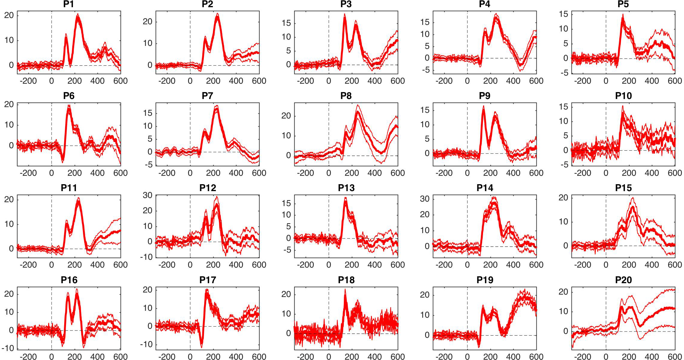
Given the presence of a few participants with differences ~100 ms but the lack of significant group effects, it is interesting to consider participants individually, as shown in Figure 8. There, we can see that participants 6, 13, 16, 17 and 19 have a negative difference ~100 ms, unlike the rest of the participants. These individual differences are wiped out by the group statistics. Of course, in this example we cannot conclude that there is something special about these participants, because we only looked at one electrode: other participants could show similar effects at other electrodes. I’ll demonstrate  how to assess effects potentially spread across electrodes in another post.

fig8_every_participant

Figure 8. ERP differences with 95% confidence intervals for every participant.


To conclude: in my own research, I have seen numerous examples of large discrepancies between plots of individual results and plots of group results, such that in certain cases group averages do not represent any particular participant. For this reason, and because most ERP papers do not illustrate individual participants and use non-robust statistics, I simply do not trust them.

Finally, I do not see the point of measuring ERP peaks. It is trivial to perform analyses at all time points and sensors to map the full spatial-temporal distribution of the effects. Limiting analyses to peaks is a waste of data and defeats the purpose of using EEG or MEG for their temporal resolution.

References

Allen et al. 2012 is a very good reference for making better figures overall and with an ERP example, although they do not make the most crucial recommendation of plotting the time-course of the difference.

For one of the best example of clear ERP figures, including figures showing individual participants, check out Kovalenko, Chaumon & Busch 2012.

I have discussed issues with ERP figures and analyses here and here. And here are probably some of the most detailed figures of ERP results you can find in the literature – brace yourself for figure overkill.

One simple step to improve statistical inferences

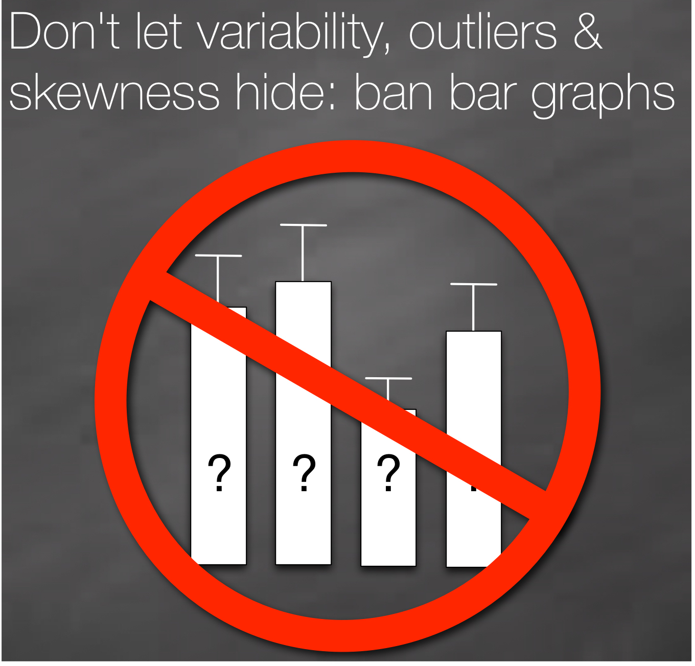
There are many changes necessary to improve the quality of neuroscience & psychology research. Suggestions abound to increase science openness, promote better experimental designs, and educate researchers about statistical inferences. These changes are necessary and will take time to implement. As part of this process, here, I’d like to propose one simple step to dramatically improve the assessment of statistical results in psychology & neuroscience: to ban bar graphs.

banbargraphs
[https://figshare.com/articles/Ban_bar_graphs/1572294]

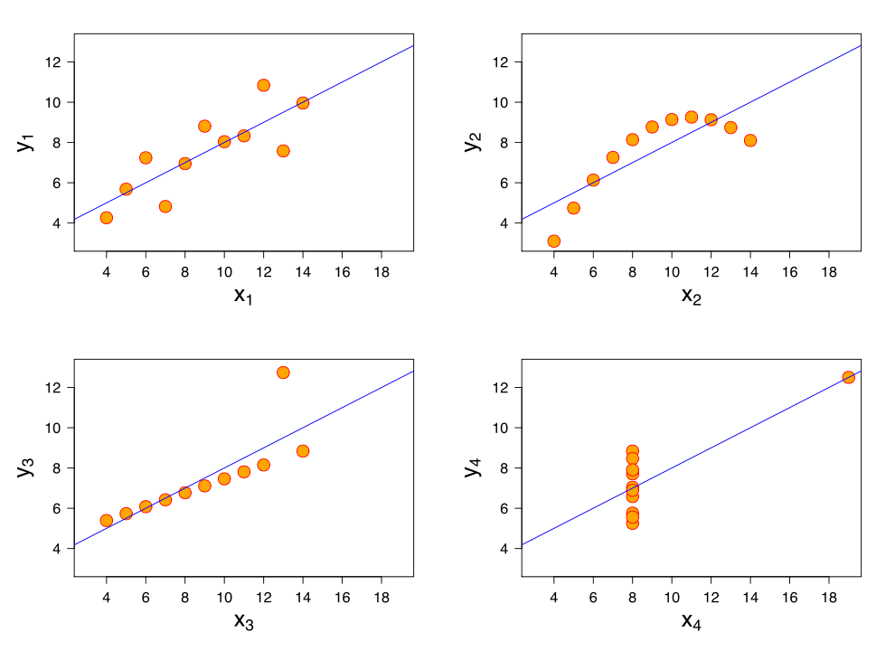
The benefits of illustrating data distributions has been emphasised in many publications and is often the topic of one of the first chapters of introductory statistics books. One of the most striking example is provided by Anscombe’s quartet, in which very different distributions are associated with the same summary statistics:

990px-Anscombe's_quartet_3.svg
[https://en.wikipedia.org/wiki/Anscombe%27s_quartet]

Moving away from bar graphs can achieve a badly needed departure from current statistical standards. Indeed, using for instance scatterplots instead of bar graphs can help shift the emphasis from the unproductive significant vs. non-significant dichotomy to a focus on what really matters: effect sizes and individual differences. By effect size, here, I do not mean Cohen’s d and other normalised non-robust equivalents (Wilcox, 2006); I mean, literally how big the effect is. Why does it matter? Say you have a significant group effect, it would be (more) informative to answer these questions as well:

  • how many participants actually show an effect in the same direction as the group?
  • how many participants show no effect, or an effect in the opposite direction as the group?
  • is there a smooth continuum of effects across participants, or can we identify sub-clusters of participants who appear to behave differently from the rest?
  • exactly how big are the individual results? For instance, what does it mean for a participant to be 20 ms faster in one condition than another? What if someone else is 40 ms faster? Our incapacity to answer these last questions in many situations simply reflects our lack of knowledge and the poverty of our models and predictions. But this is not an excuse to hide the richness of our data behind bar graphs.

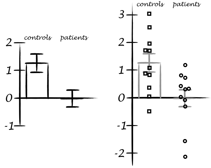
Let’s consider an example from a published paper, which I will not identify. On the left is the bar graph alone representation, whereas the right panel contains both bars and scatterplots. The graphs show results from two independent groups: participants in each group were tested in two conditions, and the pairwise differences are illustrated here. For paired designs, illustrating each condition of the pair separately is inadequate to portray effect sizes because one doesn’t know which points are part of a pair. So here the authors selected the best option: to plot the differences, so that readers can appreciate effect sizes and their distributions across participants. Then they performed two mixed linear analyses, one per group, and found a significant effect for controls, and a non-significant effect in patients. These results seem well supported by the bar graph on the left, and the authors concluded that unlike controls, patients did not demonstrate the effect.

bargraphexample

We can immediately flag two problems with this conclusion. First, the authors did not test the group interaction, which is a common fallacy (Nieuwenhuis et al. 2011). Second, the lack of significance (p<0.05) does not provide evidence for the lack of effect, again a common fallacy (see e.g. Kruschke 2013). And obviously there is a third problem: without showing the content of the bars, I would argue that no conclusion can be drawn at all. Well, in fact the authors did report the graph on the right in the above figure! Strangely, they based their conclusions on the statistical tests instead of simply looking at the data.

The data show large individual differences and overlap between the two distributions. In patients, except for 2 outliers showing large negative effects, the remaining observations are within the range observed in controls. Six patients have results suggesting an effect in the same direction as controls, 2 are near zero, 3 go in the opposite direction. So, clearly, the lack of significant group effect in patients is not supported by the data, and arises from the use of a statistical test non-robust to outliers.

Here is what I would conclude about this dataset: both groups show an effect, but the effect sizes tend to be larger in controls than in patients. There are large individual differences, and in both groups, not all participants seem to show an effect. Because of these inter-participant differences, larger sample sizes need to be tested to properly quantify the effect. In light of the current data, there is evidence that patients do show an effect. Finally, the potential lack of effect in certain control participants, and the rather large effects in some patients, questions the use of this particular effect as a diagnostic tool.

I will describe how I would go about analysing this dataset in another post. At the moment, I would just point out that group analyses are highly questionable when groups are small and heterogenous. In the example above, depending on the goals of the experiment, it might suffice to report the scatterplots and a verbal description, as I provided in the previous paragraph. I would definitely favour that option to reporting a single statistical test of central tendency, whether it is robust or not.

The example of the non-significant statistical test in patients illustrate a critical point: if a paper reports bar graphs and non-significant statistical analyses of the mean, not much can be concluded! There might be differences in other aspects than the mean; central tendency differences might exist, but the assumptions of the test could have been violated because of skewness or outliers for instance. Without informative illustrations of the results, it is impossible to tell.

In my experience as reviewer and editor, once bar graphs are replaced by scatterplots (or boxplots etc.) the story can get much more interesting, subtle, convincing, or the opposite… It depends what surprises the bars are holding. So show your data, and ask others to do the same.

“But what if I have clear effects, low within-group dispersion, and I know what I’m doing? Why can’t I use bar graphs?”

This is rather circular: unless you show the results using, for instance, scatterplots, no one knows for sure that you have clear effects and low within-group dispersion. So, if you have nothing to hide and you want to convince your readers, show your results. And honestly, how often do we get clear effects with low intra-group variability? Showing scatterplots is the start of a discussion about the nature of the results, an invitation to go beyond the significant vs. non-significant dichotomy.

“But scatterplots are ugly, they make my results look messy!”

First, your results are messy – scatterplots do not introduce messiness. Second, there is nothing stopping you from adding information to your scatterplots, for instance lines marking the quartiles of the distributions, or superimposing boxplots or many of the other options available.

References

Examples of more informative figures

Wilcox, R.R. (2006) Graphical methods for assessing effect size: Some alternatives to Cohen’s d. Journal of Experimental Education, 74, 353-367.

Allen, E.A., Erhardt, E.B. & Calhoun, V.D. (2012) Data visualization in the neurosciences: overcoming the curse of dimensionality. Neuron, 74, 603-608.

Weissgerber, T.L., Milic, N.M., Winham, S.J. & Garovic, V.D. (2015) Beyond bar and line graphs: time for a new data presentation paradigm. PLoS Biol, 13, e1002128.

Overview of robust methods, to go beyond ANOVAs on means

Wilcox, R.R. & Keselman, H.J. (2003) Modern Robust Data Analysis Methods: Measures of Central Tendency. Psychological Methods, 8, 254-274.

Wilcox, R.R. (2012) Introduction to robust estimation and hypothesis testing. Academic Press.

Extremely useful resources to go Bayesian

Kruschke, J.K. (2015) Doing Bayesian data analysis : a tutorial with R, JAGS, and Stan. Academic Press, San Diego, CA.

http://doingbayesiandataanalysis.blogspot.co.uk

Understanding Bayes

Other references

Kruschke, J.K. (2013) Bayesian estimation supersedes the t test. J Exp Psychol Gen, 142, 573-603.

Nieuwenhuis, S., Forstmann, B.U. & Wagenmakers, E.J. (2011) Erroneous analyses of interactions in neuroscience: a problem of significance. Nat Neurosci, 14, 1105-1107.