Tag Archives: effect size

Planning for measurement precision, an alternative to power analyses

When we estimate power curves, we ask this question: given some priors about the data generating process, the nature of the effect and measurement variance, what is the probability to detect an effect for a given statistical test (say using an arbitrary p<0.05 threshold) for various sample sizes and effect sizes. While there are very good reasons to focus on power estimation, this is not the only or the most important aspect of an experimental procedure to consider (Gelman & Carlin, 2014). Indeed, finding the number of observations needed so that we get p<0.05 in say 87% of experiments, is not the most exciting part of designing an experiment. 

The relevant question is not “What is the power of a test?” but rather is “What might be expected to happen in studies of this size?” (Gelman & Carlin, 2014)

A related but more important question is that of measurement precision: given some priors and a certain number of participants, how close can we get to the unknown population value (Maxwell et al., 2008; Schönbrodt & Perugini, 2013; Peters & Crutzen, 2018; Trafimow, 2019)? Not surprisingly, measurement precision depends on sample size. As we saw in previous posts, sampling distributions get narrower with increasing sample sizes:

And with narrower sampling distributions, measurement precision increases. To illustrate, let’s consider an example from a lexical decision task – hundreds of reaction times (RT) were measured in hundreds of participants who had to distinguish between words and non-words presented on a computer screen.

Here are examples of RT distributions from 100 participants for each condition:

figure_flp_100
Reaction time distributions from 100 participants. Participants were randomly selected among 959. Distributions are shown for the same participants (colour coded) in the Word (A) and Non-Word (B) conditions.

If we save the median of each distribution, for each participant and condition, we get these positively skewed group level distributions:

figure_flp_dist

The distribution of pairwise differences between medians is also positively skewed:

figure_flp_all_p_diff

Notably, most participants have a positive difference: 96.4% of participants are faster in the Word than the Non-Word condition – a potential case of stochastic dominance (Rouder & Haaf, 2018; see also this summary blog post).

Now let say we want to estimate the group difference between conditions. Because of the skewness at each level of analysis (within and across participants), we estimate the central tendency at each level using the median: that is, we compute the median for each participant and each condition, then compute the medians of medians across participants (a more detailed assessment could be obtained by performing hierarchical modelling or multiple quantile estimation for instance).

Then we can assess measurement precision at the group level by performing a multi-level simulation. In this simulation, we can ask, for instance, how often the group estimate is no more than 10 ms from the population value across many experiments. To simplify, in each iteration of the simulation, we draw 200 trials per condition and participant, compute the median and save the Non-Word – Word difference. Group estimation of the difference is then based on a random sample of 10 to 300 participants, with the group median computed across participants’ differences between medians. Because the dataset is very large at the two level of analysis, we can pretend we have access to the population values, and define them by first computing, for each condition, the median across all available trials for each participant, second by computing across all participants the median of the pairwise differences. 

Having defined population values (the truth we’re trying to estimate, here a group difference of 78 ms), we can calculate measurement precision as the proportion of experiments in which the group estimate is no more than X ms from the population value, with X varying from 5 to 40 ms. Here are the results:

figure_flp_sim_precision
Group measurement precision for the difference between the Non-Word and Word conditions. Measurement precision was estimated by using a simulation with 10,000 iterations, 200 trials per condition and participant, and varying numbers of participants.

Not surprisingly, the proportion of estimates close to the population value increases with the number of participants. More interestingly, the relationship is non-linear, such that a larger gain in precision can be achieved by increasing sample size for instance from 10 to 20 compared to from 90 to 100. 

The results also let us answer useful questions for planning experiments (see the black arrows in the above figure):

 • So that in 70% of experiments the group estimate of the median is no more than 10 ms from the population value, we need to test at least 56 participants. 

• So that in 90% of experiments the group estimate of the median is no more than 20 ms from the population value, we need to test at least 38 participants.

Obviously, this is just an example, about a narrow problem related to lexical decisions. Other aspects could be considered too, for instance the width of the confidence intervals (Maxwell, Kelley & Rausch, 2008; Peters & Crutzen, 2017; Rothman & Greenland, 2018). And for your particular case, most likely, you won’t have access to a large dataset from which to perform a data driven simulation. In this case, you can get estimates about plausible effect sizes and their variability from various sources (Gelman & Carlin 2014):

  • related data;

  • (systematic) literature review;

  • meta-analysis;

  • outputs of a hierarchical model;

  • modelling.

To model a range of plausible effect sizes and their consequences on repeated measurements, you need priors about a data generating process and how distributions differ between conditions. For instance, you could use exGaussian distributions to simulate RT data. For research on new effects, it is advised to consider a large range of potential effects, with their plausibility informed by the literature and psychological/biological constraints.  

Although relying on the literature alone can lead to over-optimistic expectations because of the dominance of small n studies and a bias towards significant results (Yarkoni 2009; Button et al. 2013), methods are being developed to overcome these limitations (Anderson, Kelley & Maxwell, 2017). In the end, the best cure against effect size over-estimation is a combination of pre-registration/registered reports (to diminish literature bias) and data sharing (to let anyone do their own calculations and meta-analyses).

Code

The code is on figshare: the simulation can be reproduced using the flp_sim_precision notebook, the illustrations of the distributions can be reproduced using flp_illustrate_dataset.

Shiny app by Malcolm Barrett (@malco_barrett)

https://malcolmbarrett.shinyapps.io/precisely/

References

Anderson, S.F., Kelley, K. & Maxwell, S.E. (2017) Sample-Size Planning for More Accurate Statistical Power: A Method Adjusting Sample Effect Sizes for Publication Bias and Uncertainty. Psychol Sci, 28, 1547-1562.

Bland J.M.. The tyranny of power: is there a better way to calculate sample size? https://www.bmj.com/content/339/bmj.b3985)

Button, K.S., Ioannidis, J.P., Mokrysz, C., Nosek, B.A., Flint, J., Robinson, E.S. & Munafo, M.R. (2013) Power failure: why small sample size undermines the reliability of neuroscience. Nature reviews. Neuroscience, 14, 365-376.

Ferrand, L., New, B., Brysbaert, M., Keuleers, E., Bonin, P., Meot, A., Augustinova, M. & Pallier, C. (2010) The French Lexicon Project: lexical decision data for 38,840 French words and 38,840 pseudowords. Behav Res Methods, 42, 488-496.

Gelman, A. & Carlin, J. (2014) Beyond Power Calculations: Assessing Type S (Sign) and Type M (Magnitude) Errors. Perspect Psychol Sci, 9, 641-651.

Maxwell, S.E., Kelley, K. & Rausch, J.R. (2008) Sample size planning for statistical power and accuracy in parameter estimation. Annu Rev Psychol, 59, 537-563.

Peters, G.-J.Y. & Crutzen, R. (2017) Knowing exactly how effective an intervention, treatment, or manipulation is and ensuring that a study replicates: accuracy in parameter estimation as a partial solution to the replication crisis. PsyArXiv. doi:10.31234/osf.io/cjsk2.

Rothman, K.J. & Greenland, S. (2018) Planning Study Size Based on Precision Rather Than Power. Epidemiology, 29, 599-603.

Rouder, J.N. & Haaf, J.M. (2018) Power, Dominance, and Constraint: A Note on the Appeal of Different Design Traditions. Advances in Methods and Practices in Psychological Science, 1, 19-26.

Rousselet, G.A. & Wilcox, R.R. (2018) Reaction times and other skewed distributions: problems with the mean and the median. bioRxiv. doi: https://doi.org/10.1101/383935

Rousselet, G.; Wilcox, R. (2018): Reaction times and other skewed distributions: problems with the mean and the median. figshare. Fileset. https://doi.org/10.6084/m9.figshare.6911924.v1

Schönbrodt, F.D. & Perugini, M. (2013) At what sample size do correlations stabilize? J Res Pers, 47, 609-612.

Trafimow, D. (2019) Five Nonobvious Changes in Editorial Practice for Editors and Reviewers to Consider When Evaluating Submissions in a Post p < 0.05 Universe, The American Statistician, 73:sup1, 340-345, DOI: 10.1080/00031305.2018.1537888

Yarkoni, T. (2009) Big Correlations in Little Studies: Inflated fMRI Correlations Reflect Low Statistical Power‚ Commentary on Vul et al. (2009). Perspectives on Psychological Science, 4, 294-298.

Power estimation for correlation analyses

Following the previous posts on small n correlations [post 1][post 2][post 3], in this post we’re going to consider power estimation (if you do not care about power, but you’d rather focus on estimation, this post is for you). 

To get started, let’s look at examples of n=1000 samples from bivariate populations with known correlations (rho), with rho increasing from 0.1 to 0.9 in steps of 0.1. For each rho, we draw a random sample and plot Y as a function of X. The variances of the two correlated variables are independent – there is homoscedasticity. Later we will look at heteroscedasticity, when the variance of Y varies with X.

demo_homo_dist

For the same distributions illustrated in the previous figure, we compute the proportion of positive Pearson’s correlation tests for different sample sizes. This gives us power curves (here based on simulations with 50,000 samples). We also include rho = 0 to determine the proportion of false positives.

figure_power_homo

Power increases with sample size and with rho. When rho = 0, the proportion of positive tests is the proportion of false positives. It should be around 0.05 for a test with alpha = 0.05. This is the case here, as Pearson’s correlation is well behaved for bivariate normal data.

For a given expected population correlation and a desired long run power value, we can use interpolation to find out the matching sample size.

To achieve at least 80% power given an expected population rho of 0.4, the minimum sample size is 46 observations.

To achieve at least 90% power given an expected population rho of 0.3, the minimum sample size is 118 observations.

figure_power_homo_arrows

Alternatively, for a given sample size and a desired power, we can determine the minimum effect size we can hope to detect. For instance, given n = 40 and a desired power of at least 90%, the minimum effect size we can detect is 0.49.

So far, we have only considered situations where we sample from bivariate normal distributions. However, Wilcox (2012 p. 444-445) describes 6 aspects of data that affect Pearson’s r:

  • outliers

  • the magnitude of the slope around which points are clustered

  • curvature

  • the magnitude of the residuals

  • restriction of range

  • heteroscedasticity

The effect of outliers on Pearson’s and Spearman’s correlations is described in detail in Pernet et al. (2012) and Rousselet et al. (2012).

Next we focus on heteroscedasticity. Let’s look at Wilcox’s heteroscedasticity example (2012, p. 445). If we correlate variable X with variable Y, heteroscedasticity means that the variance of Y depends on X. Wilcox considers this example:

X and Y have normal distributions with both means equal to zero. […] X and Y have variance 1 unless |X|>0.5, in which case Y has standard deviation |X|.”

Here is an example of such data:

demo_wilcox_dist

Next, Wilcox (2012) considers the effect of this heteroscedastic situation on false positives. We superimpose results for the homoscedastic case for comparison. In the homoscedastic case, as expected for a test with alpha = 0.05, the proportion of false positives is very close to 0.05 at every sample size. In the heteroscedastic case, instead of 5%, the number of false positives is between 12% and 19%. The number of false positives actually increases with sample size! That’s because the standard T statistics associated with Pearson’s correlation assumes homoscedasticity, so the formula is incorrect when there is heteroscedasticity.

figure_power_hetero_wilcox

As a consequence, when Pearson’s test is positive, it doesn’t always imply the existence of a correlation. There could be dependence due to heteroscedasticity, in the absence of a correlation.

Let’s consider another heteroscedastic situation, in which the variance of Y increases linearly with X. This could correspond for instance to situations in which cognitive performance or income are correlated with age – we might expect the variance amongst participants to increase with age.

We keep rho constant at 0.4 and increase the maximum variance from 1 (homoscedastic case) to 9. That is, the variance of Y linear increases from 1 to the maximum variance as a function of X.

demo_hetero_dist

For rho = 0, we can compute the proportion of false positives as a function of both sample size and heteroscedasticity. In the next figure, variance refers to the maximum variance. 

figure_power_hetero_rho0

From 0.05 for the homoscedastic case (max variance = 1), the proportion of false positives increases to 0.07-0.08 for a max variance of 9. This relatively small increase in the number of false positives could have important consequences if 100’s of labs are engaged in fishing expeditions and they publish everything with p<0.05. However, it seems we shouldn’t worry much about linear heteroscedasticity as long as sample sizes are sufficiently large and we report estimates with appropriate confidence intervals. An easy way to build confidence intervals when there is heteroscedasticity is to use the percentile bootstrap (see Pernet et al. 2012 for illustrations and Matlab code).

Finally, we can run the same simulation for rho = 0.4. Power progressively decreases with increasing heteroscedasticity. Put another way, with larger heteroscedasticity, larger sample sizes are needed to achieve the same power.

figure_power_hetero_rho04

We can zoom in:

figure_power_hetero_rho04_zoom

The vertical bars mark approximately a 13 observation increase to keep power at 0.8 between a max variance of 0 and 9. This decrease in power can be avoided by using the percentile bootstrap or robust correlation techniques, or both (Wilcox, 2012).

Conclusion

The results presented in this post are based on simulations. You could also use a sample size calculator for correlation analyses – for instance this one.

But running simulations has huge advantages. For instance, you can compare multiple estimators of association in various situations. In a simulation, you can also include as much information as you have about your target populations. For instance, if you want to correlate brain measurements with response times, there might be large datasets you could use to perform data-driven simulations (e.g. UK biobank), or you could estimate the shape of the sampling distributions to draw samples from appropriate theoretical distributions (maybe a gamma distribution for brain measurements and an exGaussian distribution for response times).

Simulations also put you in charge, instead of relying on a black box, which most likely will only cover Pearson’s correlation in ideal conditions, and not robust alternatives when there are outliers or heteroscedasticity or other potential issues.

The R code to reproduce the simulations and the figures is on GitHub.

References

Pernet, C.R., Wilcox, R. & Rousselet, G.A. (2012) Robust correlation analyses: false positive and power validation using a new open source matlab toolbox. Front Psychol, 3, 606.

Rousselet, G.A. & Pernet, C.R. (2012) Improving standards in brain-behavior correlation analyses. Frontiers in human neuroscience, 6, 119.

Wilcox, R.R. (2012) Introduction to robust estimation and hypothesis testing. Academic Press, San Diego, CA.

Small n correlations cannot be trusted

This post illustrates two important effects of sample size on the estimation of correlation coefficients: lower sample sizes are associated with increased variability and lower probability of replication. This is not specific to correlations, but here we’re going to have a detailed look at what it means when using the popular Pearson’s correlation (similar results are obtained using Spearman’s correlation, and the same problems arise with regression). The R code is available on github.


UPDATE: 2018-06-02

In the original post, I mentioned non-linearities in some of the figures. Jan Vanhove replied on Twitter that he was not getting any, and suggested a different code snippet. I’ve updated the simulations using his code, and now the non-linearities are gone! So thanks Jan!

Johannes Algermissen mentioned on Twitter that his recent paper covered similar issues. Have a look! He also reminded me about this recent paper that makes points very similar to those in this blog.

Gjalt-Jorn Peters mentioned on Twitter that “you can also use the Pearson distribution in package suppdists. Also see pwr.confintR to compute the required sample size for a given desired accuracy in parameter estimation (AIPE), which can also come in handy when planning studies”.

Wolfgang Viechtbauer‏ mentioned on Twitter “that one can just compute the density of r directly (no need to simulate). For example: link. Then everything is nice and smooth”.

UPDATE: 2018-06-30

Frank Harrell wrote on Twitter: “I’ll also push the use of precision of correlation coefficient estimates in justifying sample sizes. Need n > 300 to estimate r. BBR Chapter 8″


Let’s start with an example, shown in the figure below. It is common to see such an array of scatterplots in articles (though confidence intervals are typically not reported). In my experience, the accompanying description goes like that:

“There was a significant correlation in group/condition 5 (p < 0.05); however, there was no association in the other groups/conditions (p>0.05).”

Of course there are many problems with this description:

– there is no mention of estimator (Pearson correlation is the default, but this should be explicit);
– there is no acknowledgment that Pearson correlation is sensitive to other features of the data than the presence of an association (same goes for OLS regression);
– there is no control for multiple comparisons;
– correlations are not explicitly compared – an example of interaction fallacy;
– there is no acknowledgment that p values near 0.05 typically only provide weak evidence against the null;
– authors have committed the fallacy of assuming that the lack of evidence (p>0.05) is the same as evidence for a lack of effect;
– …

Finally, to bring us back to the topic of this blog: researchers tend to forget that promising looking correlations are easily obtained by chance when sample sizes are small.

unnamed-chunk-4-1

The data in the scatterplots were sampled from a bivariate population with zero correlation and a bit of skewness to create more realistic examples (you can play with the code to see what happens in different situations). I suspect a lot of published correlations might well fall into that category. Nothing new here, false positives and inflated effect sizes are a natural outcome of small n experiments, and the problem gets worse with questionable research practices and incentives to publish positive new results. 

To understand the problem with estimation from small n experiments, we can perform a simulation in which we draw samples of different sizes from a normal population with a known Pearson’s correlation (rho) of zero. The sampling distributions of the estimates of rho for different sample sizes look like this: 

figure_sampling_distributions

Sampling distributions tell us about the behaviour of a statistics in the long run, if we did many experiments. Here, with increasing sample sizes, the sampling distributions are narrower, which means that in the long run, we get more precise estimates. However, a typical article reports only one correlation estimate, which could be completely off. So what sample size should we use to get a precise estimate? The answer depends on:

  • the shape of the univariate and bivariate distributions (if outliers are common, consider robust methods);
  • the expected effect size (the larger the effect, the fewer trials are needed – see below);
  • the precision we want to afford.

For the sampling distributions in the previous figure, we can ask this question for each sample size:

What is the proportion of correlation estimates that are within +/- a certain number of units from the true population correlation? For instance:

  • for 70% of estimates to be within +/- 0.1 of the true correlation value (between -0.1 and 0.1), we need at least 109 observations;
  • for 90% of estimates to be within +/- 0.2 of the true correlation value (between -0.2 and 0.2), we need at least 70 observations. 

These values are illustrated in the next figure using black lines and arrows. The figure shows the proportion of estimates near the true value, for different sample sizes, and for different levels of precision. The bottom-line is that even if we’re willing to make imprecise measurements (up to 0.2 from the true value), we need a lot of observations to be precise enough and often enough in the long run.  

figure_precision

The estimation uncertainty associated with small sample sizes leads to another problem: effects are not likely to replicate. A successful replication can be defined in several ways. Here I won’t consider the relatively trivial case of finding a statistically significant (p<0.05) effect going in the same direction in two experiments. Instead, let’s consider how close two estimates are. We can determine, given a certain level of precision, the probability to observe similar effects in two consecutive experiments. In other words, we can find the probability that two measurements differ by at most a certain amount. Not surprisingly, the results follow the same pattern as those observed in the previous figure: the probability to replicate (y-axis) increases with sample size (x-axis) and with the uncertainty we’re willing to accept (see legend with colour coded difference conditions).  

figure_replication

In the figure above, the black lines indicates that for 80% of replications to be at most 0.2 apart, we need at least 83 observations.

So far, we have considered samples from a population with zero correlation, such that large correlations were due to chance. What happens when there is an effect? Let see what happens for a fixed sample size of 30, as illustrated in the next figure. 

figure_sampling_distributions_rho

As a sanity check, we can see that the modes of the sampling distributions progressively increase with increasing population correlations. More interestingly, the sampling distributions also get narrower with increasing effect sizes. As a consequence, the larger the true effect we’re trying to estimate, the more precise our estimations. Or put another way, for a given level of desired precision, we need fewer trials to estimate a true large effect. The next figure shows the proportion of estimates close to the true estimate, as a function of the population correlation, and for different levels of precision, given a sample size of 30 observations.

figure_precision_rho

Overall, in the long run, we can achieve more precise measurements more often if we’re studying true large effects. The exact values will depend on priors about expected effect sizes, shape of distributions and desired precision or achievable sample size. Let’s look in more detail at the sampling distributions for a generous rho = 0.4.

figure_sampling_distributions_rho04

The sampling distributions for n<50 appear to be negatively skewed, which means that in the long run, experiments might tend to give biased estimates of the population value; in particular, experiments with n=10 or n=20 are more likely than others to get the sign wrong (long left tail) and to overestimate the true value (distribution mode shifted to the right). From the same data, we can calculate the proportion of correlation estimates close to the true value, as a function of sample size and for different precision levels.

figure_precision_rho04

We get this approximate results:

  • for 70% of estimates to be within +/- 0.1 of the true correlation value (between 0.3 and 0.5), we need at least 78 observations;
  • for 90% of estimates to be within +/- 0.2 of the true correlation value (between 0.2 and 0.6), we need at least 50 observations. 

You could repeat this exercise using the R code to get estimates based on your own priors and the precision you want to afford.

Finally, we can look at the probability to observe similar effects in two consecutive experiments, for a given precision. In other words, what is the probability that two measurements differ by at most a certain amount? The next figure shows results for differences ranging from 0.05 (very precise) to 0.4 (very imprecise). The black arrow illustrates that for 80% of replications to be at most 0.2 apart, we need at least 59 observations.

figure_replication_rho04

We could do the same analyses presented in this post for power. However, I don’t really see the point of looking at power if the goal is to quantify an effect. The precision of our measurements and of our estimations should be a much stronger concern than the probability to flag any effect as statistically significant (McShane et al. 2018).

There is a lot more to say about correlation estimation and I would recommend in particular these papers from Ed Vul and Tal Yarkoni, from the voodoo correlation era. More recently, Schönbrodt & Perugini (2013) looked at the effect of sample size on correlation estimation, with a focus on precision, similarly to this post. Finally, this more general paper (Forstmeier, Wagemakers & Parker, 2016) about false positives is well worth reading.

Cohen’s d is biased

The R notebook associated with this post is available on github.

Cohen’s d is a popular measure of effect size. In the one-sample case, d is simply computed as the mean divided by the standard deviation (SD). For repeated measures, the same formula is applied to difference scores (see detailed presentation and explanation of variants in Lakens, 2013). 

Because d relies on a non-robust measure of central tendency (the mean), and a non-robust measure of dispersion (SD), it is a non-robust measure of effect size, meaning that a single observation can have a dramatic effect on its value, as explained here. Cohen’s d also makes very strict assumptions about the data, so it is only appropriate in certain contexts. As a consequence, it should not be used as the default measure of effect size, and more powerful and informative alternatives should be considered – see a few examples here. For comparisons across studies and meta-analyses, nothing will beat data-sharing though.

Here we look at another limitation of Cohen’s d: it is biased when we draw small samples. Bias is covered in detail in another post. In short, in the one-sample case, when Cohen’s d is estimated from a small sample, in the long run it tends to be larger than the population value. This over-estimation is due to a bias of SD, which tends to be lower than the population’s SD. Because the mean is not biased, when divided by an under-estimated SD, it leads to an over-estimated measure of effect size. The bias of SD is explained in intro stat books, in the section describing Student’s t. Not surprisingly it is never mentioned in the discussions of small n studies, as a limitation of effect size estimation…

In this demonstration, we sample with replacement 10,000 times from the ex-Gaussian distributions below, for various sample sizes, as explained here:

figure_miller_distributions

The table below shows the population values for each distribution. For comparison, we also consider a robust equivalent to Cohen’s d, in which the mean is replaced by the median, and SD is replaced by the percentage bend mid-variance (pbvar, Wilcox, 2017). As we will see, this robust alternative is also biased – there is no magic solution I’m afraid.

m:          600  600  600  600  600  600  600  600  600  600  600  600

md:        509  512  524  528  540  544  555  562  572  579  588  594

m-md:    92    88     76    72    60    55     45    38    29    21    12     6

m.den:   301  304  251  255  201  206  151  158  102  112  54     71

md.den: 216  224  180  190  145  157  110  126  76    95    44     68

m.es:       2.0   2.0    2.4   2.4   3.0   2.9   4.0   3.8   5.9   5.4   11.1  8.5

md.es:     2.4   2.3    2.9   2.8   3.7   3.5   5.0   4.5   7.5   6.1   13.3  8.8

m = mean

md = median

den = denominator

es = effect size

m.es = Cohen’s d

md.es = md / pbvar


Let’s look at the behaviour of d as a function of skewness and sample size.

figure_es_m_es

Effect size d tends to decrease with increasing skewness, because SD tends to increase with skewness. Effect size also increases with decreasing sample size. This bias is stronger for samples from the least skewed distributions. This is counterintuitive, because one would think estimation tends to get worse with increased skewness. Let’s find out what’s going on.

Computing the bias normalises the effect sizes across skewness levels, revealing large bias differences as a function of skewness. Even with 100 observations, the bias (mean of 10,000 simulation iterations) is still slightly larger than zero for the least skewed distributions. This bias is not due to the mean, because we the sample mean is an unbiased estimator of the population mean.

figure_es_m_es_bias

Let’s check to be sure:

figure_es_m_num

So the problem must be with the denominator:

figure_es_m_den

Unlike the mean, the denominator of Cohen’s d, SD, is biased. Let’s look at bias directly.

figure_es_m_den_bias

SD is most strongly biased for small sample sizes and bias increases with skewness. Negative values indicate that sample SD tends to under-estimate the population values. This is because the sampling distribution of SD is increasingly skewed with increasing skewness and decreasing sample sizes. This can be seen in this plot of the 80% highest density intervals (HDI) for instance:

figure_m_den_hdi80

The sampling distribution of SD is increasingly skewed and variable with increasing skewness and decreasing sample sizes. As a result, the sampling distribution of Cohen’s d is also skewed. The bias is strongest in absolute term for the least skewed distributions because the sample SD is overall smaller for these distributions, resulting in overall larger effect sizes. Although SD is most biased for the most skewed distributions, SD is also overall much larger for them, resulting in much smaller effect sizes than those obtained for less skewed distributions. This strong attenuation of effect sizes with increasing skewness swamps the absolute differences in SD bias. This explains the counter-intuitive lower d bias for more skewed distributions.

As we saw previously, bias can be corrected using a bootstrap approach. Applied, to Cohen’s d, this technique does reduce bias, but it still remains a concern:

figure_es_m_es_bias_after_bc

Finally, let’s look at the behaviour of a robust equivalent to Cohen’s d, the median normalised by the percentage bend mid-variance.

figure_es_md_es

The median effect size shows a similar profile to the mean effect size. It is overall larger than the mean effect size because it uses a robust measure of spread, which is less sensitive to the long right tails of the skewed distributions we sample from.

figure_es_md_bias

The bias disappears quickly with increasing sample sizes, and quicker than for the mean effect size.

However, unlike what we observed for d, in this case the bias correction does not work for small samples, because the repetition of the same observations in some bootstrap samples leads to very large values of the denominator. It’s ok for n>=15, for which bias is relatively small anyway, so at least based on these simulations, I wouldn’t use bias correction for this robust effect size.

figure_es_md_bias_after_bc

Conclusion

Beware of small sample sizes: they are associated with increased variability (see discussion in a clinical context here) and can accentuate the bias of some effect size estimates. If effect sizes tend to be reported more often if they pass some arbitrary threshold, for instance p < 0.05, then the literature will tend to over-estimate them (see demonstration here), a phenomenon exacerbated by small sample sizes (Button et al. 2013). 

Can’t say it enough: small n is bad for science if the goal is to provide accurate estimates of effect sizes.

To determine how the precision and accuracy of your results depend on sample size, the best approach is to perform simulations, providing some assumptions about the shape of the population distributions.

References

Button, K.S., Ioannidis, J.P., Mokrysz, C., Nosek, B.A., Flint, J., Robinson, E.S. & Munafo, M.R. (2013) Power failure: why small sample size undermines the reliability of neuroscience. Nature reviews. Neuroscience, 14, 365-376.

Lakens, D. (2013) Calculating and reporting effect sizes to facilitate cumulative science: a practical primer for t-tests and ANOVAs. Front Psychol, 4, 863.

Wilcox, R.R. (2017) Introduction to Robust Estimation and Hypothesis Testing. Academic Press, 4th edition., San Diego, CA.

A clearer explanation of the shift function

The shift function is a power tool to compare two marginal distributions. It’s covered in detail in this previous post. Below is a new illustration which might help better understand the graphical representation of the shift function. The R code to generate the figure is available in the README of the rogme package.

Panel A illustrates two distributions, both n = 1000, that differ in spread. The observations in the scatterplots were jittered based on their local density, as implemented in ggforce::geom_sina.

Panel B illustrates the same data from panel A. The dark vertical lines mark the deciles of the distributions. The thicker vertical line in each distribution is the median. Between distributions, the matching deciles are joined by coloured lined. If the decile difference between group 1 and group 2 is positive, the line is orange; if it is negative, the line is purple. The values of the differences for deciles 1 and 9 are indicated in the superimposed labels.

Panel C focuses on the portion of the x-axis marked by the grey shaded area at the bottom of panel B. It shows the deciles of group 1 on the x-axis – the same values that are shown for group 1 in panel B. The y-axis shows the differences between deciles: the difference is large and positive for decile 1; it then progressively decreases to reach almost zero for decile 5 (the median); it becomes progressively more negative for higher deciles. Thus, for each decile the shift function illustrates by how much one distribution needs to be shifted to match another one. In our example, we illustrate by how much we need to shift deciles from group 2 to match deciles from group 1.

More generally, a shift function shows quantile differences as a function of quantiles in one group. It estimates how and by how much two distributions differ. It is thus a powerful alternative to the traditional t-test on means, which focuses on only one, non-robust, quantity. Quantiles are robust, intuitive and informative.

figure2

the shift function: a powerful tool to compare two entire distributions


The R code for this post is available on github, and is based on Rand Wilcox’s WRS R package, with extra visualisation functions written using ggplot2. The R code for the 2013 percentile bootstrap version of the shift function was also covered here and here. Matlab code is described in another post.


UPDATE: The shift function and its cousin the difference asymmetry function are described in a review article with many examples. And a Bayesian shift function is now available! The hierarchical shift function provides a powerful alternative to the t-test.


In neuroscience & psychology, group comparison is usually an exercise that involves comparing two typical observations. This is most of the time achieved using a t-test on means. This standard procedure makes very strong assumptions:

  • the distributions differ only in central tendency, not in other aspects;
  • the typical observation in each distribution can be summarised by the mean;
  • the t-test is sufficient to detect changes in location.

As we saw previously, t-tests on means are not robust. In addition, there is no reason a priori to assume that two distributions differ only in the location of the bulk of the observations. Effects can occur in the tails of the distributions too: for instance a particular intervention could have an effect only in animals with a certain hormonal level at baseline; a drug could help participants with severe symptoms, but not others with milder symptoms… Because effects are not necessarily homogenous among participants, it is useful to have appropriate tools at hand, to determine how, and by how much, two distributions differ. Here we’re going to consider a powerful family of tools that are robust and let us compare entire distributions: shift functions.

A more systematic way to characterise how two independent distributions differ was originally proposed by Doksum (Doksum, 1974; Doksum & Sievers, 1976; Doksum, 1977): to plot the difference between the quantiles of two distributions as a function of the quantiles of one group. The original shift function approach is implemented in the functions sband and wband in Rand Wilcox’s WRS R package.

In 1995, Wilcox proposed an alternative technique which has better probability coverage and potentially more power than Doksum & Sievers’ approach. Wilcox’s technique:

  • uses the Harrell-Davis quantile estimator;
  • computes confidence intervals of the decile differences with a bootstrap estimation of the standard error of the deciles;
  • controls for multiple comparisons so that the type I error rate remains around 0.05 across the 9 confidence intervals. This means that the confidence intervals are a bit larger than what they would be if only one decile was compared, so that the long-run probability of a type I error across all 9 comparisons remains near 0.05;
  • is implemented in the shifthd function.

Let’s start with an extreme and probably unusual example, in which two distributions differ in spread, not in location (Figure 1). In that case, any test of central tendency will fail to reject, but it would be wrong to conclude that the two distributions do not differ. In fact, a Kolmogorov-Smirnov test reveals a significant effect, and several measures of effect sizes would suggest non-trivial effects. However, a significant KS test just tells us that the two distributions differ, not how.

shift_function_ex1_arrows

Figure 1. Two distributions that differ in spread A Kernel density estimates for the groups. B Shift function. Group 1 – group 2 is plotted along the y-axis for each decile (white disks), as a function of group 1 deciles. For each decile difference, the vertical line indicates its 95% bootstrap confidence interval. When a confidence interval does not include zero, the difference is considered significant in a frequentist sense.

The shift function can help us understand and quantify how the two distributions differ. The shift function describes how one distribution should be re-arranged to match the other one: it estimates how and by how much one distribution must be shifted. In Figure 1, I’ve added annotations to help understand the link between the KDE in panel A and the shift function in panel B. The shift function shows the decile differences between group 1 and group 2, as a function of group 1 deciles. The deciles for each group are marked by coloured vertical lines in panel A. The first decile of group 1 is slightly under 5, which can be read in the top KDE of panel A, and on the x-axis of panel B. The first decile of group 2 is lower. As a result, the first decile difference between group 1 and group 2 is positive, as indicated by a positive value around 0.75 in panel B, as marked by an upward arrow and a + symbol. The same symbol appears in panel A, linking the deciles from the two groups: it shows that to match the first deciles, group 2’s first decile needs to be shifted up. Deciles 2, 3 & 4 show the same pattern, but with progressively weaker effect sizes. Decile 5 is well centred, suggesting that the two distributions do not differ in central tendency. As we move away from the median, we observe progressively larger negative differences, indicating that to match the right tails of the two groups, group 2 needs to be shifted to the left, towards smaller values – hence the negative sign.

To get a good understanding of the shift function, let’s look at its behaviour in several other clear-cut situations. First, let’s consider a  situation in which two distributions differ in location (Figure 2). In that case, a t-test is significant, but again, it’s not the full story. The shift function looks like this:

shift_function_ex2_complete

Figure 2. Complete shift between two distributions

What’s happening? All the differences between deciles are negative and around -0.45. Wilcox (2012) defines such systematic effect has the hallmark of a completely effective method. In other words, there is a complete and seemingly uniform shift between the two distributions.

In the next example (Figure 3), only the right tails differ, which is captured by significant differences for deciles 6 to 9. This is a case described by Wilcox (2012) as involving a partially effective experimental manipulation.

shift_function_ex3_onesided1

Figure 3. Positive right tail shift

Figure 4 also shows a right tail shift, this time in the negative direction. I’ve also scaled the distributions so they look a bit like reaction time distributions. It would be much more informative to use shift functions in individual participants to study how RT distributions differ between conditions, instead of summarising each distribution by its mean (sigh)!

shift_function_ex4_onesided2

Figure 4. Negative right tail shift

Figure 5 shows two large samples drawn from a standard normal population. As expected, the shift function suggests that we do not have enough evidence to conclude that the two distributions differ. The shift function does look bumpy tough, potentially suggesting local differences – so keep that in mind when you plug-in your own data.

shift_function_ex5_nochange

Figure 5. No difference?

And be careful not to over-interpret the shift function: the lack of significant differences should not be used to conclude that we have evidence for the lack of effect; indeed, failure to reject in the frequentist sense can still be associated with non-trivial evidence against the null – it depends on prior results (Wagenmakers, 2007).

So far, we’ve looked at simulated examples involving large sample sizes. We now turn to a few real-data examples.

Doksum & Sievers (1976) describe an example in which two groups of rats were kept in an environment with or without ozone for 7 days and their weight gains measured (Figure 6). The shift function suggests two results: overall, ozone reduces weight gain; ozone might promote larger weight gains in animals gaining the most weight. However, these conclusions are only tentative given the small sample size, which explains the large confidence intervals.

shift_function_ex6_ozone

Figure 6. Weight gains A Because the sample sizes are much smaller than in the previous examples, the distributions are illustrated using 1D scatterplots. The deciles are marked by grey vertical lines, with lines for the 0.5 quantiles. B Shift function.

Let’s consider another example used in (Doksum, 1974; Doksum, 1977), concerning the survival time in days of 107 control guinea pigs and 61 guinea pigs treated with a heavy dose of tubercle bacilli (Figure 7). Relative to controls, the animals that died the earliest tended to live longer in the treatment group, suggesting that the treatment was beneficial to the weaker animals (decile 1). However, the treatment was harmful to animals with control survival times larger than about 200 days (deciles 4-9). Thus, this is a case where the treatment has very different effects on different animals. As noted by Doksum, the same experiment was actually performed 4 times, each time giving similar results.

shift_function_ex7_guineapigs

Figure 7. Survival time

Shift function for dependent groups

All the previous examples were concerned with independent groups. There is a version of the shift function for dependent groups implemented in shiftdhd. We’re going to apply it to ERP onsets from an object detection task (Bieniek et al., 2015). In that study, 74 of our 120 participants were tested twice, to assess the test-retest reliability of different measurements, including onsets. Typically, test-retest assessment is performed using a correlation. However, we care about the units (ms), which a correlation would get rid of, and we had a more specific hypothesis, which a correlation cannot test; so we used a shift function (Figure 8). If you look at the distributions of onsets across participants, you will see that it is overall positively skewed, and with a few participants with particularly early or late onsets. With the shift function, we wanted to test for the overall reliability of the results, but also in particular the reliability of the left and right tails: if early onsets in session 1 were due to chance, we would expect session 2 estimates to be overall larger (shifted to the right); similarly, if late onsets in session 1 were due to chance, we would expect session 2 estimates to be overall smaller (shifted to the left). The shift function does not provide enough evidence to suggest a uniform or non-uniform shift – but we would probably need many more observations to make a strong claim.

shift_function_ex8_onsets

Figure 8. ERP onsets

Because we’re dealing with a paired design, the illustration of the marginal distributions in Figure 8 is insufficient: we should illustrate the distribution of pairwise differences too, as shown in Figure 9.

shift_function_ex9_onsets_diff

Figure 9. ERP onsets with KDE of pairwise differences

Figure 10 provides an alternative representation of the distribution of pairwise differences using a violin plot.

shift_function_ex10_onsets_diff_violin

Figure 10. ERP onsets with violin plot of pairwise differences

Figure 11 uses a 1D scatterplot (strip chart).

shift_function_ex11_onsets_diff_scatter

Figure 11. ERP onsets with 1D scatterplot of pairwise differences

Shift function for other quantiles

Although powerful, Wilcox’s 1995 technique is not perfect, because it:

  • is limited to the deciles;
  • can only be used with alpha = 0.05;
  • does not work well with tied values.

More recently, Wilcox’s proposed a new version of the shift function that uses a straightforward percentile bootstrap (Wilcox & Erceg-Hurn, 2012; Wilcox et al., 2014). This new approach:

  • allows tied values;
  • can be applied to any quantile;
  • can have more power when looking at extreme quantiles (<=0.1, or >=0.9).
  • is implemented in qcomhd for independent groups;
  • is implemented in Dqcomhd for dependent groups.

Examples are provided in the R script for this post.

In the percentile bootstrap version of the shift function, p values are corrected, but not the confidence intervals. For dependent variables, Wilcox & Erceg-Hurn (2012) recommend at least 30 observations to compare the .1 or .9 quantiles. To compare the quartiles, 20 observations appear to be sufficient. For independent variables, Wilcox et al. (2014) make the same recommendations made for dependent groups; in addition, to compare the .95 quantiles, they suggest at least 50 observations per group.

Conclusion

The shift function is a powerful tool that can help you better understand how two distributions differ, and by how much. It provides much more information than the standard t-test approach.

Although currently the shift function only applies to two groups, it can in theory be extended to more complex designs, for instance to quantify interaction effects.

Finally, it would be valuable to make a Bayesian version of the shift function, to focus on effect sizes, model the data, and integrate them with other results.

References

Bieniek, M.M., Bennett, P.J., Sekuler, A.B. & Rousselet, G.A. (2015) A robust and representative lower bound on object processing speed in humans. The European journal of neuroscience.

Doksum, K. (1974) Empirical Probability Plots and Statistical Inference for Nonlinear Models in the two-Sample Case. Annals of Statistics, 2, 267-277.

Doksum, K.A. (1977) Some graphical methods in statistics. A review and some extensions. Statistica Neerlandica, 31, 53-68.

Doksum, K.A. & Sievers, G.L. (1976) Plotting with Confidence – Graphical Comparisons of 2 Populations. Biometrika, 63, 421-434.

Wagenmakers, E.J. (2007) A practical solution to the pervasive problems of p values. Psychonomic bulletin & review, 14, 779-804.

Wilcox, R.R. (1995) Comparing Two Independent Groups Via Multiple Quantiles. Journal of the Royal Statistical Society. Series D (The Statistician), 44, 91-99.

Wilcox, R.R. (2012) Introduction to robust estimation and hypothesis testing. Academic Press, Amsterdam; Boston.

Wilcox, R.R. & Erceg-Hurn, D.M. (2012) Comparing two dependent groups via quantiles. J Appl Stat, 39, 2655-2664.

Wilcox, R.R., Erceg-Hurn, D.M., Clark, F. & Carlson, M. (2014) Comparing two independent groups via the lower and upper quantiles. J Stat Comput Sim, 84, 1543-1551.

How to chase ERP monsters hiding behind bars

I think detailed and informative illustrations of results is the most important step in the statistical analysis process, whether we’re looking at a single distribution, comparing groups, or dealing with more complex brain imaging data. Without careful illustrations, it can be difficult, sometimes impossible, to understand our results and to convey them to an audience. Yet, from specialty journals to Science & Nature, the norm is still to hide rich distributions behind bar graphs or one of their equivalents. For instance, in ERP (event-related potential) research, the equivalent of a bar graph looks like this:

figure1

Figure 1. ERP averages in 2 conditions. Paired design, n=30, cute little red star indicates p<0.05.

All the figures in this post can be reproduced using Matlab code available on github.

Figure 1 is very much standard in the field. It comes with a little star to attract your attention to one time point that has reached the magic p<0.05 threshold. Often, the ERP figure will be complemented with a bar graph:

figure1b

Figure 1b. Bar graph of means +/- SEM for conditions 1 & 2.

Ok, what’s wrong with this picture? You might argue that the difference is small, and that the statistical tests have probably not been corrected for multiple comparisons. And in many cases, you would be right. But many ERP folks would reply that because they focus their analyses on peaks, they do not need to correct for multiple comparisons. Well, unless you have a clear hypothesis for each peak, then you should at least correct for the number of peaks or time windows of interest tested if you’re willing to flag any effect p<0.05. I would also add that looking at peaks is wasteful and defeats the purpose of using EEG: it is much more informative to map the full time-course of the effects across all sensors, instead of throwing valuable data away (Rousselet & Pernet, 2011).

Another problem with Figure 1 is the difficulty in mentally subtracting two time-courses, which can lead to underestimating differences occurring between peaks. So, in the next figure, we show the mean difference as well:

figure2

Figure 2. Mean ERPs + mean difference. The black vertical line marks the time of the largest absolute difference between conditions.

Indeed, there is a modest bump in the difference time-course around the time of the significant effect marked by the little star. The effect looks actually more sustained than it appears by just looking at the time-courses of the two original conditions – so we learn something by looking at the difference time-course. The effect is much easier to interpret by adding some measure of accuracy, for instance a 95% confidence interval:

figure3

Figure 3. Mean ERPs + mean difference + confidence interval.

We could also show confidence intervals for condition 1 and condition 2 mean ERPs, but we are primarily interested in how they differ, so the focus should be on the difference. Figure 3 reveals that the significant effect is associated with a confidence interval only very slightly off the zero mark. Although p<0.05, the confidence interval suggests a weak effect, and Bayesian estimation might actually suggest no evidence against the null (Wetzels et al. 2011). And this is why the focus should be on robust effect sizes and their illustration, instead of binary outcomes resulting from the application of arbitrary thresholds. How do we proceed in this case? A simple measure of effect size is to report the difference, which in our case can be illustrated by showing the time-course of the difference for every participant (see a nice example in Kovalenko et al. 2012). And what’s lurking under the hood here? Monsters?

figure4

Figure 4. Mean ERPs + mean difference + confidence interval + individual differences.

Yep, it’s a mess of spaghetti monsters!

After contemplating a figure like that, I would be very cautious about my interpretation of the results. For instance, I would try to put the results into context, looking carefully at effect sizes and how they compare to other manipulations, etc. I would also be very tempted to run a replication of the experiment. This can be done in certain experimental situations on the same participants, to see if effect sizes are similar across sessions (Bieniek et al. 2015). But I would certainly not publish a paper making big claims out of these results, just because p<0.05.

So what can we say about the results? If we look more closely at the distribution of differences at the time of the largest group difference (marked by a vertical line in Figure 2), we can make another observation:

figure5

Figure 5. Distribution of individual differences at the time of the maximum absolute group difference.

About 2/3 of participants show an effect in the same direction as the group effect (difference < 0). So, in addition to the group effect, there are large individual differences. This is not surprising. What is surprising is the usual lack of consideration for individual differences in most neuroscience & psychology papers I have come across. Typically, results portrayed in Figure 1 would be presented like this:

“We measured our favourite peak in two conditions. It was larger in condition 1 than in condition 2 (p<0.05), as predicted by our hypothesis. Therefore, when subjected to condition 1, our brains process (INSERT FAVOURITE STIMULUS, e.g. faces) more (INSERT FAVOURITE PROCESS, e.g. holistically).”

Not only this is a case of bad reverse inference, it is also inappropriate to generalise the effect to the entire human population, or even to all participants in the sample – 1/3 showed an effect in the opposite direction after all. Discrepancies between group statistics and single-participant statistics are not unheard of, if you dare to look (Rousselet et al. 2011).

Certainly, more subtle and honest data description would go a long way towards getting rid of big claims, ghost effects and dodgy headlines. But how many ERP papers have you ever seen with figures such as Figure 4 and Figure 5? How many papers contain monsters behind bars? Certainly, “my software does not have that option” doesn’t cut it; these figures are easy to make in Matlab, R or Python. If you don’t know how, ask a colleague, post questions on online forums, there are plenty of folks eager to help. For Matlab code, you could start here for instance.

Now: the final blow. The original ERP data used for this post are real and have huge effect sizes (check Figure A2 here for instance). However, the effect marked by a little star in Figure 1 is a false positive: there are no real effects in this dataset! The current data were generated by sampling trials with replacement from a pool of 7680 trials, to which pink noise was added, to create 30 fake participants and 2 fake conditions. I ran the fake data making process several times and selected the version that gave me a significant peak difference, because, you know, I love peaks. So yes, we’ve been looking at noise all along. And I’m sure there is plenty of noise out there in published papers. But it is very difficult to tell, because standard ERP figures are so poor.

How do we fix this?

  • make detailed, honest figures of your effects;
  • post your data to an online repository for other people to scrutinise them;
  • conclude honestly about what you’ve measured (e.g. “I only analyse the mean, I don’t know how other aspects of the distributions behave”), without unwarranted generalisation (“1/3 of my participants did not show the group effect”);
  • replicate new effects;
  • report p values if you want, but do not obsess over the 0.05 threshold, it is arbitrary, and continuous distributions should not be dichotomised (MacCallum et al. 2002);
  • focus on effect sizes.

References

Bieniek, M.M., Bennett, P.J., Sekuler, A.B. & Rousselet, G.A. (2015) A robust and representative lower bound on object processing speed in humans. The European journal of neuroscience.

Kovalenko, L.Y., Chaumon, M. & Busch, N.A. (2012) A pool of pairs of related objects (POPORO) for investigating visual semantic integration: behavioral and electrophysiological validation. Brain Topogr, 25, 272-284.

MacCallum RC, Zhang S, Preacher KJ, Rucker DD. 2002. On the practice of dichotomization of quantitative variables. Psychological Methods 7: 19-40

Rousselet, G.A. & Pernet, C.R. (2011) Quantifying the Time Course of Visual Object Processing Using ERPs: It’s Time to Up the Game. Front Psychol, 2, 107.

Rousselet, G.A., Gaspar, C.M., Wieczorek, K.P. & Pernet, C.R. (2011) Modeling Single-Trial ERP Reveals Modulation of Bottom-Up Face Visual Processing by Top-Down Task Constraints (in Some Subjects). Front Psychol, 2, 137.

Wetzels, R., Matzke, D., Lee, M.D., Rouder, J.N., Iverson, G.J. & Wagenmakers, E.J. (2011) Statistical Evidence in Experimental Psychology: An Empirical Comparison Using 855 t Tests. Perspectives on Psychological Science, 6, 291-298.

Robust effect sizes for 2 independent groups

When I was an undergrad, I was told that beyond a certain sample size (n=30 if I recall correctly), t-tests and ANOVAs are fine. This was a lie. I wished I had been taught robust methods and that t-tests and ANOVAs on means are only a few options among many alternatives. Indeed, t-tests and ANOVAs on means are not robust to outliers, skewness, heavy-tails, and for independent groups, differences in skewness, variance (heteroscedasticity) and combinations of these factors (Wilcox & Keselman, 2003; Wilcox, 2012). The main consequence is a lack of statistical power. For this reason, it is often advised to report a measure of effect size to determine, for instance, if a non-significant effect (based on some arbitrary p value threshold) could be due to lack of power, or reflect a genuine lack of effect. The rationale is that an effect could be associated with a sufficiently large effect size but yet fail to trigger the arbitrary p value threshold. However, this advise is pointless, because classic measures of effect size, such as Cohen’s d, its variants, and its extensions to ANOVA are not robust.

To illustrate the problem, first, let’s consider a simple situation in which we compare 2 independent groups of 20 observations, each sampled from a normal distribution with mean = 0 and standard deviation = 1. We then add a constant of progressively larger value to one of the samples, to progressively shift it away from the other. As illustrated in Figure 1, as the difference between the two groups increases, so does Cohen’s d. The Matlab code to reproduce all the examples is available here, along with a list of matching R functions from Rand Wilcox’s toolbox.

fig1-cohend_3ex

Figure 1. Examples of Cohen’s d as a function of group differences. For simplicity, I report the absolute value of Cohen’s d, here and in subsequent figures.

We can map the relationship between group mean differences and d systematically, by running a simulation in which we repeatedly generate two random samples and progressively shift one away from the other by a small amount. We get a nice linear relationship (Figure 2).

fig2-cohend_sysmap

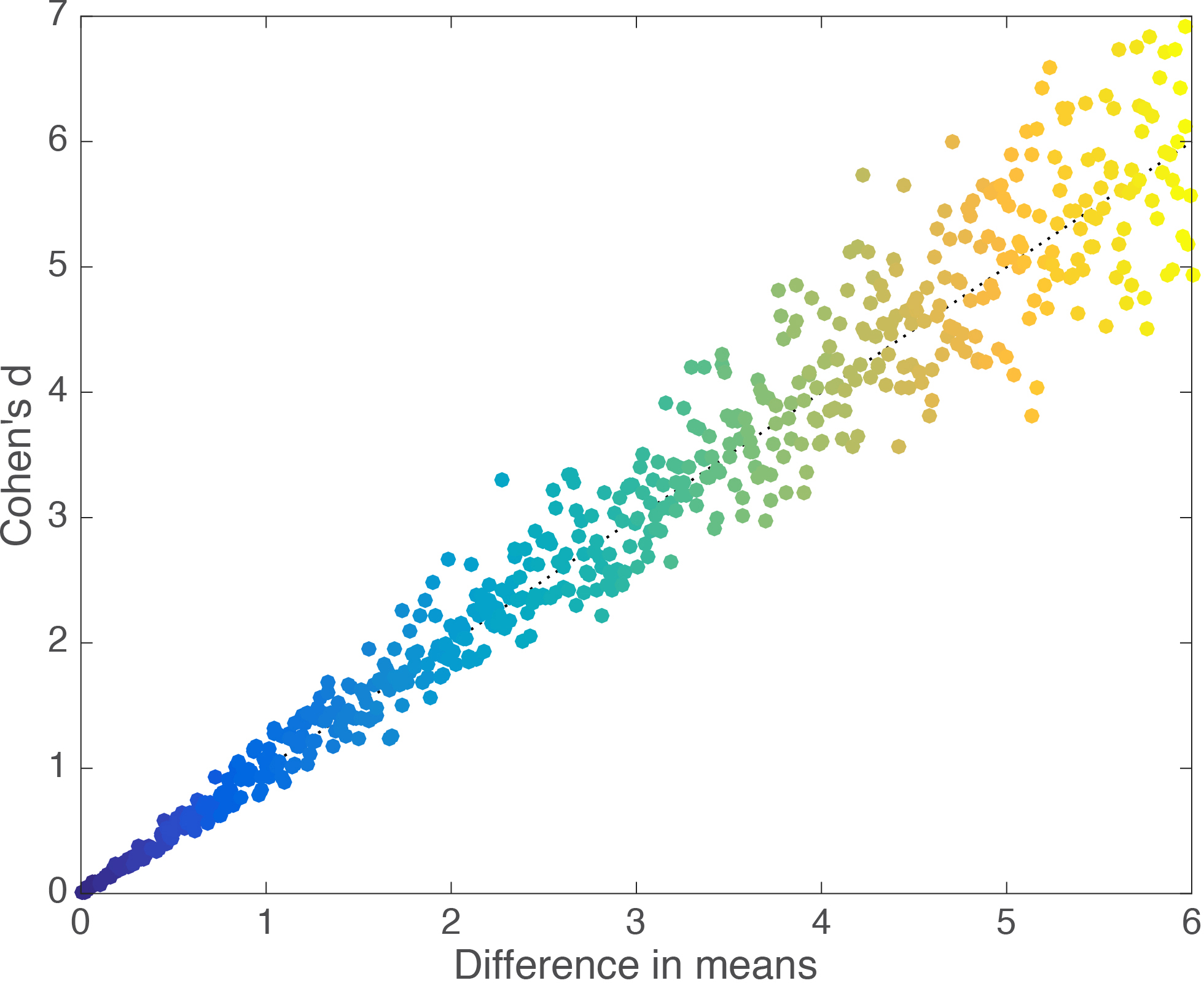
Figure 2. Linear relationship between Cohen’s d and group mean differences.

Cohen’s d appears to behave nicely, so what’s the problem? Let’s consider another example, in which we generate 2 samples of 20 observations from a normal distribution, and shift their means by a fixed amount of 2. Then, we replace the largest observation from group 2 by progressively larger values. As we do so, the difference between the means of group 1 and group 2 increases, but Cohen’s d decreases (Figure 3).

fig3-cohend_outliers

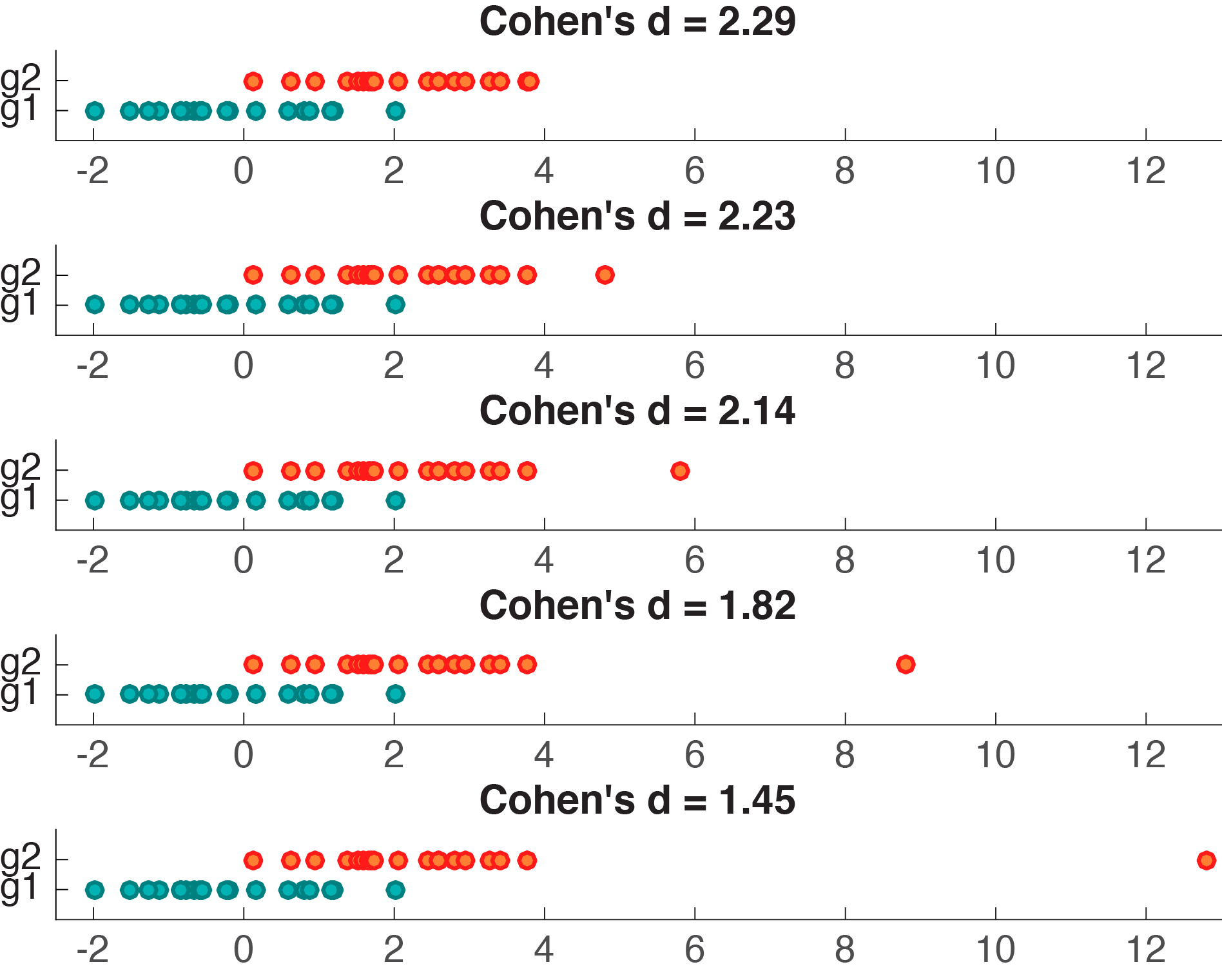
Figure 3. Cohen’s d is not robust to outliers.

Figure 4 provides a more systematic illustration of the effect of extreme values on Cohen’s d for the case of 2 groups of 20 observations. As the group difference increases, Cohen’s d wrongly suggests progressively lower effect sizes.

fig4-cohend_sysout

Figure 4. Cohen’s d as a function of group mean differences in the presence of one outlier. There is an inverse and slightly non-linear relationship between the two variables.

What is going on? Remember that Cohen’s d is the difference between the two group means divided by the pooled standard deviation. As such, neither the numerator nor the denominator are robust, so that even one unusual value can potentially significantly alter d and lead to the wrong conclusions about  effect size. In the example provided in Figure 4, d gets smaller as the mean difference increases because the denominator of d is composed of a non-robust estimator of dispersion, the variance, such that the outlier increases variability, which leads to an increase of the denominator, and thus a lower d. The outlier also has a strong effect on the mean, which leads to an increase of the numerator, and thus larger d. However, the outlier has a stronger effect on the variance than the mean: this imbalance explains the overall decrease of d with increasing outlier size. I leave it as an exercise to understand the origin of the non-linearity in Figure 4. It has to do with the differential effect of the outlier on the mean and the variance.

One could argue that the outlier value added to one of the groups could be removed, which would solve the problem. There are 3 objections to this argument:

  • there are situations in which extreme values are not outliers but expected and plausible observations from a skewed or heavy tail distribution, and thus physiologically or psychologically meaningful values. In other words, what looks like an outlier in a sample of 20 observations could well look very natural in a sample of 200 observations;
  • for small sample sizes, relatively small outliers could go unnoticed but still affect effect size estimation;
  • outliers are not the only problem: skewness & heavy tails can affect the mean and the variance and thus d.

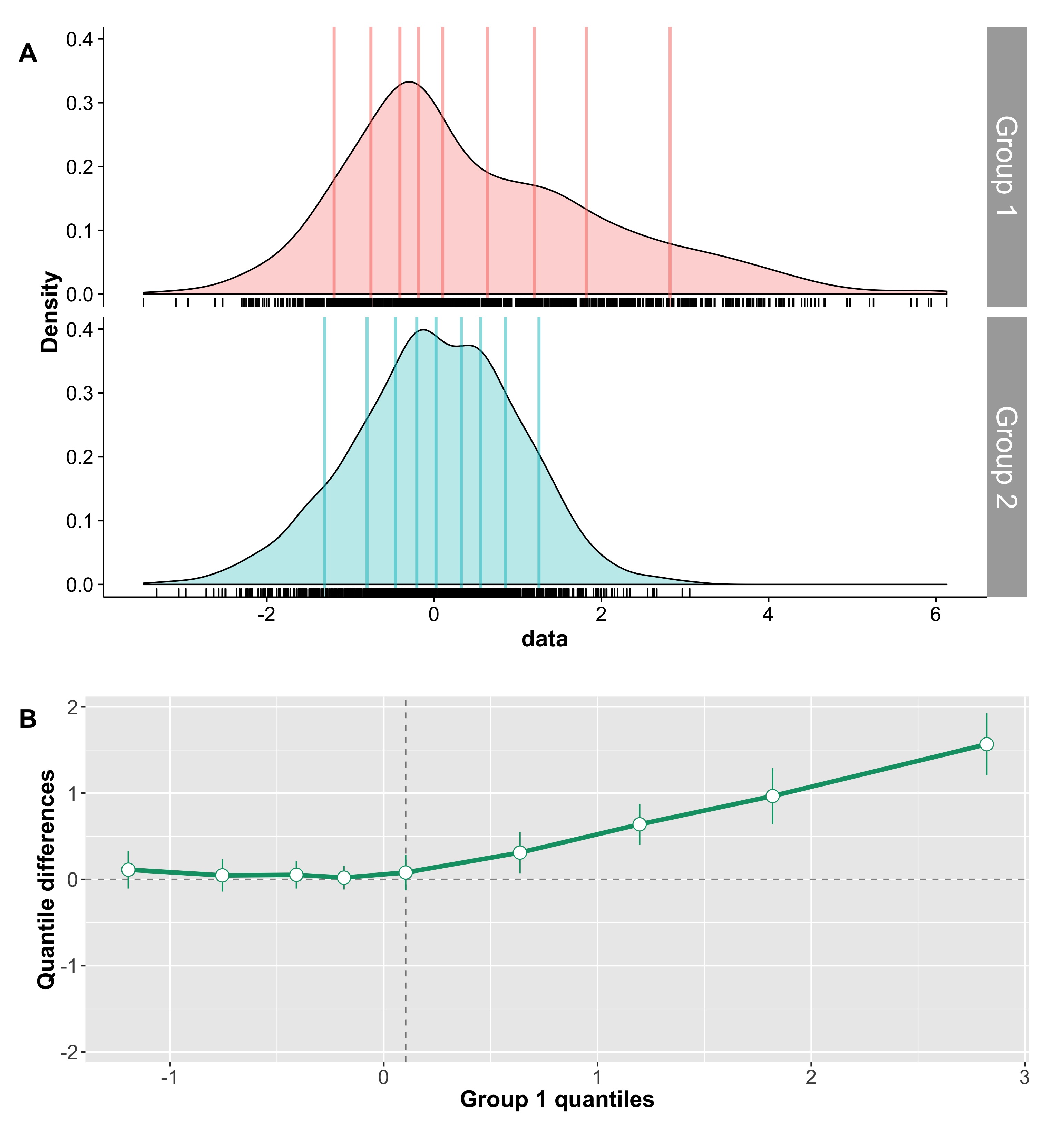
For instance, in some cases, two groups can differ in skewness, as illustrated in Figure 5. In the left panel, the two kernel density estimates illustrate two samples of 100 observations from a normal distribution. The two groups overlap only moderately, and Cohen’s d is high. In the right panel, group 1, with a mean of zero, is the same as in the previous panel; group 2, with a mean of 2, is almost identical to the one in the left panel, except that its largest 10% observations were replaced with slightly larger observations. As a result, the overlap between the two distributions is the same in the two panels – yet Cohen’s d is quite smaller in the second example.

fig5-cohend_mixed

Figure 5. Cohen’s d for normal & skewed distributions.

The point of this example is to illustrate the potential for discrepancies between a visual inspection of two distributions and Cohen’s d. Clearly, in Figure 5, a useful measure of effect size should provide the same estimates for the two examples. Fortunately, several robust alternatives have this desirable property, including Cliff’s delta, the Kolmogorov-Smirnov test statistic, Wilcox & Muska’s Q, and mutual information.

Robust versions of Cohen’s d

Before going over the 4 robust alternatives listed above, it is useful to consider that Cohen’s d is part of a large family of estimators of effect size, which can be described as the ratio of a difference between two measures of central tendency (CT), over some measure of variability:

(CT1 – CT2) / variability

From this expression, it follows that robust effect size estimators can be derived by plugging in robust estimators of central tendency in the numerator and robust estimators of variability in the denominator. Several examples of such robust alternatives are available, for instance using trimmed means and Winsorised variances (Keselman et al. 2008; Wilcox 2012). R users might want to check these functions from Wilcox for instance:

  • akp.effect
  • yuenv2
  • med.effect

There are also extensions of these quantities to the comparison of more than one group (Wilcox 2012).

Robust & intuitive measures of effect sizes

In many situations, the robust effect sizes presented above can bring a great improvement over Cohen’s d and its derivatives. However, they provide only a limited perspective on the data. First, I don’t find this family of effect sizes the easiest to interpret: having to think of effects in standard deviation (or robust equivalent) units is not the most intuitive. Second, this type of effect sizes does not always answer the questions we’re most interested in (Cliff, 1996; Wilcox, 2006).

The simplest measure of effect size: the difference

Fortunately, effect sizes don’t have to be expressed as the ratio difference / variability. The simplest effect size is simply a difference. For instance, when reporting that group A differs from group B, typically people report the mean for each group. It is also very useful to report the difference, without normalisation, but with a confidence or credible interval around it, or some other estimate of uncertainty. This simple measure of effect size can be very informative, particularly if you care about the units. It is also trivial to make it robust by using robust estimators, such as the median when dealing with reaction times and other skewed distributions.

Probabilistic effect size and the Wilcoxon-Mann-Whitney U statistic

For two independent groups, asking by how much the central tendencies of the two groups differ is useful, but this certainly does not exhaust all the potential differences between the two groups. Another perspective relates to a probabilistic description: for instance, given two groups of observations, what is the probability that one random observation from group 1 is larger than a random observation from group 2? Given two independent variables X and Y, this probability can be defined as P(X > Y). Such probability gives a very useful indication of the amount of overlap between the two groups, in a way that is not limited to and dependent on measures of central tendency. More generally, we could consider these 3 probabilities:

  • P(X > Y)
  • P(X = Y)
  • P(X < Y)

These probabilities are worth reporting in conjunction with illustrations of the group distributions. Also, there is a direct relationship between these probabilities and the Wilcoxon-Mann-Whitney U statistic (Birnbaum, 1956; Wilcox 2006). Given sample sizes Nx and Ny:

U / NxNy = P(X > Y) + 0.5 x P(X = Y)

In the case of two strictly continuous distributions, for which ties do not occur:

U / NxNy = P(X > Y)

Cliff’s delta

Cliff suggested to use P(X > Y) and P(X < Y) to compute a new measure of effect size. He defined what is now called Cliff’s delta as:

delta = P(X > Y) – P(X < Y)

Cliff’s delta estimates the probability that a randomly selected observation from one group is larger than a randomly selected observation from another group, minus the reverse probability (Cliff, 1996). It is estimated as:

delta = (sum(x > y) – sum(x < y)) / NxNy

In this equation, each observation from one group is compared to each observation in the other group, and we count how many times the observations from one group are higher or lower than in the other group. The difference between these two counts is then divided by the total number of observations, the product of their sample sizes NxNy. This statistic ranges from 1 when all values from one group are higher than the values from the other group, to -1 when the reverse is true. Completely overlapping distributions have a Cliff’s delta of 0. Because delta is a statistic based on ordinal properties of the data, it is unaffected by rank preserving data transformations. Its non-parametric nature reduces the impact of extreme values or distribution shape. For instance, Cliff’s delta is not affected by the outlier or the difference in skewness in the examples from Figure 3 & 5.

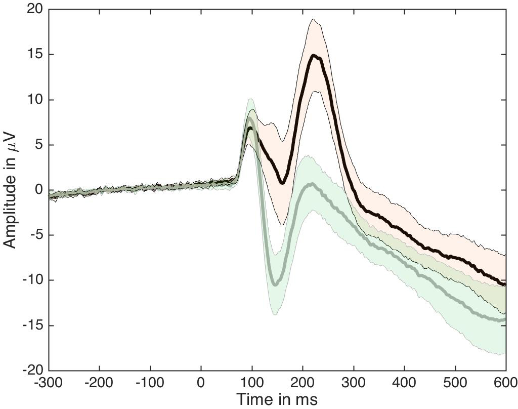
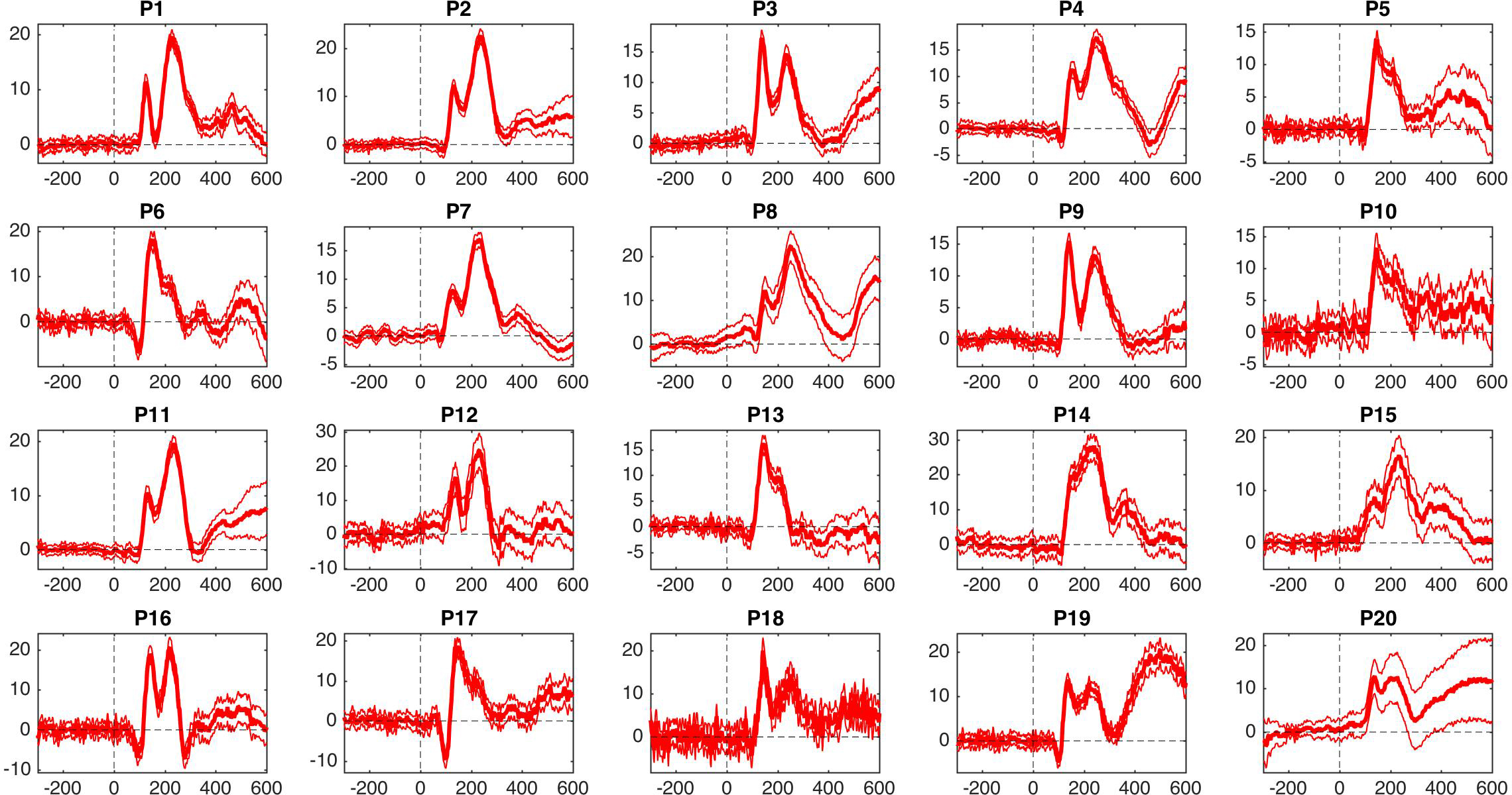
For an MEEG application, we’ve used Cliff’s delta to quantify effect sizes in single-trial ERP distributions (Bieniek et al. 2015). We also used Q, presented later on in this post, but it behaved so similarly to delta that it does not feature in the paper.

An estimate of the standard error of delta can be used to compute a confidence interval for delta. When conditions differ, the statistical test associated with delta can be more  powerful than the Wilcoxon-Mann-Whitney test, which uses the wrong standard error (Cliff, 1996; Wilcox, 2006). Also, contrary to U, delta is a direct measure of effect size, with an intuitive interpretation. There are also some attempts at extending delta to handle more than two groups (e.g. Wilcox, 2011). Finally, Joachim Goedhart has provided an Excel macro to compute Cliff’s delta.

Update: Cliff’s delta is also related to the later introduced “common-language effect size” – see this post from Jan Vanhove.

All pairwise differences

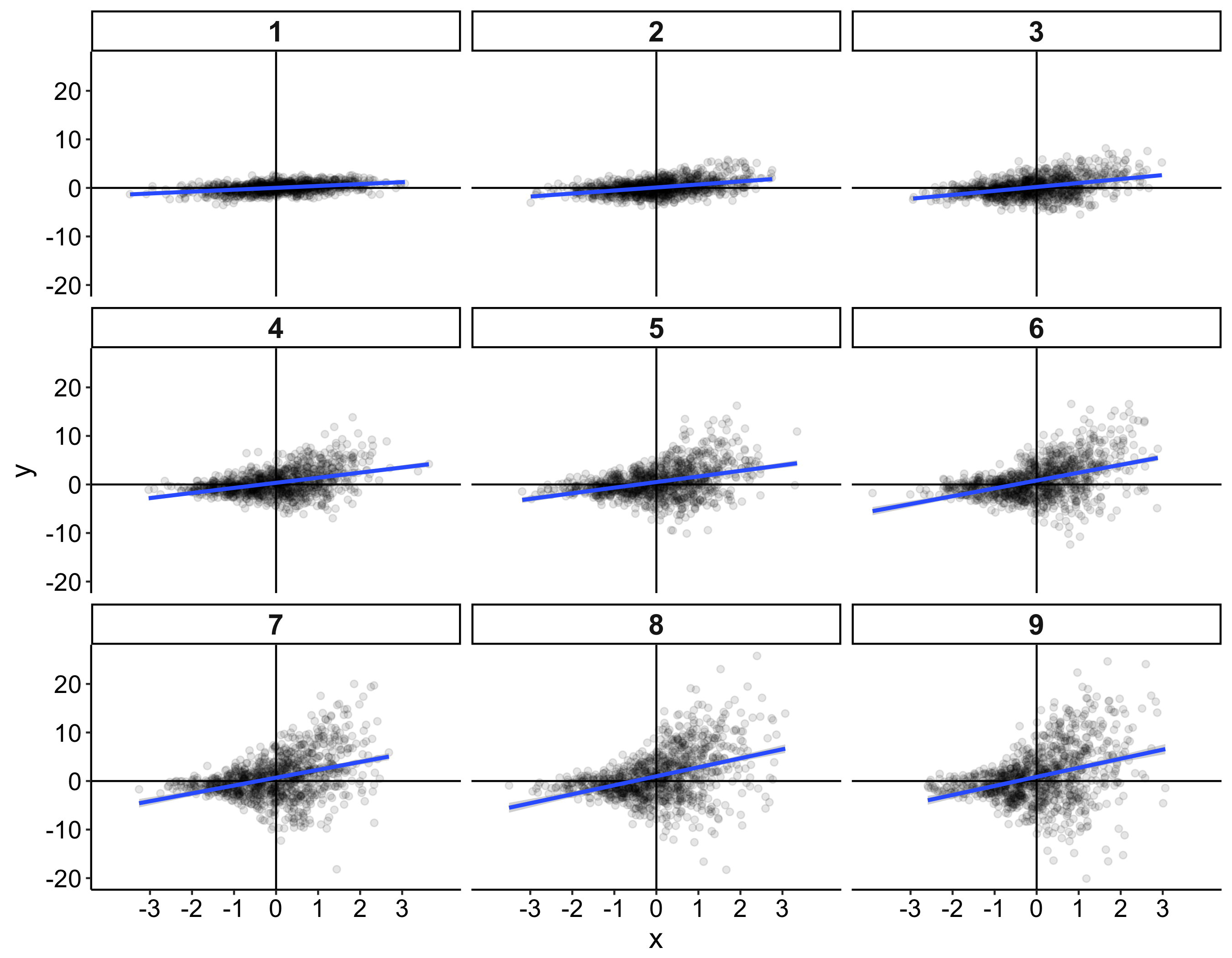
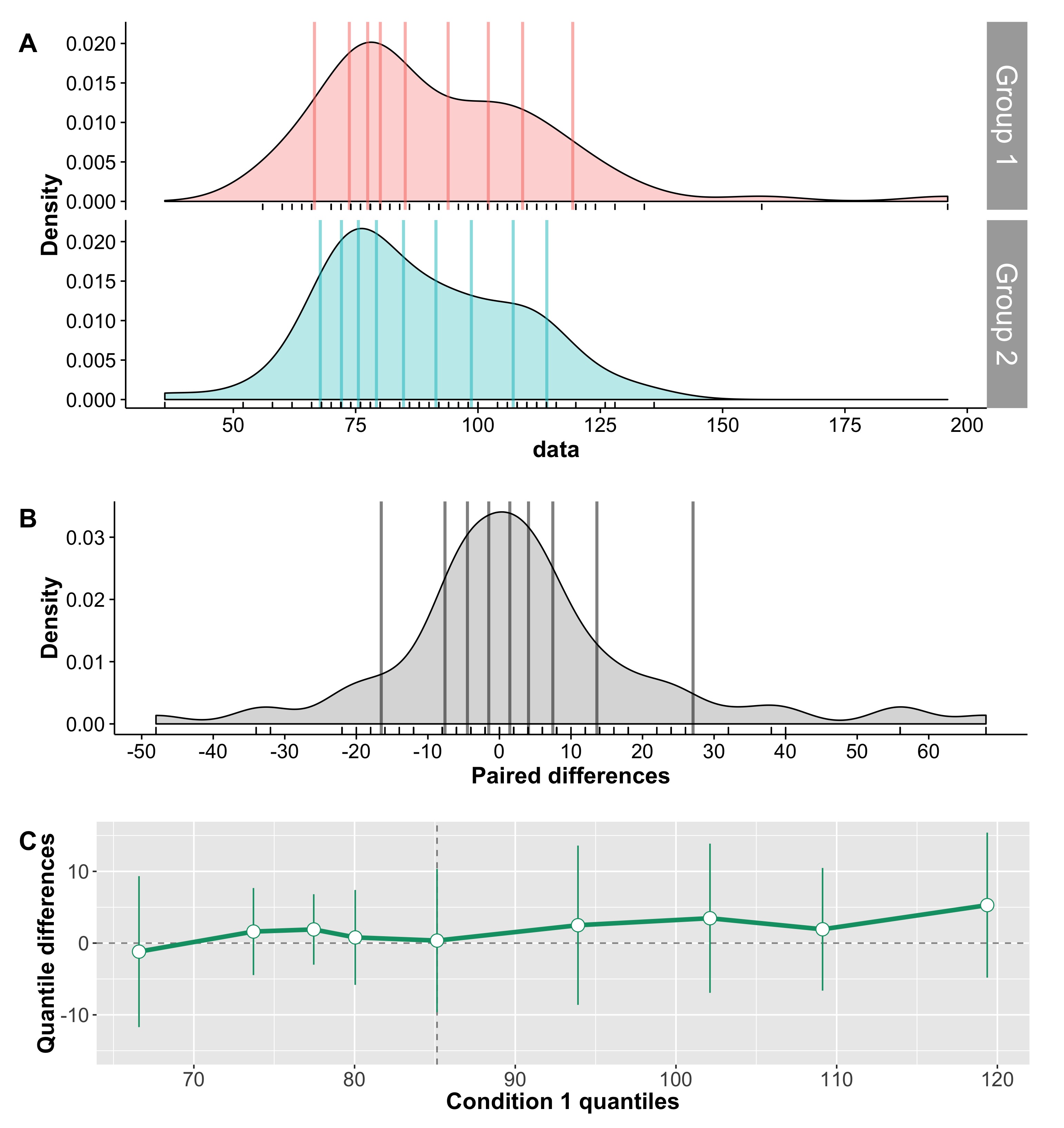
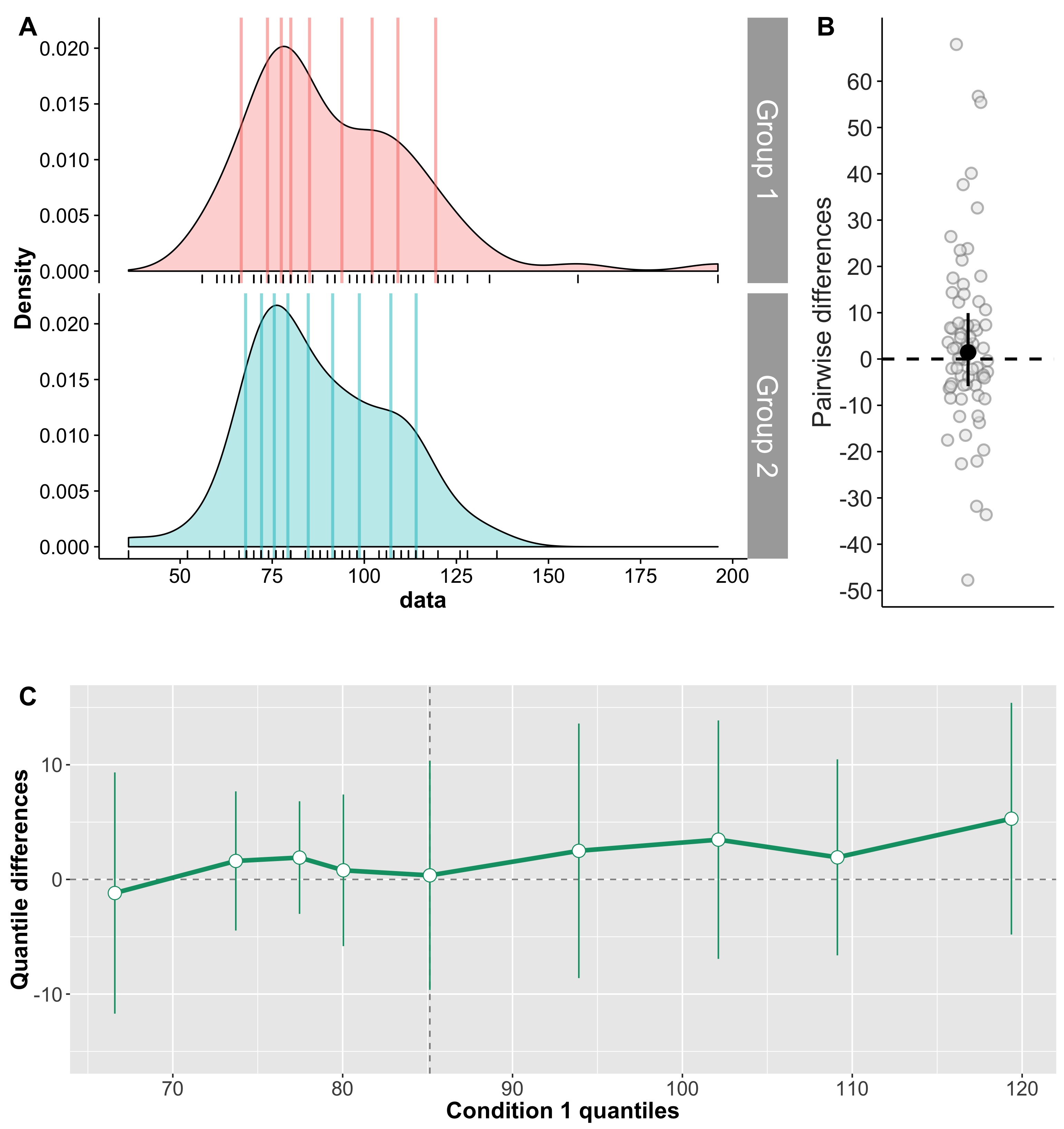
Cliff’s delta is a robust and informative measure of effect size. Because it relies on probabilities, it normalises effect sizes onto a common scale useful for comparisons across experiments. However, the normalisation gets rid of the original units. So, what if the units matter? A complementary perspective to that provided by delta can be gained by considering all the pairwise differences between individual observations from the two groups (Figure 6). Such distribution can be used to answer a very useful question: given that we randomly select one observation from each group, what is the typical difference we can expect? This can be obtained by computing for instance the  median of the pairwise differences. An illustration of the full distribution provides a lot more information: we can see how far away the bulk of the distribution is from zero, get a sense of how large differences can be in the tails…

fig6-all_pairwise_differences

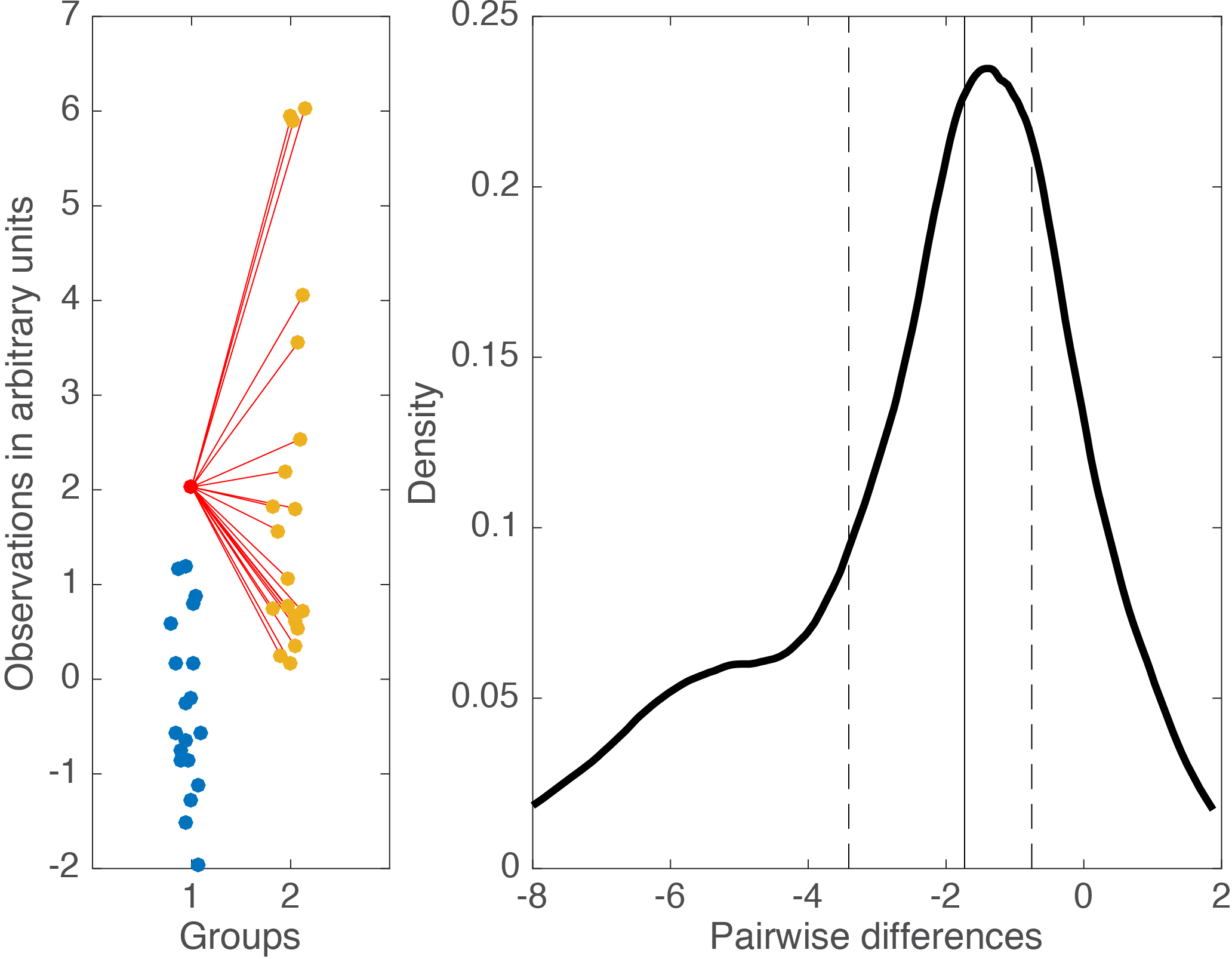
Figure 6. Illustration of all pairwise differences. Left panel: scatterplots of the two groups of observations. One observation from group 1 (in red) is compared to all the observations from group 2 (in orange). The difference between all the pairs of observations is saved and the same process is applied to all the observations from group 1. Right panel: kernel density estimate of the distribution of all the pairwise differences between the two groups. The median of these differences is indicated by the continuous vertical line; the 1st & 3rd quartiles are indicated by the dashed vertical lines.

Something like Figure 6, in conjunction with Cliff’s delta and associated probabilities, would provide a very useful summary of the data.

When Cohen’s d & Cliff’s delta fail

Although robust alternatives to Cohen’s d considered so far, including Cliff’s delta, can handle well situations in which 2 conditions differ in central tendency, they fail completely to describe situations like the one in Figure 7. In this example, the two distributions are dramatically different from each other, yet Cohen’s d is exactly zero, and Cliff’s delta is very close to zero.

fig7-vardiffexample

Figure 7. Measures of effect size for two distributions that differ in spread, not in location. Cd = Cohen’s d, delta = Cliff’s delta, MI = mutual information, KS = Kolmogorov-Smirnov test statistics, Q = Wilcox & Muska’s Q.

Here the two distributions differ in spread, not in central tendency, so it would wise to estimate spread instead. This is indeed one possibility. But it would also be nice to have an estimator of effect size that can handle special cases like this one as well. Three estimators fit the bill, as suggested by the title of Figure 7.

The Kolmogorov-Smirnov statistic

It’s time to introduce a powerful all-rounder: the Kolmogorov-Smirnov test statistic. The KS test is often mentioned to compare one distribution to a normal distribution. It can also be used to compare two independent samples. In that context, the KS test statistic is defined as the maximum of the absolute differences between the empirical cumulative distribution functions (ecdf) of the two groups. As such KS is not limited to differences in central tendency; it is also robust, independent of the shape of distributions, and provides a measure of effect size bounded between 0 and 1. Figure 8 illustrates the statistic using the example from Figure 7. The KS statistic is quite large, suggesting correctly that the two distributions differ. More generally, because it is robust and sensitive to differences located anywhere in the distributions, the KS test is a solid candidate for a default test for two independent samples. However, the KS test is more sensitive to differences in the middle of the distributions than in the tails. To correct this problem, there is also a weighted version of the KS test which provides increased sensitivity to differences in the tails of the distributions – check out the ks R function from Wilcox.

fig8-vardiff_ks_illustration

Figure 8. Illustration of the KS statistic for two independent samples. The top panel shows the kernel density estimates for the two groups. The lower panel shows the matching empirical cumulative distribution functions. The thick black line marks the maximum absolute difference between the two ecdfs – the KS statistic. Figure 8 is the output of the ksstat_fig Matlab function written for this post.

The KS statistic non-linearly increases as the difference in variance between two samples of 100 observations progressively increases (Figure 9). The two samples were drawn from a standard normal distribution and do not differ in mean.

fig9-vardiff_map

Figure 9. Relationship between effect sizes and variance differences. The 3 measures of effect size illustrated here are sensitive to distribution differences other than central tendency, and are therefore better able to handle a variety of cases compared to traditional effect size estimates.

Wilcox & Muska’s Q

Similarly to KS, the Q statistic is also a non-parametric measure of effect size. It ranges from 0 to 1, with chance level at 0.5. It is the probability of correctly deciding whether a randomly selected observation from one of two groups belongs to the first group, based on the kernel density estimates of the two groups (Wilcox & Muska, 1999). Essentially, it reflects the degree of separation between two groups. Again, similarly to KS, in situations in which two distributions differ in other aspects than central tendency, Q might suggest that a difference exists, whereas other methods such as Cohen’s d or Cliff’s delta would not (Figure 9).

Mutual information

In addition to the KS statistic and Q, a third estimator can be used to quantify many sorts of differences between two or more independent samples: mutual information (MI). MI is a non-parametric measure of association between distributions. As shown in Figure 9, it is sensitive to group differences in spread. MI is expressed in bits and is quite popular in neuroscience – much more so than in psychology. MI is a powerful and much more versatile quantity than any of the tools we have considered so far. To learn more about MI, check out Robin Ince’s tutorial with Matlab & Python code and examples, with special applications to brain imaging. There is also a clear illustration of MI calculation using bins in Figure S3 of Schyns et al. 2010.

In the lab, we use MI to quantify the relationship between stimulus variability and behaviour or brain activity (e.g. Rousselet et al. 2014). This is done using single-trial distributions in every participant. Then, at the group level, we compare distributions of MI between conditions or groups of participants. We thus use MI as a robust measure of within-participant effect size, applicable to many situations. This quantity can then be illustrated and tested across participants. This strategy is particularly fruitful to compare brain activity between groups of participants, such as younger and older participants. Cliff’s delta for instance could then be used to quantify the MI difference between groups.

Comparisons of effect sizes

We’ve covered several useful robust measures of effect size, with different properties. So, which one should be used? In statistics, the answer to this sort of questions often is “it depends”. Indeed, it depends on your needs and on the sort of data you’re dealing with. It also depends on which measure makes more sense to you. The code provided with this post will let you explore the different options using simulated data or your own data. For now, we can get a sense of the behaviour of delta, MI, KS and Q for relatively large samples of observations from a normal distribution. In Figure 10, two distributions are progressively shifted from each other.

fig10-escomp_kde

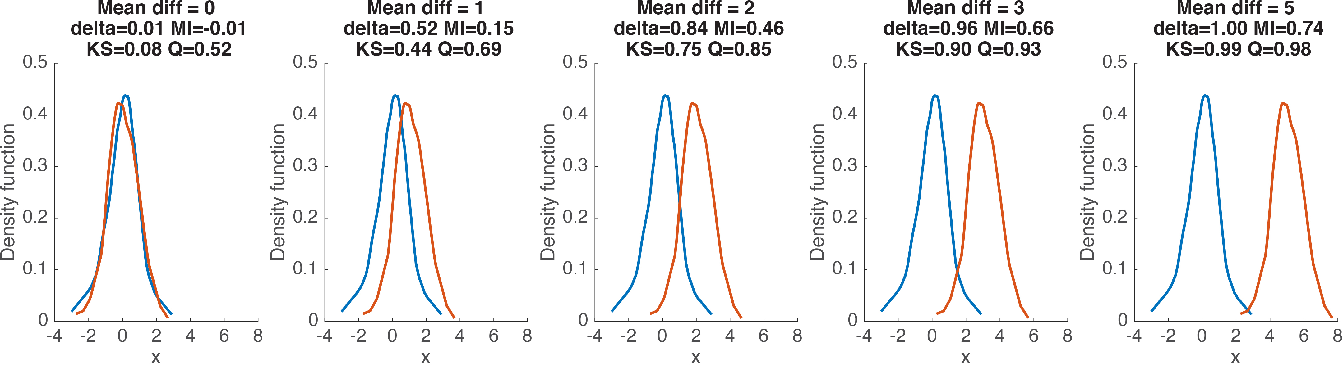
Figure 10. Examples of effect size estimates for different distribution shifts.

Figure 11 provides a more systematic mapping of the relationship between effect size estimates and the difference between the means of two groups of 100 observations. The KS statistic and Q appear to have similar profiles, with a linear rise for small differences, before progressively reaching a plateau. In contrast, Cliff’s delta appears to be less variable and to reach a maximum earlier than KS and Q. MI differs from the other 3 quantities with its non-linear rise for small mean differences.

fig11-escomp_diffmean

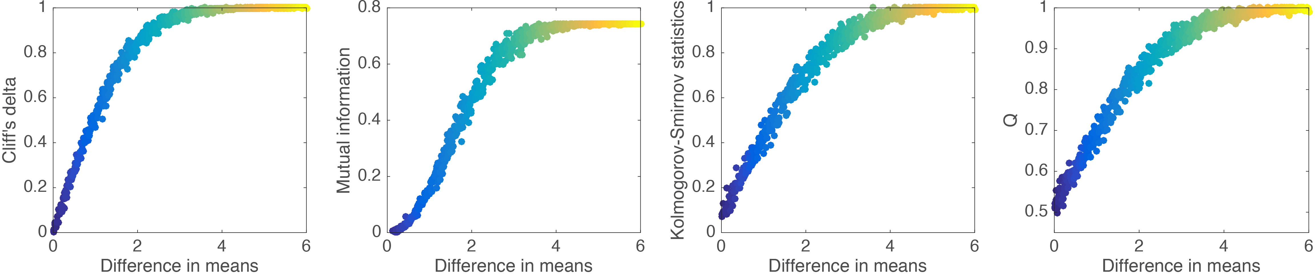
Figure 11. Relationship between effect sizes and mean differences.

To more clearly contrast the 4 effect sizes, all their pairwise comparisons are provided in Figure 12. From these comparisons, it seems that KS and Q are almost completely linearly related. If this is the case, then there isn’t much advantage in using Q given that it is much slower to compute than KS. Other comparisons reveal different non-linearities between estimators. These differences would certainly be worth exploring in particular experimental contexts… But enough for this post.

fig12-escomp_sys

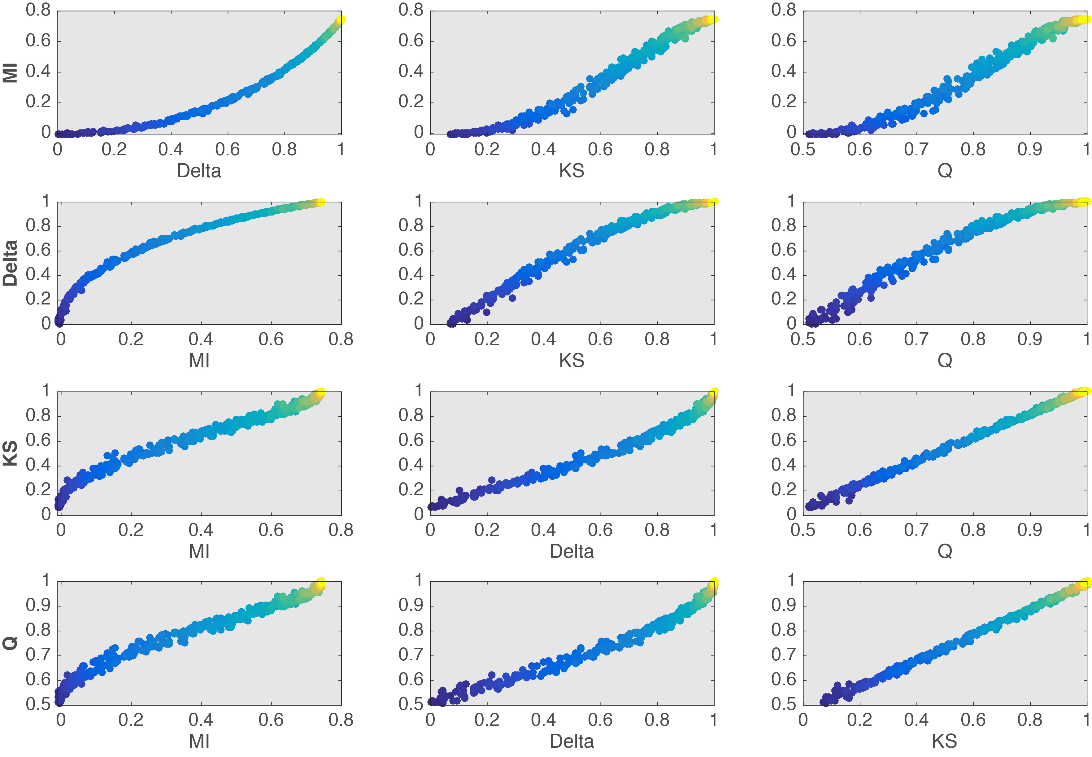
Figure 12. Relationship between effect sizes.

Final notes

Given that Cohen’s d and related estimators of effect size are not robust suggests that they should be abandoned in favour of robust methods. This is not to say that Cohen’s d is of no value – for instance in the case of single-trial ERP distributions of 100s of trials, it would be appropriate (Bieniek et al. 2015). But for typical group level analyses, I see no reason to use non-robust methods such as Cohen’s d. And defending the use of Cohen’s d and related measures for the sake of continuity in the literature, so that readers can compare them across studies is completely misguided: non-robust measures cannot be compared because the same value can be obtained for different amounts of overlap between distributions. For this reason, I am highly suspicious of any attempt to perform meta-analysis or to quantify effect sizes in the literature using published values, without access to the raw data. To allow true comparisons across studies, there is only one necessary and sufficient step: to share your data.

In the literature, there is a rampant misconception assuming that statistical tests and measures of effect size are different  entities. The Kolmogorov-Smirnov test and Cliff’s delta demonstrate that both aspects can be combined elegantly. Other useful measures of effect size, such as mutual information, can be used to test hypotheses by combining them with a bootstrap or permutation approach.

Which technique to use in which situation is something best worked out by yourself, given your own data and extensive tests. Essentially, you want to find measures that are informative and intuitive to use, and that you can trust in the long run. The alternatives described in this post are not the only ones on the market, but they are robust, informative, intuitive, and they cover a lot of useful situations. For instance, if the fields of neuroscience and psychology were to use the Kolmogorov-Smirnov test as default test when comparing two independent groups, I would expect a substantial reduction in the number of false negatives reported in the literature. The Kolmogorov-Smirnov test statistic is also a useful measure of effect size on its own. But because the KS test does not tell us how two distributions differ, it requires the very beneficial addition of detailed illustrations to understand how two groups differ.  This comment applies to all the techniques described in this post, which, although useful, do not provide a full picture of the effects. Notably, they do not tell us how two distributions differ. But detailed illustrations can be combined with robust estimation to compare 2 entire distributions.

References

Bieniek, M.M., Bennett, P.J., Sekuler, A.B. & Rousselet, G.A. (2015) A robust and representative lower bound on object processing speed in humans. The European journal of neuroscience.

Birnbaum ZW. 1955. On a use of the Mann-Whitney statistic

Cliff N. 1996. Ordinal methods for behavioral data analysis. Mahwah, N.J.: Erlbaum

Keselman HJ, Algina J, Lix LM, Wilcox RR, Deering KN. 2008. A generally robust approach for testing hypotheses and setting confidence intervals for effect sizes. Psychol Methods 13: 110-29

Rousselet, G.A., Ince, R.A., van Rijsbergen, N.J. & Schyns, P.G. (2014) Eye coding mechanisms in early human face event-related potentials. J Vis, 14, 7.

Wilcox RR. 2006. Graphical methods for assessing effect size: Some alternatives to Cohen’s d. Journal of Experimental Education 74: 353-67

Wilcox, R.R. (2011) Inferences about a Probabilistic Measure of Effect Size When Dealing with More Than Two Groups. Journal of Data Science, 9, 471-486.

Wilcox RR. 2012. Introduction to robust estimation and hypothesis testing. Amsterdam ; Boston: Academic Press

Wilcox RR, Keselman HJ. 2003. Modern Robust Data Analysis Methods: Measures of Central Tendency. Psychological Methods 8: 254-74

Wilcox RR, Muska J. 2010. Measuring effect size: A non-parametric analogue of omega(2). The British journal of mathematical and statistical psychology 52: 93-110

Simple steps for more informative ERP figures

I read, review and edit a lot of ERP papers. A lot of these papers have in common shockingly poor figures. Here I’d like to go over a few simple steps that can help to produce much more informative figures. The data and the code to reproduce all the examples are available on github.

Let’s first consider what I would call the standard ERP figure, the one available in so many ERP papers (Figure 1). It presents two paired group averages for one of the largest ERP effect on the market: the contrast between ERP to noise textures (in black) and ERP to face images (in grey). This standard figure is essentially equivalent to a bar graph without error bars: it is simply unacceptable. At least, in this one, positive values are plotted up, not down, as can still be seen in some papers.

fig1_standard

Figure 1. Standard ERP figure.

How can we improve this figure? As a first step, one could add some symbols to indicate at which time points the two ERPs differ significantly. So in Figure 2 I’ve added red dots marking time points at which a paired t-test gave p<0.05. The red dots appear along the x-axis so their timing is easy to read. This is equivalent to a bar graph without error bars but with little stars to mark p<0.05.

fig2_standard_with_stats

Figure 2. Standard figure with significant time points.

You know where this is going: next we will add confidence intervals, and then more. But it’s important to consider why Figure 2 is not good enough.

First, are significant effects that interesting? We can generate noise in Matlab or R for instance, perform t-tests, and find significant results – doesn’t mean we should write papers about these effects. Although no one would question that significant effects can be obtained by chance, I am yet to see a single paper in which an effect is described as potential false positive. Anyway, more information is required about significant effects:

  • do they make sense physiologically? For instance, you might find a significant ERP difference between 2 object categories at 20 ms, but that does not mean that the retina performs object categorisation;

  • how many participants actually show the group effect? It is possible to get significant group effects with very few individual participants showing a significant effect themselves. Actually, with large enough sample sizes you can pretty much guarantee significant group effects;

  • what is the group effect size, e.g. how large is the difference between two conditions?

  • how large are effect sizes in individual participants?

  • how do effect sizes compare to other known effects, or to effects observed at other time points, such as in the baseline, before stimulus presentation?

Second, because an effect is not statistically significant (p<0.05), it does not mean it is not there, or that you have evidence for the lack of effect. Similarly to the previous point, we should be able to answer these questions about seemingly non-significant effects:

  • how many participants do not show the effect?

  • how many participants actually show an effect?

  • how large are the effects in individual participants?

  • is the group effect non-significant because of the lack of statistical power, e.g. due to skewness, outliers, heavy tails?

Third, most ERP papers report inferences on means using non-robust statistics. Typically, results are then discussed in very general terms as showing effects or not, following a p<0.05 cutoff. What is assumed, at least implicitly, is that the lack of significant mean differences implies that the distributions do not differ. This is clearly unwarranted because distributions can differ in other aspects than the mean, e.g. in dispersion, in the tails, and the mean is not a robust estimator of central tendency. Thus, interpretations should be limited to what was measured: group differences in means, probably using a non-robust statistical test. That’s right, if you read an ERP paper in which the authors report:

“condition A did not differ from condition B”

the sub-title really is:

“we only measured a few time-windows or peaks of interest, and we only tested group means using non-robust statistics and used poor illustrations, so there could well be interesting effects in the data, but we don’t know”.

Some of the points raised above can be addressed by making more informative figures. A first step is to add confidence intervals, which is done in Figure 3. Confidence intervals can provide a useful indication of the dispersion around the average given the inter-participant variability. But be careful with the classic confidence interval formula: it uses mean and standard deviation and is therefore not robust. I’ll demonstrate Bayesian highest density intervals in another post.

fig3_standard_with_ci

Figure 3. ERPs with confidence intervals.


Ok, Figure 3 would look nicer with shaded areas, an example of which is provided in Figure 4 – but this is rather cosmetic. The important point is that Figures 3 and 4 are not sufficient because the difference is sometimes difficult to assess from the original conditions.

fig4_standard_with_ci2

Figure 4. ERPs with nicer confidence intervals.


So in Figure 5 we present the time-course of the average difference, along with a confidence interval. This is a much more useful representation of the results. I learnt that trick in 1997, when I first visited the lab of Michele Fabre-Thorpe & Simon Thorpe in Toulouse. In that lab, we mostly looked at differences – ERP peaks were deemed un-interpretable and not really worth looking at…

fig5_difference

Figure 5. ERP time-courses for each condition and their difference.


In Figure 5, the two vertical red lines mark the latency of the two difference peaks. They coincide with a peak from one of the two ERP conditions, which might be reassuring for folks measuring peaks. However, between the two difference peaks, there is a discrepancy between the top and bottom representations: whereas the top plot suggests small differences between the two conditions around ~180 ms, the bottom plot reveals a strong difference with a narrow confidence interval. The apparent discrepancy is due the difficulty in mentally subtracting two time-courses. It seems that in the presence of large peaks, we tend to focus on them and neglect other aspects of the data. Figure 6 uses fake data to illustrate the relationship between two ERPs and their difference in several situations. In row 1, try to imagine the time-course of the difference from the two conditions, without looking at the solution in row 2 – it’s not as trivial as it seems.

fig6_erp_differences

Figure 6. Fake ERP time-courses and their differences.


Because it can be difficult to mentally subtract two time-courses, it is critical to always plot the time-course of the difference. More generally, you should plot the time-course of the effect you are trying to quantify, whatever that is.

We can make another important observation from Figure 5: there are large differences before the ERP peaks ~140-180 ms shown in the top plot. Without showing the time-course of the difference, it is easy to underestimate potentially large effects occurring before or after peaks.

So, are we done? Well, as much as Figure 5 is a great improvement on the standard figure, in a lot of situations it is not sufficient, because it does not portray individual results. This is essential to interpret significant and non-significant results. For instance, in Figure 5, there is non-significant group negative difference ~100 ms, and a large positive difference ~120 to 280 ms. What do they mean? The answer is in Figure 7: a small number of participants seem to have clear differences ~100 ms despite the lack of significant group effect, and all participants have a positive difference ~120 to 250 ms post-stimulus. There are also large individual differences at most time points. So Figure 7 presents a much richer and compelling story than the group averages on their own.


fig7_full

Figure 7. A more detailed look at the group results. In the middle panel, individual differences are shown in grey and the group mean and its confidence interval are superimposed in red. The lower panel shows at every time point the proportion of participants with a positive difference.


Given the presence of a few participants with differences ~100 ms but the lack of significant group effects, it is interesting to consider participants individually, as shown in Figure 8. There, we can see that participants 6, 13, 16, 17 and 19 have a negative difference ~100 ms, unlike the rest of the participants. These individual differences are wiped out by the group statistics. Of course, in this example we cannot conclude that there is something special about these participants, because we only looked at one electrode: other participants could show similar effects at other electrodes. I’ll demonstrate  how to assess effects potentially spread across electrodes in another post.

fig8_every_participant

Figure 8. ERP differences with 95% confidence intervals for every participant.


To conclude: in my own research, I have seen numerous examples of large discrepancies between plots of individual results and plots of group results, such that in certain cases group averages do not represent any particular participant. For this reason, and because most ERP papers do not illustrate individual participants and use non-robust statistics, I simply do not trust them.

Finally, I do not see the point of measuring ERP peaks. It is trivial to perform analyses at all time points and sensors to map the full spatial-temporal distribution of the effects. Limiting analyses to peaks is a waste of data and defeats the purpose of using EEG or MEG for their temporal resolution.

References

Allen et al. 2012 is a very good reference for making better figures overall and with an ERP example, although they do not make the most crucial recommendation of plotting the time-course of the difference.

For one of the best example of clear ERP figures, including figures showing individual participants, check out Kovalenko, Chaumon & Busch 2012.

I have discussed issues with ERP figures and analyses here and here. And here are probably some of the most detailed figures of ERP results you can find in the literature – brace yourself for figure overkill.

One simple step to improve statistical inferences

There are many changes necessary to improve the quality of neuroscience & psychology research. Suggestions abound to increase science openness, promote better experimental designs, and educate researchers about statistical inferences. These changes are necessary and will take time to implement. As part of this process, here, I’d like to propose one simple step to dramatically improve the assessment of statistical results in psychology & neuroscience: to ban bar graphs.

banbargraphs
[https://figshare.com/articles/Ban_bar_graphs/1572294]

The benefits of illustrating data distributions has been emphasised in many publications and is often the topic of one of the first chapters of introductory statistics books. One of the most striking example is provided by Anscombe’s quartet, in which very different distributions are associated with the same summary statistics:

990px-Anscombe's_quartet_3.svg
[https://en.wikipedia.org/wiki/Anscombe%27s_quartet]

Moving away from bar graphs can achieve a badly needed departure from current statistical standards. Indeed, using for instance scatterplots instead of bar graphs can help shift the emphasis from the unproductive significant vs. non-significant dichotomy to a focus on what really matters: effect sizes and individual differences. By effect size, here, I do not mean Cohen’s d and other normalised non-robust equivalents (Wilcox, 2006); I mean, literally how big the effect is. Why does it matter? Say you have a significant group effect, it would be (more) informative to answer these questions as well:

  • how many participants actually show an effect in the same direction as the group?
  • how many participants show no effect, or an effect in the opposite direction as the group?
  • is there a smooth continuum of effects across participants, or can we identify sub-clusters of participants who appear to behave differently from the rest?
  • exactly how big are the individual results? For instance, what does it mean for a participant to be 20 ms faster in one condition than another? What if someone else is 40 ms faster? Our incapacity to answer these last questions in many situations simply reflects our lack of knowledge and the poverty of our models and predictions. But this is not an excuse to hide the richness of our data behind bar graphs.

Let’s consider an example from a published paper, which I will not identify. On the left is the bar graph alone representation, whereas the right panel contains both bars and scatterplots. The graphs show results from two independent groups: participants in each group were tested in two conditions, and the pairwise differences are illustrated here. For paired designs, illustrating each condition of the pair separately is inadequate to portray effect sizes because one doesn’t know which points are part of a pair. So here the authors selected the best option: to plot the differences, so that readers can appreciate effect sizes and their distributions across participants. Then they performed two mixed linear analyses, one per group, and found a significant effect for controls, and a non-significant effect in patients. These results seem well supported by the bar graph on the left, and the authors concluded that unlike controls, patients did not demonstrate the effect.

bargraphexample

We can immediately flag two problems with this conclusion. First, the authors did not test the group interaction, which is a common fallacy (Nieuwenhuis et al. 2011). Second, the lack of significance (p<0.05) does not provide evidence for the lack of effect, again a common fallacy (see e.g. Kruschke 2013). And obviously there is a third problem: without showing the content of the bars, I would argue that no conclusion can be drawn at all. Well, in fact the authors did report the graph on the right in the above figure! Strangely, they based their conclusions on the statistical tests instead of simply looking at the data.

The data show large individual differences and overlap between the two distributions. In patients, except for 2 outliers showing large negative effects, the remaining observations are within the range observed in controls. Six patients have results suggesting an effect in the same direction as controls, 2 are near zero, 3 go in the opposite direction. So, clearly, the lack of significant group effect in patients is not supported by the data, and arises from the use of a statistical test non-robust to outliers.

Here is what I would conclude about this dataset: both groups show an effect, but the effect sizes tend to be larger in controls than in patients. There are large individual differences, and in both groups, not all participants seem to show an effect. Because of these inter-participant differences, larger sample sizes need to be tested to properly quantify the effect. In light of the current data, there is evidence that patients do show an effect. Finally, the potential lack of effect in certain control participants, and the rather large effects in some patients, questions the use of this particular effect as a diagnostic tool.

I will describe how I would go about analysing this dataset in another post. At the moment, I would just point out that group analyses are highly questionable when groups are small and heterogenous. In the example above, depending on the goals of the experiment, it might suffice to report the scatterplots and a verbal description, as I provided in the previous paragraph. I would definitely favour that option to reporting a single statistical test of central tendency, whether it is robust or not.

The example of the non-significant statistical test in patients illustrate a critical point: if a paper reports bar graphs and non-significant statistical analyses of the mean, not much can be concluded! There might be differences in other aspects than the mean; central tendency differences might exist, but the assumptions of the test could have been violated because of skewness or outliers for instance. Without informative illustrations of the results, it is impossible to tell.

In my experience as reviewer and editor, once bar graphs are replaced by scatterplots (or boxplots etc.) the story can get much more interesting, subtle, convincing, or the opposite… It depends what surprises the bars are holding. So show your data, and ask others to do the same.

“But what if I have clear effects, low within-group dispersion, and I know what I’m doing? Why can’t I use bar graphs?”

This is rather circular: unless you show the results using, for instance, scatterplots, no one knows for sure that you have clear effects and low within-group dispersion. So, if you have nothing to hide and you want to convince your readers, show your results. And honestly, how often do we get clear effects with low intra-group variability? Showing scatterplots is the start of a discussion about the nature of the results, an invitation to go beyond the significant vs. non-significant dichotomy.

“But scatterplots are ugly, they make my results look messy!”

First, your results are messy – scatterplots do not introduce messiness. Second, there is nothing stopping you from adding information to your scatterplots, for instance lines marking the quartiles of the distributions, or superimposing boxplots or many of the other options available.

References

Examples of more informative figures

Wilcox, R.R. (2006) Graphical methods for assessing effect size: Some alternatives to Cohen’s d. Journal of Experimental Education, 74, 353-367.

Allen, E.A., Erhardt, E.B. & Calhoun, V.D. (2012) Data visualization in the neurosciences: overcoming the curse of dimensionality. Neuron, 74, 603-608.

Weissgerber, T.L., Milic, N.M., Winham, S.J. & Garovic, V.D. (2015) Beyond bar and line graphs: time for a new data presentation paradigm. PLoS Biol, 13, e1002128.

Overview of robust methods, to go beyond ANOVAs on means

Wilcox, R.R. & Keselman, H.J. (2003) Modern Robust Data Analysis Methods: Measures of Central Tendency. Psychological Methods, 8, 254-274.

Wilcox, R.R. (2012) Introduction to robust estimation and hypothesis testing. Academic Press.

Extremely useful resources to go Bayesian

Kruschke, J.K. (2015) Doing Bayesian data analysis : a tutorial with R, JAGS, and Stan. Academic Press, San Diego, CA.

http://doingbayesiandataanalysis.blogspot.co.uk

Understanding Bayes

Other references

Kruschke, J.K. (2013) Bayesian estimation supersedes the t test. J Exp Psychol Gen, 142, 573-603.

Nieuwenhuis, S., Forstmann, B.U. & Wagenmakers, E.J. (2011) Erroneous analyses of interactions in neuroscience: a problem of significance. Nat Neurosci, 14, 1105-1107.