Tag Archives: sample size

Analog teaching activities about sampling and resampling

This year I’m teaching a new undergraduate course on the bootstrap for 4th year psychology students. Class examples, take-home exercises and the exam use R. I will also use a few analog activities in class. Here I’d like to share some of these activities. (This is also the opportunity to start a new category of posts on teaching.) The course is short, with only 5 sessions of 2 hours, but I think it is important to spend some of that time to try to get key concepts across by providing engaging activities. I’ll report back on how it went.

The 3 main activities involve dice, poker chips and wooden fish, to explore different types of sampling, sampling distributions, the distinction between sample and population, resampling…

Activity 1: dice (hierarchical sampling)

We use dice to simulate sampling with replacement from an infinite population of participants and trials.

This exercise provides an opportunity to learn about:

  • the distinction between population and sample;
  • sampling with replacement;
  • hierarchical sampling;
  • running simulations;
  • estimation;
  • the distinction between finite and infinite populations.

Material:

  • 3 bags of dice
  • 3 trays (optional)

Each bag contains a selection of dice with 4 to 20 facets, forming 3 independent populations. I used a lot of dice in each of bag but that’s not necessary. It just makes it harder to guess the content of the bags. I got the dice from the TheDiceShopOnline.

Many exercises can be proposed, involving different sampling strategies, with the aim of making some sort of inference about the populations. Here is the setup we will use in class:

  • 3 participants or groups of participants are involved, each working independently with their own bag/population;
  • a dice is randomly picked from a bag (without looking inside the bag!) — this is similar to randomly sampling a participant from the population;
  • the dice is rolled 5 times, and the results written down — this is similar to randomly sampling trials from the participant;
  • perform the two previous steps 10 times, for a total of 10 participants x 5 trials = 50 trials.

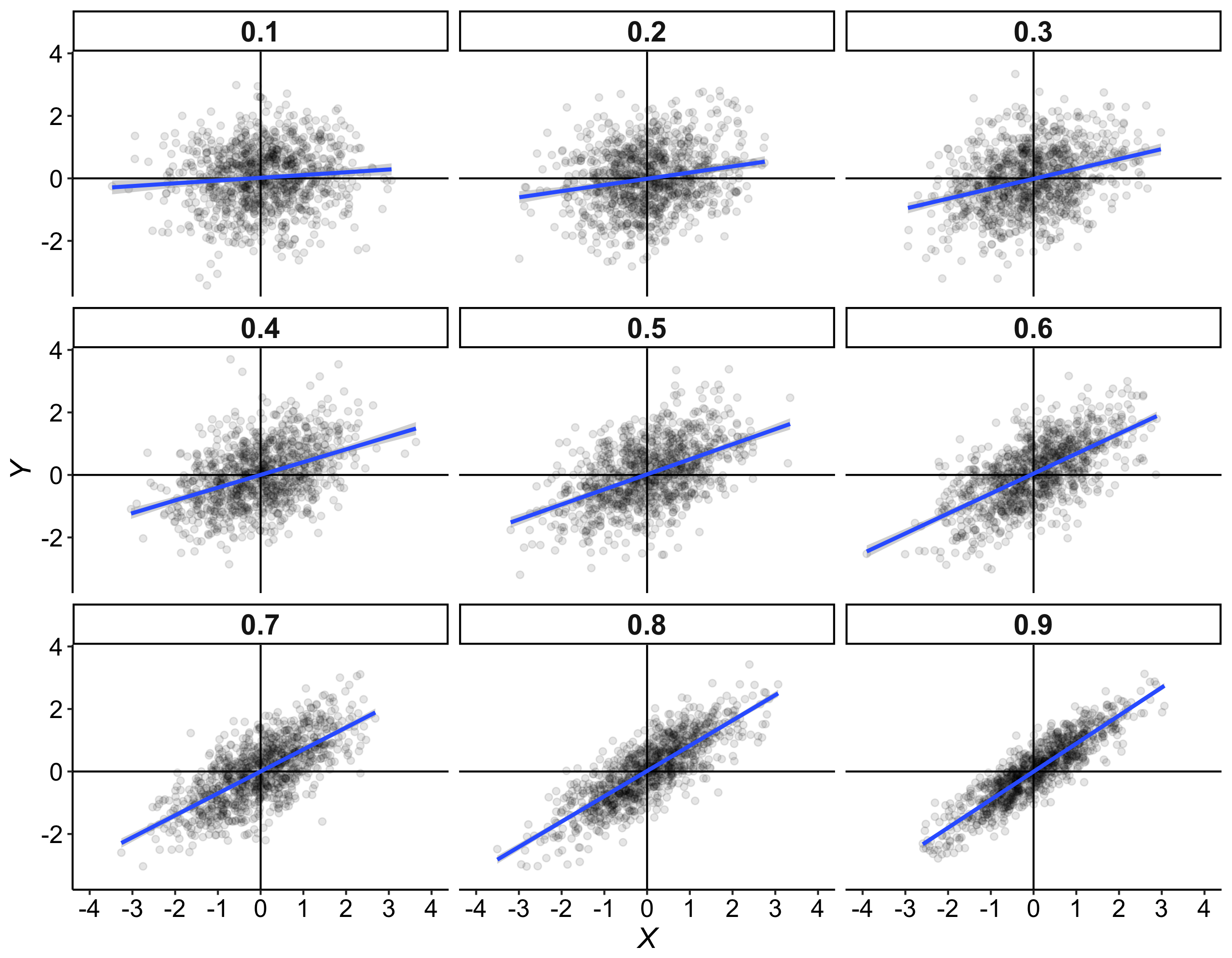
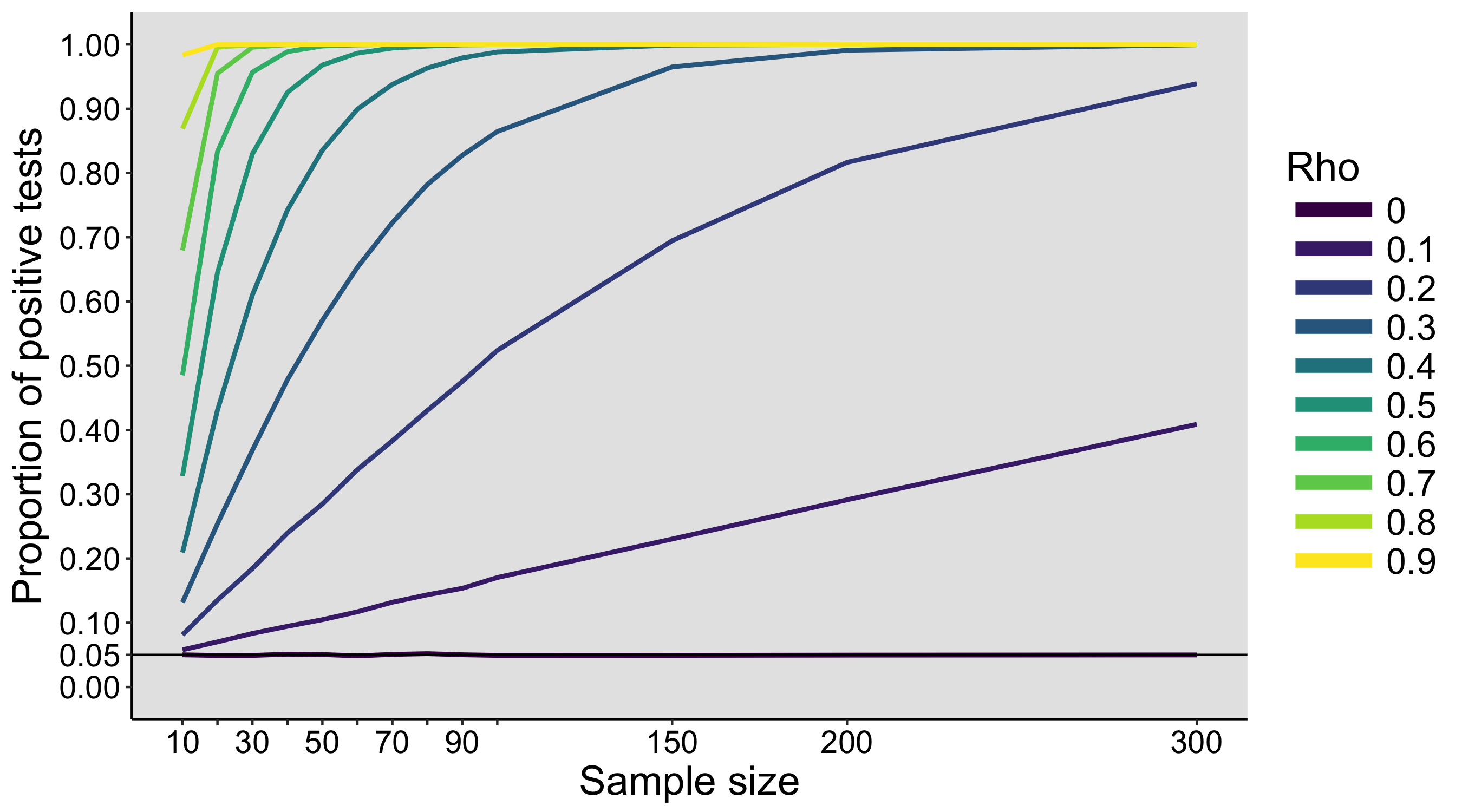
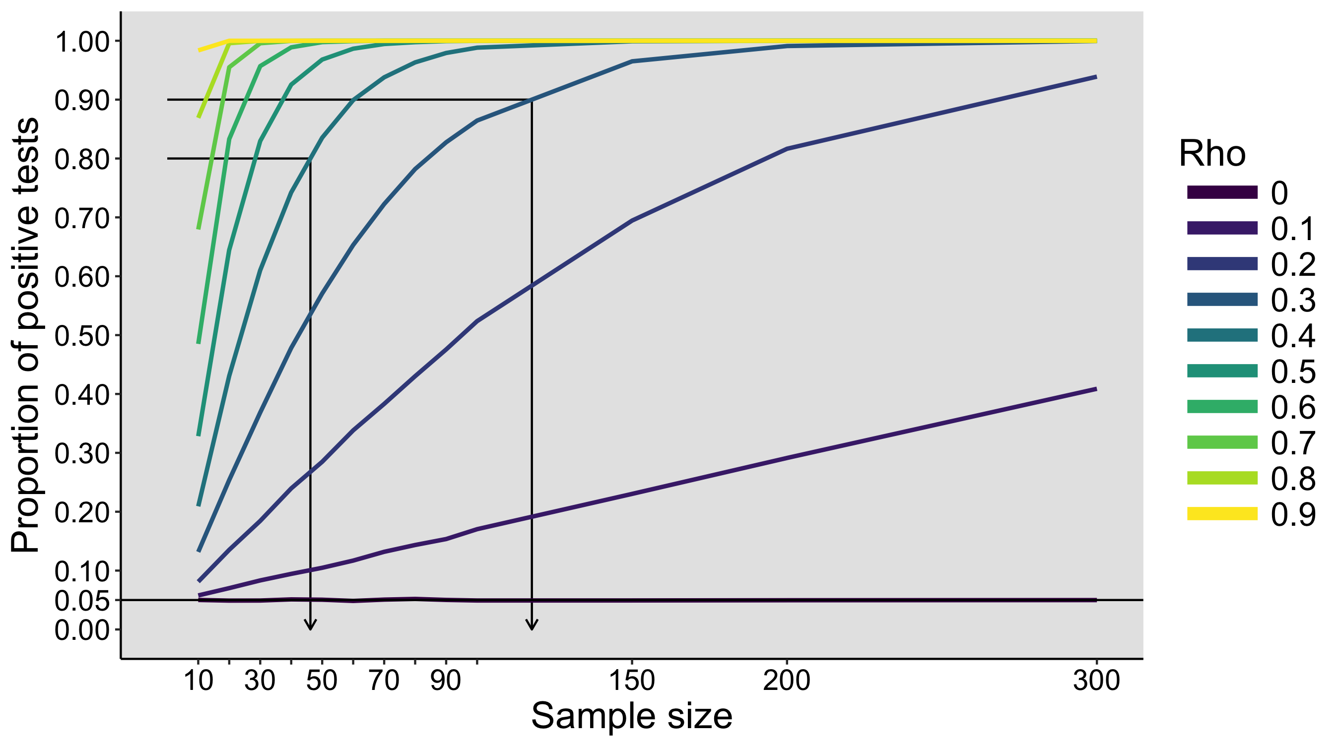
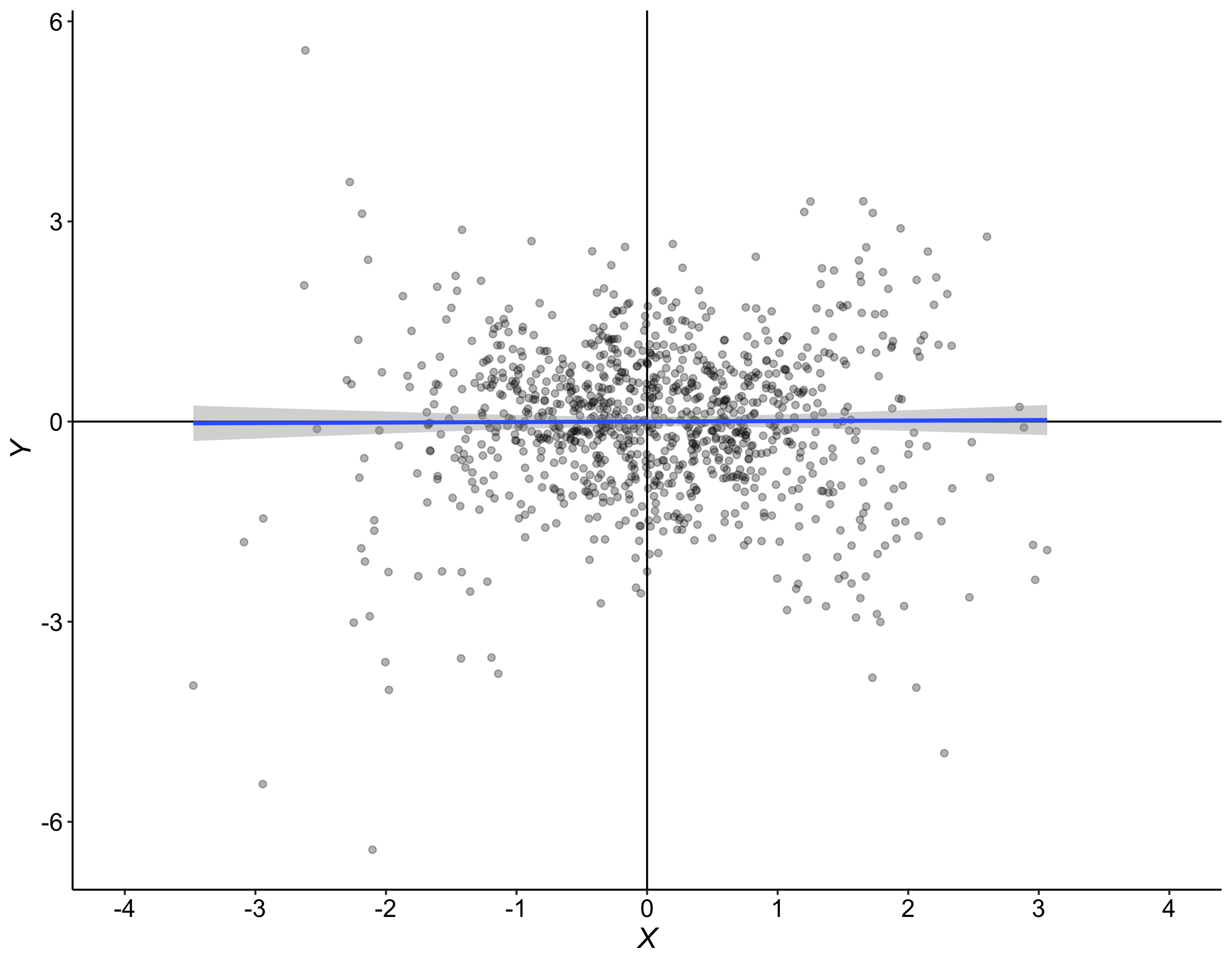
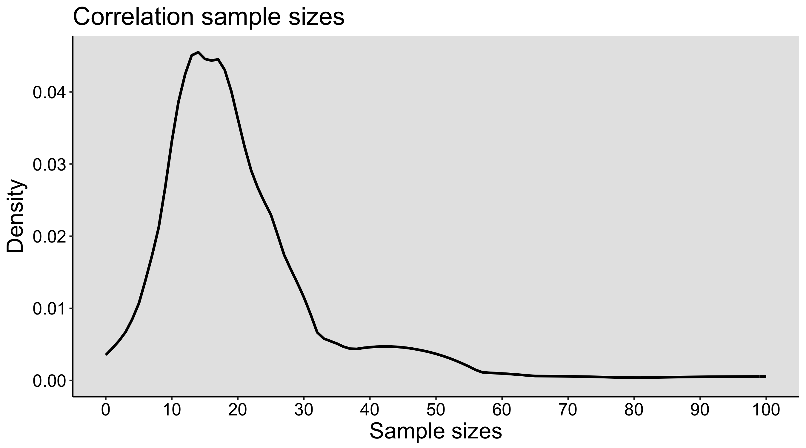
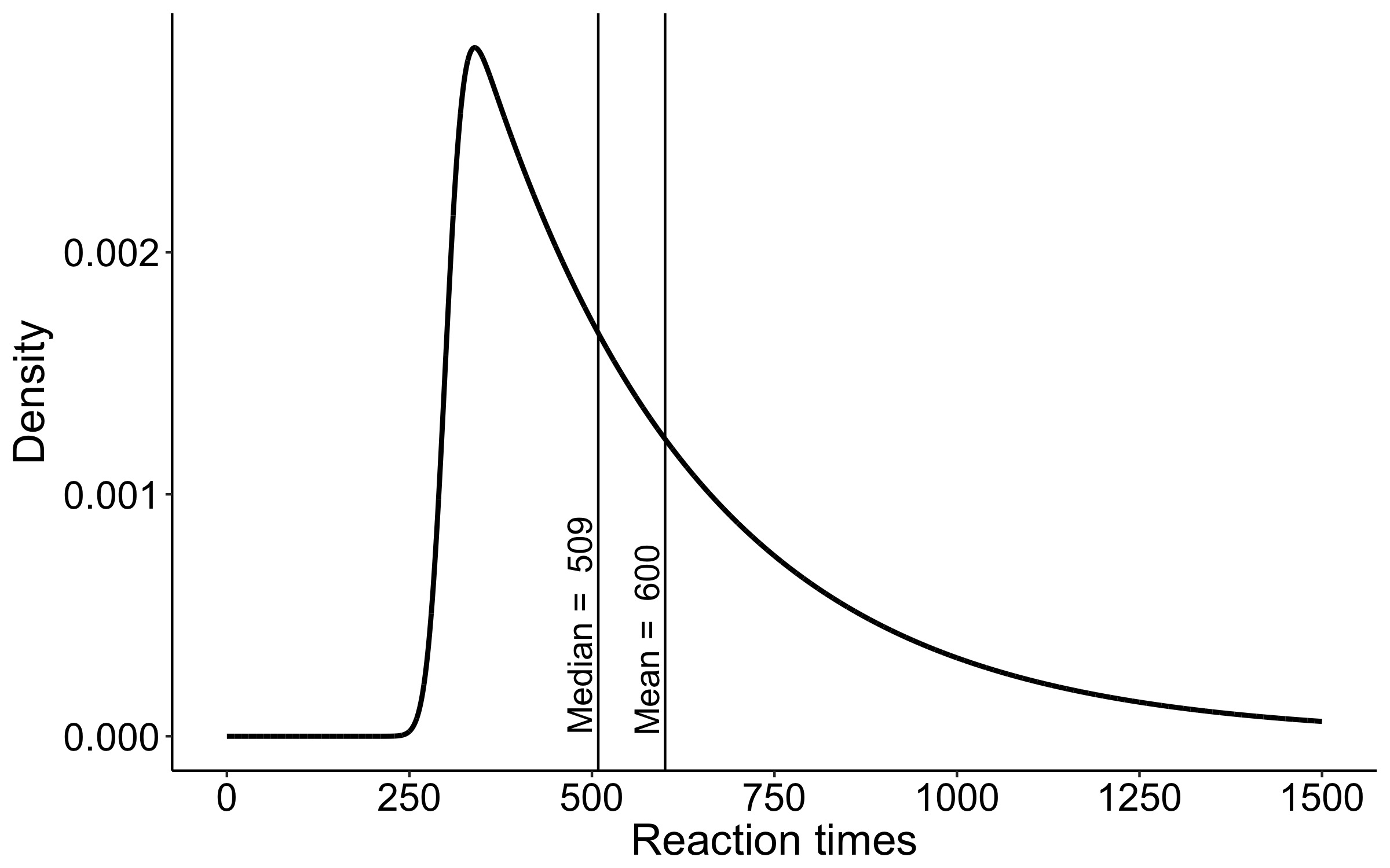
These values are then entered into a text file and shared with the rest of the class. The text files are opened in R, and the main question is: is there evidence that our 3 samples of 10 participants x 5 trials were drawn from different populations? To simplify the problem, a first step could involve averaging over trials, so we are left with 10 values from each group. The second step is to produce some graphical representation of the data. Then we can try various inferential statistics.

The exercise can be repeated on different days, to see how much variability we get between simulated experiments. During the last class, the populations and the sampling distributions are revealed.

Also, in this exercise, because the dice are sampled with replacement, the population has an infinite size. The content of each bag defines the probability of sampling each type of dice, but it is not the entire population, unlike in the faux fish activity (see below).

Here is an example of samples after averaging the 5 trials per dice/participant:

Activity 2: poker chips (bootstrap sampling with replacement)

We use poker chips to demonstrate sampling with replacement, as done in the bootstrap.

This exercise provides an opportunity to learn about:

  • sampling with replacement;
  • bootstrap sampling;
  • running simulations.

A bag contains 8 poker chips, representing the outcome of an experiment. Each chip is like an observation.

First, we demonstrate sampling with replacement by getting a random chip from the bag, writing down its value, and replacing the chip in the bag. Second, we demonstrate bootstrap sampling by performing sampling with replacement 8 times, each time writing down the value of the random chip selected from the bag. This should help make bootstrap sampling intuitive.

After this analog exercise, we switch to R to demonstrate the implementation of sampling with replacement using the sample function.

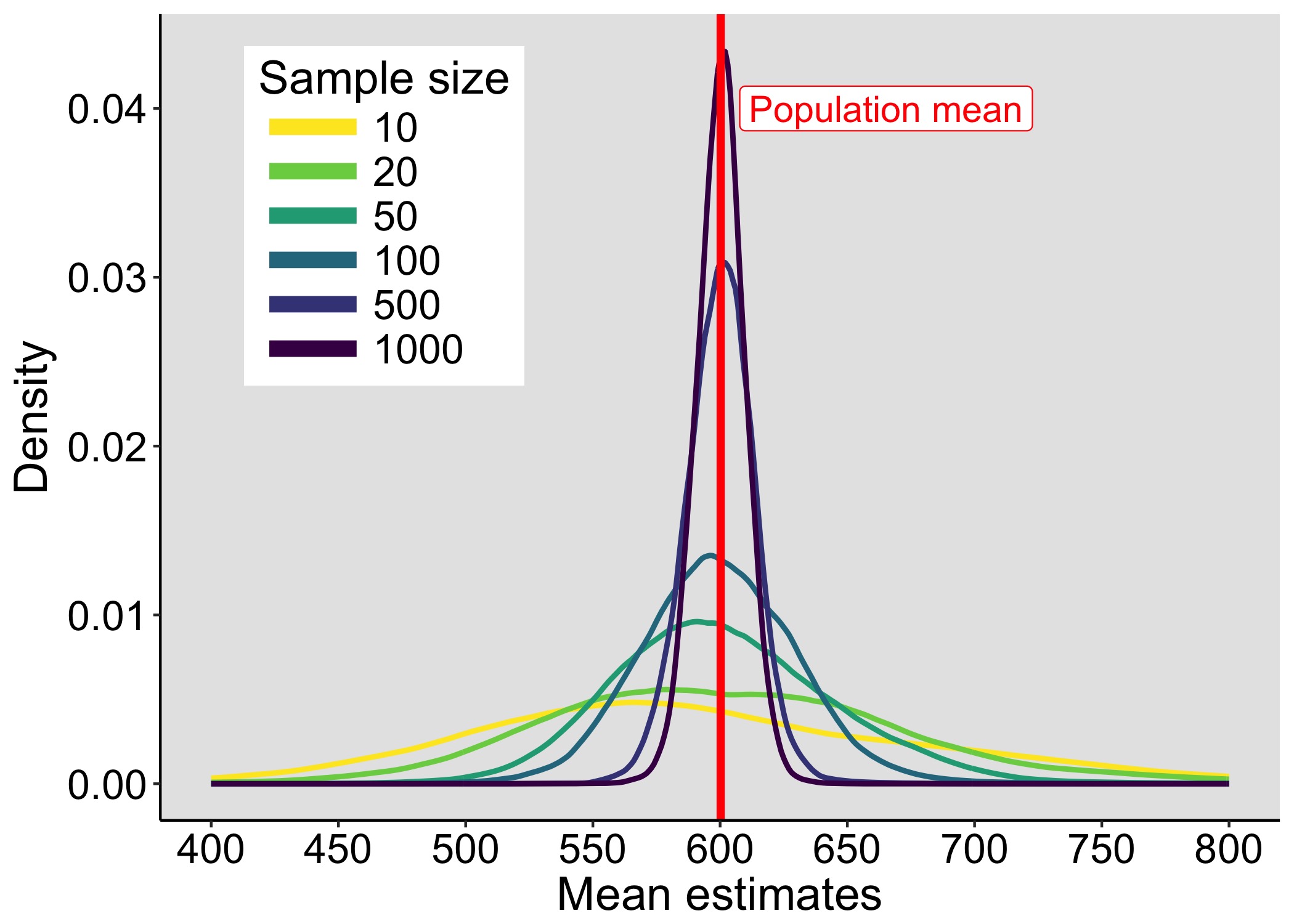
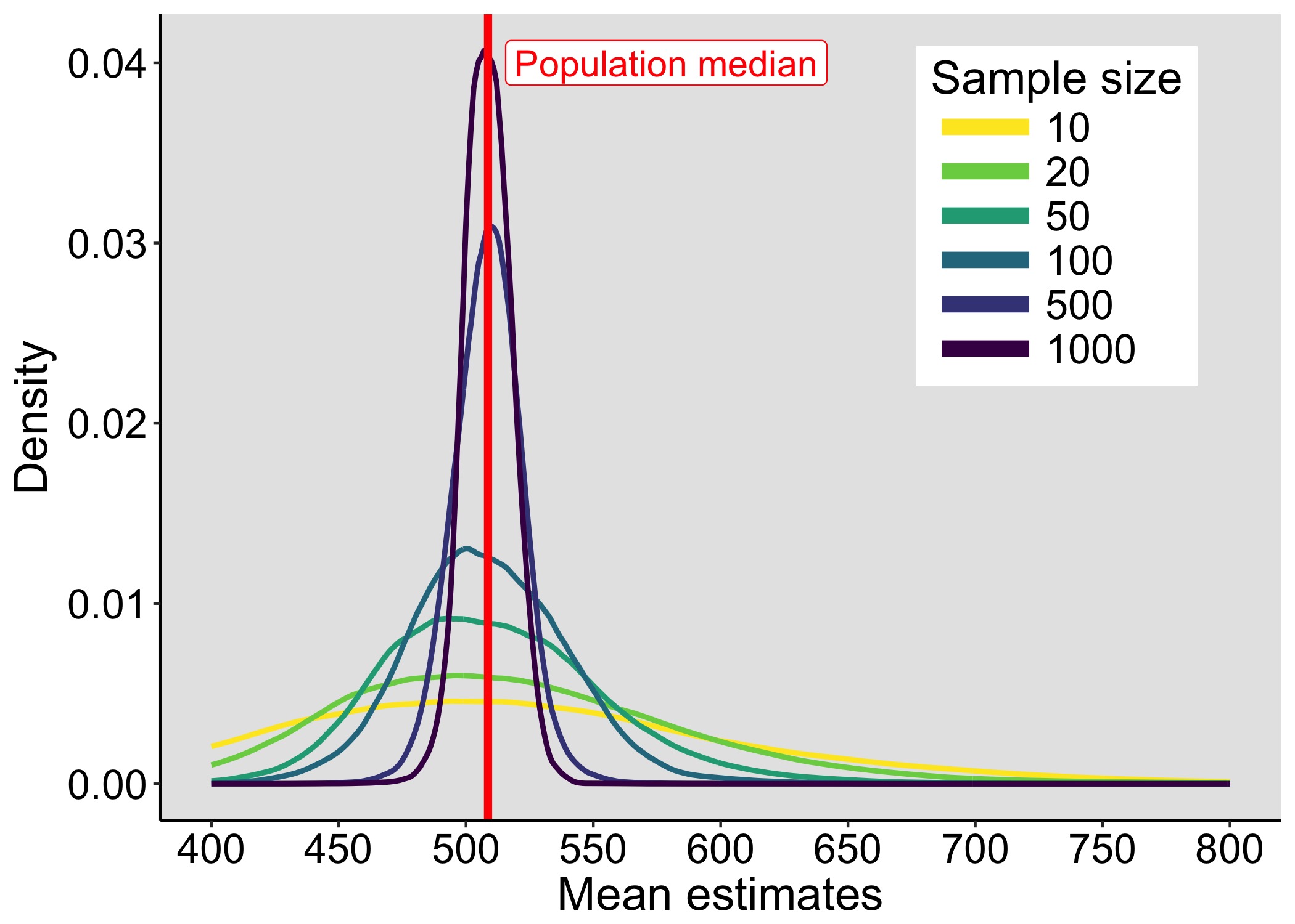
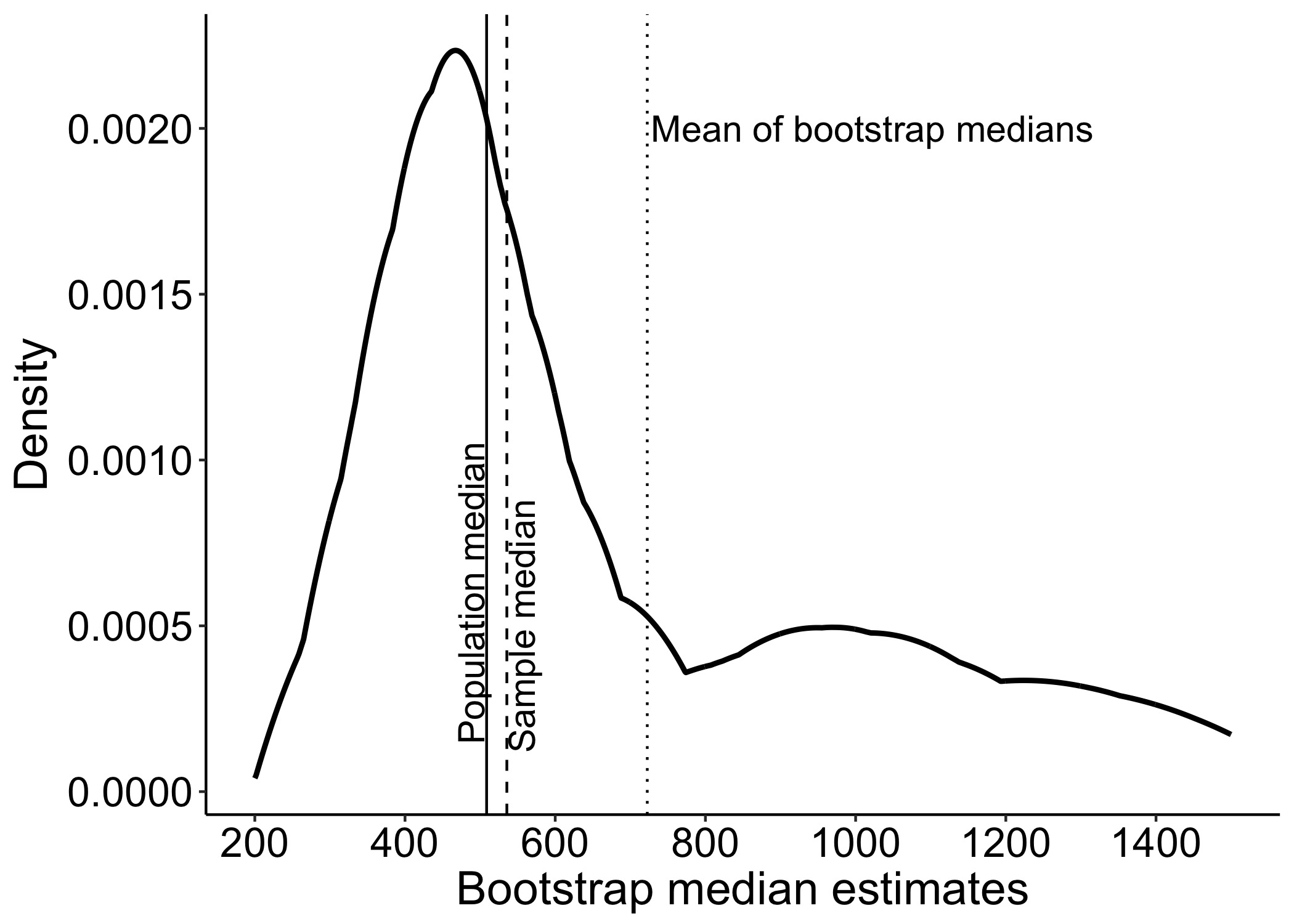
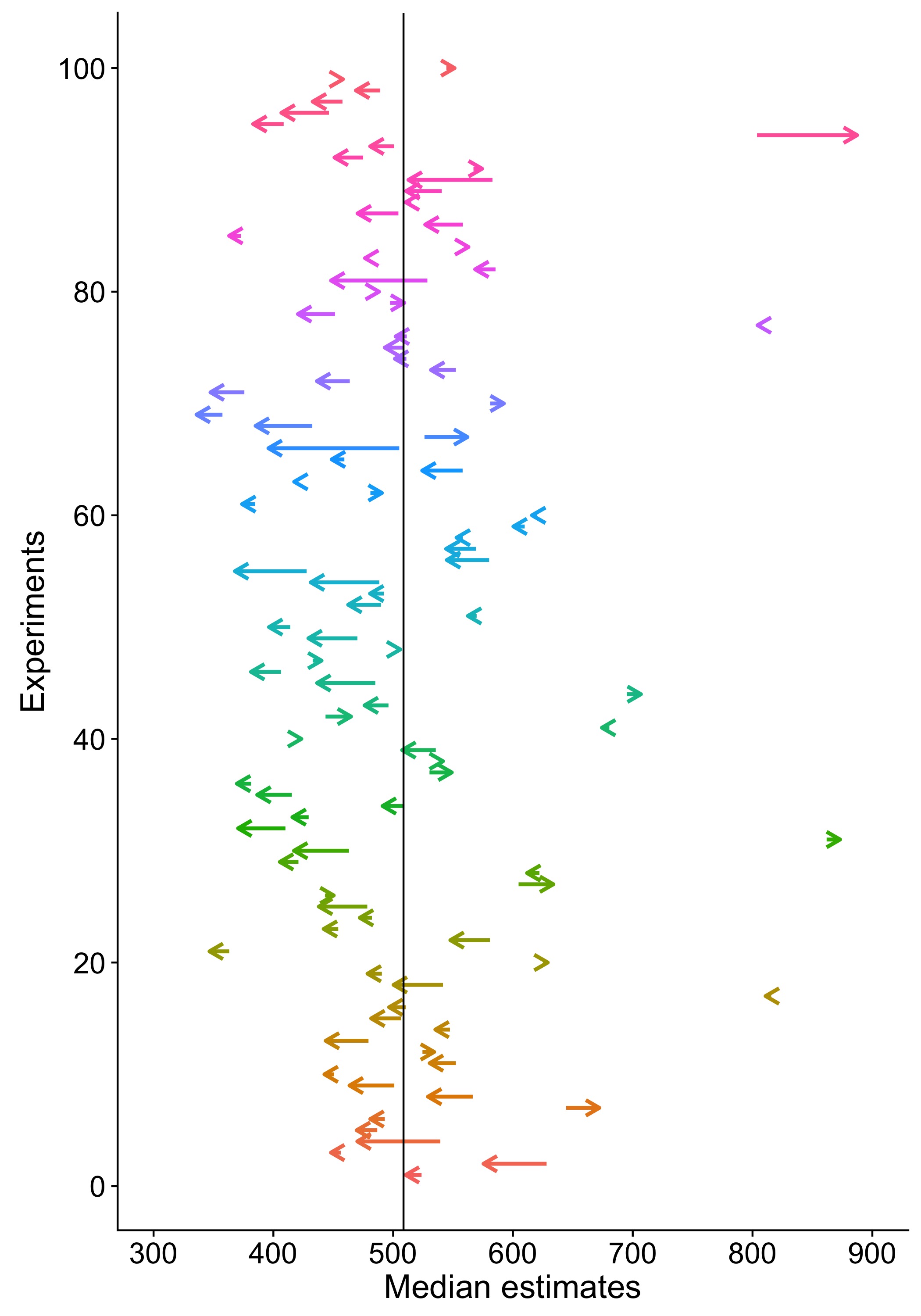
Activity 3: faux fish (sampling distributions)

We sample with replacement from a finite population of faux fish to demonstrate the effect of sample size on the shape of sampling distributions.

The faux fish activity is mentioned in Steel, Liermann & Guttorp (2019), with pictures of class results. The activity is described in detail in Kelsey & Steel (2001).

Steel, Liermann & Guttorp (2019)

This exercise provides an opportunity to learn about:

  • the distinction between population and sample;
  • sampling with replacement;
  • running simulations;
  • estimation;
  • sampling distributions.

Material:

  • two sets of 97 faux fish = fish-shaped bits of paper or other material
  • two containers = ponds
  • two large blank sheets of paper
  • x axis = ‘Mean weight (g)’
  • y axis = ‘Number of experiments’
  • titles = ‘n=3 replicates’ / ‘n=10 replicates’

I got faux fish made of wood from Wood Craft Shapes.

Each faux fish has a weight in grams written on it.

The frequencies of the weights is given in Kelsey & Steel (2001).

The fish population is stored in a box. I made 2 identical populations, so that two groups can work in parallel.

The first goal of the exercise is to produce sampling distributions by sampling with replacement from a population. The second goal is to evaluate the effect of the sample size on the shape of the sampling distribution. The third goal is to experiment with a digital version of the analog task, to gain familiarity with simulations.

Unlike the dice activity, this activity involves a finite size population: each box contains the full population under study.

Setup:

  • two groups of participants;
  • each group is assigned a box;
  • participants from each group take turn sampling from the box n=3 or n=10 faux fish (depending on the group), without looking inside the box;
  • each participant averages the numbers, writes down the answer and marks it on the large sheet of paper assigned to each group;
  • this is repeated until a sufficient number of simulated experiments have been carried out to assess the shape of the resulting sampling distribution.

To speed up the exercise, a participant picks n fish, writes down the weights, puts all the fish back in the box, and passes the box to the next participant. While the next participant is sampling fish from the box, the previous participant computes the mean and marks the result on the group graph.

Once done, the class discusses the results:

  • the sampling distributions are compared;
  • the population mean is revealed;
  • the population is revealed by showing the handout from the book and opening the boxes.

Then we do the same in R, but much quicker!

Here is an example of simulated results for n=3 (the vertical line marks the population mean):

References

Kelsey, Kathryn, and Ashley Steel. The Truth about Science: A Curriculum for Developing Young Scientists. NSTA Press, 2001.

Steel, E. Ashley, Martin Liermann, and Peter Guttorp. Beyond Calculations: A Course in Statistical Thinking. The American Statistician 73, no. sup1 (29 March 2019): 392–401. https://doi.org/10.1080/00031305.2018.1505657.

Planning for measurement precision, an alternative to power analyses

When we estimate power curves, we ask this question: given some priors about the data generating process, the nature of the effect and measurement variance, what is the probability to detect an effect for a given statistical test (say using an arbitrary p<0.05 threshold) for various sample sizes and effect sizes. While there are very good reasons to focus on power estimation, this is not the only or the most important aspect of an experimental procedure to consider (Gelman & Carlin, 2014). Indeed, finding the number of observations needed so that we get p<0.05 in say 87% of experiments, is not the most exciting part of designing an experiment. 

The relevant question is not “What is the power of a test?” but rather is “What might be expected to happen in studies of this size?” (Gelman & Carlin, 2014)

A related but more important question is that of measurement precision: given some priors and a certain number of participants, how close can we get to the unknown population value (Maxwell et al., 2008; Schönbrodt & Perugini, 2013; Peters & Crutzen, 2018; Trafimow, 2019)? Not surprisingly, measurement precision depends on sample size. As we saw in previous posts, sampling distributions get narrower with increasing sample sizes:

And with narrower sampling distributions, measurement precision increases. To illustrate, let’s consider an example from a lexical decision task – hundreds of reaction times (RT) were measured in hundreds of participants who had to distinguish between words and non-words presented on a computer screen.

Here are examples of RT distributions from 100 participants for each condition:

figure_flp_100
Reaction time distributions from 100 participants. Participants were randomly selected among 959. Distributions are shown for the same participants (colour coded) in the Word (A) and Non-Word (B) conditions.

If we save the median of each distribution, for each participant and condition, we get these positively skewed group level distributions:

figure_flp_dist

The distribution of pairwise differences between medians is also positively skewed:

figure_flp_all_p_diff

Notably, most participants have a positive difference: 96.4% of participants are faster in the Word than the Non-Word condition – a potential case of stochastic dominance (Rouder & Haaf, 2018; see also this summary blog post).

Now let say we want to estimate the group difference between conditions. Because of the skewness at each level of analysis (within and across participants), we estimate the central tendency at each level using the median: that is, we compute the median for each participant and each condition, then compute the medians of medians across participants (a more detailed assessment could be obtained by performing hierarchical modelling or multiple quantile estimation for instance).

Then we can assess measurement precision at the group level by performing a multi-level simulation. In this simulation, we can ask, for instance, how often the group estimate is no more than 10 ms from the population value across many experiments. To simplify, in each iteration of the simulation, we draw 200 trials per condition and participant, compute the median and save the Non-Word – Word difference. Group estimation of the difference is then based on a random sample of 10 to 300 participants, with the group median computed across participants’ differences between medians. Because the dataset is very large at the two level of analysis, we can pretend we have access to the population values, and define them by first computing, for each condition, the median across all available trials for each participant, second by computing across all participants the median of the pairwise differences. 

Having defined population values (the truth we’re trying to estimate, here a group difference of 78 ms), we can calculate measurement precision as the proportion of experiments in which the group estimate is no more than X ms from the population value, with X varying from 5 to 40 ms. Here are the results:

figure_flp_sim_precision
Group measurement precision for the difference between the Non-Word and Word conditions. Measurement precision was estimated by using a simulation with 10,000 iterations, 200 trials per condition and participant, and varying numbers of participants.

Not surprisingly, the proportion of estimates close to the population value increases with the number of participants. More interestingly, the relationship is non-linear, such that a larger gain in precision can be achieved by increasing sample size for instance from 10 to 20 compared to from 90 to 100. 

The results also let us answer useful questions for planning experiments (see the black arrows in the above figure):

 • So that in 70% of experiments the group estimate of the median is no more than 10 ms from the population value, we need to test at least 56 participants. 

• So that in 90% of experiments the group estimate of the median is no more than 20 ms from the population value, we need to test at least 38 participants.

Obviously, this is just an example, about a narrow problem related to lexical decisions. Other aspects could be considered too, for instance the width of the confidence intervals (Maxwell, Kelley & Rausch, 2008; Peters & Crutzen, 2017; Rothman & Greenland, 2018). And for your particular case, most likely, you won’t have access to a large dataset from which to perform a data driven simulation. In this case, you can get estimates about plausible effect sizes and their variability from various sources (Gelman & Carlin 2014):

  • related data;

  • (systematic) literature review;

  • meta-analysis;

  • outputs of a hierarchical model;

  • modelling.

To model a range of plausible effect sizes and their consequences on repeated measurements, you need priors about a data generating process and how distributions differ between conditions. For instance, you could use exGaussian distributions to simulate RT data. For research on new effects, it is advised to consider a large range of potential effects, with their plausibility informed by the literature and psychological/biological constraints.  

Although relying on the literature alone can lead to over-optimistic expectations because of the dominance of small n studies and a bias towards significant results (Yarkoni 2009; Button et al. 2013), methods are being developed to overcome these limitations (Anderson, Kelley & Maxwell, 2017). In the end, the best cure against effect size over-estimation is a combination of pre-registration/registered reports (to diminish literature bias) and data sharing (to let anyone do their own calculations and meta-analyses).

Code

The code is on figshare: the simulation can be reproduced using the flp_sim_precision notebook, the illustrations of the distributions can be reproduced using flp_illustrate_dataset.

Shiny app by Malcolm Barrett (@malco_barrett)

https://malcolmbarrett.shinyapps.io/precisely/

References

Anderson, S.F., Kelley, K. & Maxwell, S.E. (2017) Sample-Size Planning for More Accurate Statistical Power: A Method Adjusting Sample Effect Sizes for Publication Bias and Uncertainty. Psychol Sci, 28, 1547-1562.

Bland J.M.. The tyranny of power: is there a better way to calculate sample size? https://www.bmj.com/content/339/bmj.b3985)

Button, K.S., Ioannidis, J.P., Mokrysz, C., Nosek, B.A., Flint, J., Robinson, E.S. & Munafo, M.R. (2013) Power failure: why small sample size undermines the reliability of neuroscience. Nature reviews. Neuroscience, 14, 365-376.

Ferrand, L., New, B., Brysbaert, M., Keuleers, E., Bonin, P., Meot, A., Augustinova, M. & Pallier, C. (2010) The French Lexicon Project: lexical decision data for 38,840 French words and 38,840 pseudowords. Behav Res Methods, 42, 488-496.

Gelman, A. & Carlin, J. (2014) Beyond Power Calculations: Assessing Type S (Sign) and Type M (Magnitude) Errors. Perspect Psychol Sci, 9, 641-651.

Maxwell, S.E., Kelley, K. & Rausch, J.R. (2008) Sample size planning for statistical power and accuracy in parameter estimation. Annu Rev Psychol, 59, 537-563.

Peters, G.-J.Y. & Crutzen, R. (2017) Knowing exactly how effective an intervention, treatment, or manipulation is and ensuring that a study replicates: accuracy in parameter estimation as a partial solution to the replication crisis. PsyArXiv. doi:10.31234/osf.io/cjsk2.

Rothman, K.J. & Greenland, S. (2018) Planning Study Size Based on Precision Rather Than Power. Epidemiology, 29, 599-603.

Rouder, J.N. & Haaf, J.M. (2018) Power, Dominance, and Constraint: A Note on the Appeal of Different Design Traditions. Advances in Methods and Practices in Psychological Science, 1, 19-26.

Rousselet, G.A. & Wilcox, R.R. (2018) Reaction times and other skewed distributions: problems with the mean and the median. bioRxiv. doi: https://doi.org/10.1101/383935

Rousselet, G.; Wilcox, R. (2018): Reaction times and other skewed distributions: problems with the mean and the median. figshare. Fileset. https://doi.org/10.6084/m9.figshare.6911924.v1

Schönbrodt, F.D. & Perugini, M. (2013) At what sample size do correlations stabilize? J Res Pers, 47, 609-612.

Trafimow, D. (2019) Five Nonobvious Changes in Editorial Practice for Editors and Reviewers to Consider When Evaluating Submissions in a Post p < 0.05 Universe, The American Statistician, 73:sup1, 340-345, DOI: 10.1080/00031305.2018.1537888

Yarkoni, T. (2009) Big Correlations in Little Studies: Inflated fMRI Correlations Reflect Low Statistical Power‚ Commentary on Vul et al. (2009). Perspectives on Psychological Science, 4, 294-298.

Power estimation for correlation analyses

Following the previous posts on small n correlations [post 1][post 2][post 3], in this post we’re going to consider power estimation (if you do not care about power, but you’d rather focus on estimation, this post is for you). 

To get started, let’s look at examples of n=1000 samples from bivariate populations with known correlations (rho), with rho increasing from 0.1 to 0.9 in steps of 0.1. For each rho, we draw a random sample and plot Y as a function of X. The variances of the two correlated variables are independent – there is homoscedasticity. Later we will look at heteroscedasticity, when the variance of Y varies with X.

demo_homo_dist

For the same distributions illustrated in the previous figure, we compute the proportion of positive Pearson’s correlation tests for different sample sizes. This gives us power curves (here based on simulations with 50,000 samples). We also include rho = 0 to determine the proportion of false positives.

figure_power_homo

Power increases with sample size and with rho. When rho = 0, the proportion of positive tests is the proportion of false positives. It should be around 0.05 for a test with alpha = 0.05. This is the case here, as Pearson’s correlation is well behaved for bivariate normal data.

For a given expected population correlation and a desired long run power value, we can use interpolation to find out the matching sample size.

To achieve at least 80% power given an expected population rho of 0.4, the minimum sample size is 46 observations.

To achieve at least 90% power given an expected population rho of 0.3, the minimum sample size is 118 observations.

figure_power_homo_arrows

Alternatively, for a given sample size and a desired power, we can determine the minimum effect size we can hope to detect. For instance, given n = 40 and a desired power of at least 90%, the minimum effect size we can detect is 0.49.

So far, we have only considered situations where we sample from bivariate normal distributions. However, Wilcox (2012 p. 444-445) describes 6 aspects of data that affect Pearson’s r:

  • outliers

  • the magnitude of the slope around which points are clustered

  • curvature

  • the magnitude of the residuals

  • restriction of range

  • heteroscedasticity

The effect of outliers on Pearson’s and Spearman’s correlations is described in detail in Pernet et al. (2012) and Rousselet et al. (2012).

Next we focus on heteroscedasticity. Let’s look at Wilcox’s heteroscedasticity example (2012, p. 445). If we correlate variable X with variable Y, heteroscedasticity means that the variance of Y depends on X. Wilcox considers this example:

X and Y have normal distributions with both means equal to zero. […] X and Y have variance 1 unless |X|>0.5, in which case Y has standard deviation |X|.”

Here is an example of such data:

demo_wilcox_dist

Next, Wilcox (2012) considers the effect of this heteroscedastic situation on false positives. We superimpose results for the homoscedastic case for comparison. In the homoscedastic case, as expected for a test with alpha = 0.05, the proportion of false positives is very close to 0.05 at every sample size. In the heteroscedastic case, instead of 5%, the number of false positives is between 12% and 19%. The number of false positives actually increases with sample size! That’s because the standard T statistics associated with Pearson’s correlation assumes homoscedasticity, so the formula is incorrect when there is heteroscedasticity.

figure_power_hetero_wilcox

As a consequence, when Pearson’s test is positive, it doesn’t always imply the existence of a correlation. There could be dependence due to heteroscedasticity, in the absence of a correlation.

Let’s consider another heteroscedastic situation, in which the variance of Y increases linearly with X. This could correspond for instance to situations in which cognitive performance or income are correlated with age – we might expect the variance amongst participants to increase with age.

We keep rho constant at 0.4 and increase the maximum variance from 1 (homoscedastic case) to 9. That is, the variance of Y linear increases from 1 to the maximum variance as a function of X.

demo_hetero_dist

For rho = 0, we can compute the proportion of false positives as a function of both sample size and heteroscedasticity. In the next figure, variance refers to the maximum variance. 

figure_power_hetero_rho0

From 0.05 for the homoscedastic case (max variance = 1), the proportion of false positives increases to 0.07-0.08 for a max variance of 9. This relatively small increase in the number of false positives could have important consequences if 100’s of labs are engaged in fishing expeditions and they publish everything with p<0.05. However, it seems we shouldn’t worry much about linear heteroscedasticity as long as sample sizes are sufficiently large and we report estimates with appropriate confidence intervals. An easy way to build confidence intervals when there is heteroscedasticity is to use the percentile bootstrap (see Pernet et al. 2012 for illustrations and Matlab code).

Finally, we can run the same simulation for rho = 0.4. Power progressively decreases with increasing heteroscedasticity. Put another way, with larger heteroscedasticity, larger sample sizes are needed to achieve the same power.

figure_power_hetero_rho04

We can zoom in:

figure_power_hetero_rho04_zoom

The vertical bars mark approximately a 13 observation increase to keep power at 0.8 between a max variance of 0 and 9. This decrease in power can be avoided by using the percentile bootstrap or robust correlation techniques, or both (Wilcox, 2012).

Conclusion

The results presented in this post are based on simulations. You could also use a sample size calculator for correlation analyses – for instance this one.

But running simulations has huge advantages. For instance, you can compare multiple estimators of association in various situations. In a simulation, you can also include as much information as you have about your target populations. For instance, if you want to correlate brain measurements with response times, there might be large datasets you could use to perform data-driven simulations (e.g. UK biobank), or you could estimate the shape of the sampling distributions to draw samples from appropriate theoretical distributions (maybe a gamma distribution for brain measurements and an exGaussian distribution for response times).

Simulations also put you in charge, instead of relying on a black box, which most likely will only cover Pearson’s correlation in ideal conditions, and not robust alternatives when there are outliers or heteroscedasticity or other potential issues.

The R code to reproduce the simulations and the figures is on GitHub.

References

Pernet, C.R., Wilcox, R. & Rousselet, G.A. (2012) Robust correlation analyses: false positive and power validation using a new open source matlab toolbox. Front Psychol, 3, 606.

Rousselet, G.A. & Pernet, C.R. (2012) Improving standards in brain-behavior correlation analyses. Frontiers in human neuroscience, 6, 119.

Wilcox, R.R. (2012) Introduction to robust estimation and hypothesis testing. Academic Press, San Diego, CA.

Small n correlations + p values = disaster

Previously, we saw that with small sample sizes, correlation estimation is very uncertain, which implies that small n correlations cannot be trusted: the observed value in any experiment could be very far from the population value, and the sign could be wrong too. In addition to the uncertainty associated with small sample sizes, the selective report of results based on p values < 0.05 (or some other threshold), can lead to massively inflated correlation estimates in the literature (Yarkoni, 2009 ☜ if you haven’t done so, you really should read this excellent paper).

Let’s illustrate the problem (code is on GitHub). First, we consider a population rho = 0. Here is the sampling distribution as a function of sample size, as we saw in an earlier post. 

figure_rpval_ori

Figure 1: Sampling distribution for rho=0.

Now, here is the sampling distribution conditional on p < 0.05. The estimates are massively inflated and the problem gets worse with smaller sample sizes, because the smaller the sample size, the larger the correlations must be by chance for them to be significant.

figure_rpval_cond

Figure 2: Sampling distribution for rho=0, given p<0.05

So no, don’t get too excited when you see a statistically significant correlation in a paper…

Let’s do the same exercise when the population correlation is relatively large. With rho = 0.4, the sampling distribution looks like this:

figure_rpval_ori_04

Figure 3: Sampling distribution for rho=0.4.

If we report only those correlations associated with p < 0.05, the distribution looks like this:

figure_rpval_cond_04

Figure 4: Sampling distribution for rho=0.4, given p<0.05

Again, with small sample sizes, the estimates are inflated, albeit in the correct direction. There is nevertheless a small number of large negative correlations (see small purple bump around -0.6 -0.8). Indeed, in 0.77% of simulations, even though the population value was 0.4, a large and p < 0.05 negative correlation was obtained.

Correlations in neuroscience: are small n, interaction fallacies, lack of illustrations and confidence intervals the norm?

As reviewer, editor and reader of research articles, I’m regularly annoyed by the low standards in correlation analyses. In my experience with such articles, typically:

  • Pearson’s correlation, a non-robust measure of association, is used;
  • R and p values are reported, but not confidence intervals;
  • sample sizes tend to be small, leading to large estimation bias and inflated effect sizes in the literature;
  • R values and confidence intervals are not considered when interpreting the results;
  • instead, most analyses are reported as significant or non-significant (p<0.05), leading to the conclusion that an association exists or not (frequentist fallacy);
  • often figures illustrating the correlations are absent;
  • the explicit or implicit comparison of two correlations is done without a formal test (interaction fallacy).

To find out if my experience was in fact representative of the typical paper, I had a look at all papers published in 2017 in the European Journal of Neuroscience, where I’m a section editor. I care about the quality of the research published in EJN, so this is not an attempt at blaming a journal in particular, rather it’s a starting point to address a general problem. I really hope the results presented below will serve as a wake-up call for all involved and will lead to improvements in correlation analyses. Also, I bet if you look systematically at articles published in other neuroscience journals you’ll find the same problems. If you’re not convinced, go ahead, prove me wrong 😉 

I proceeded like this: for all 2017 articles (volumes 45 and 46), I searched for “correl” and I scanned for figures of scatterplots. If either searches were negative, the article was categorised as not containing a correlation analysis, so I might have missed a few. When at least one correlation was present, I looked for these details: 

  • n
  • estimator
  • confidence interval
  • R
  • p value
  • consideration of effect sizes
  • figure illustrating positive result
  • figure illustrating negative result
  • interaction test.

164 articles reported no correlation.

7 articles used regression analyses, with sample sizes as low as n=6, n=10, n=12 in 3 articles.

48 articles reported correlations.

Sample size

The norm was to not report degrees of freedom or sample size along with the correlation analyses or their illustrations. In 7 articles, the sample sizes were very difficult or impossible to guess. In the others, sample sizes varied a lot, both within and between articles. To confirm sample sizes, I counted the observations in scatterplots when they were available and not too crowded – this was a tedious job and I probably got some estimations and checks wrong. Anyway, I shouldn’t have to do all these checks, so something went wrong during the reviewing process. 

To simplify the presentation of the results, I collapsed the sample size estimates across articles. Here is the distribution: 

figure_ejn_sample_sizes

The figure omits 3 outliers with n= 836, 1397, 1407, all from the same article.

The median sample size is 18, which is far too low to provide sufficiently precise estimation.

Estimator

The issue with low sample sizes is made worse by the predominant use of Pearson’s correlation or the lack of consideration for the type of estimator. Indeed, 21 articles did not mention the estimator used at all, but presumably they used Pearson’s correlation.

Among the 27 articles that did mention which estimator was used:

  • 11 used only Pearson’s correlation;
  • 11 used only Spearman’s correlation;
  • 4 used Pearson’s and Spearman’s correlations;
  • 1 used Spearman’s and Kendall’s correlations.

So the majority of studies used an estimator that is well-known for its lack of robustness and its inaccurate confidence intervals and p values (Pernet, Wilcox & Rousselet, 2012).

R & p values

Most articles reported R and p values. Only 2 articles did not report R values. The same 2 articles also omitted p values, simply mentioning that the correlations were not significant. Another 3 articles did not report p values along with the R values.

Confidence interval

Only 3 articles reported confidence intervals, without mentioning how they were computed. 1 article reported percentile bootstrap confidence intervals for Pearson’s correlations, which is the recommended procedure for this estimator (Pernet, Wilcox & Rousselet, 2012).

Consideration for effect sizes

Given the lack of interest for measurement uncertainty demonstrated by the absence of confidence intervals in most articles, it is not surprising that only 5 articles mentioned the size of the correlation when presenting the results. All other articles simply reported the correlations as significant or not.

Illustrations

In contrast with the absence of confidence intervals and consideration for effect sizes, 23 articles reported illustrations for positive results. 4 articles reported only negative results, which leaves us with 21 articles that failed to illustrate the correlation results. 

Among the 40 articles that reported negative results, only 13 illustrated them, which suggests a strong bias towards positive results.

Interaction test

Finally, I looked for interaction fallacies (Nieuwenhuis, Forstmann & Wagenmakers 2011). In the context of correlation analyses, you commit an interaction fallacy when you present two correlations, one significant, the other not, implying that the 2 differ, but without explicitly testing the interaction. In other versions of the interaction fallacy, two significant correlations with the same sign are presented together, implying either that the 2 are similar, or that one is stronger than the other, without providing a confidence interval for the correlation difference. You can easily guess the other flavours… 

10 articles presented only one correlation, so there was no scope for the interaction fallacy. Among the 38 articles that presented more than one correlation, only one provided an explicit test for the comparison of 2 correlations. However, the authors omitted the explicit test for their next comparison!

Recommendations

In conclusion, at least in 2017 EJN articles, the norm is to estimate associations using small sample sizes and a non-robust estimator, to not provide confidence intervals and to not consider effect sizes and measurement uncertainty when presenting the results. Also, positive results are more likely to be illustrated than negative ones. Finally, interaction fallacies are mainstream.

How can we do a better job?

If you want to do a correlation analysis, consider your sample size carefully to assess statistical power and even better, your long-term estimation precision. If you have a small n, I wouldn’t even look at the correlation. 

Do not use Pearson’s correlation unless you have well-behaved and large samples, and you are only interested in linear relationships; otherwise explore robust measures of associations and techniques that provide valid confidence intervals (Pernet, Wilcox & Rousselet, 2012; Wilcox & Rousselet, 2018).

Reporting

These details are essential in articles reporting correlation analyses:

  • sample size for each correlation;
  • estimator of association;
  • R value;
  • confidence interval;
  • scatterplot illustration of every correlation, irrespective of the p value;
  • explicit comparison test of all correlations explicitly or implicitly compared;
  • consideration of effect sizes (R values) and their uncertainty (confidence intervals) in the interpretation of the results.

 Report p values if you want but they are not essential and should not be given a special status (McShane et al. 2018).

Finally, are you sure you really want to compute a correlation?

“Why then are correlation coefficients so attractive? Only bad reasons seem to come to mind. Worst of all, probably, is the absence of any need to think about units for either variable. Given two perfectly meaningless variables, one is reminded of their meaninglessness when a regression coefficient is given, since one wonders how to interpret its value. A correlation coefficient is less likely to bring up the unpleasant truth—we think we know what r = —.7 means. Do we? How often? Sweeping things under the rug is the enemy of good data analysis. Often, using the correlation coefficient is “sweeping under the rug” with a vengeance. Being so disinterested in our variables that we do not care about their units can hardly be desirable.”
Analyzing data: Sanctification or detective work?

John W. Tukey.
 American Psychologist, Vol 24(2), Feb 1969, 83-91. http://dx.doi.org/10.1037/h0027108


References

McShane, B.B., Gal, D., Gelman, A., Robert, C. & Tackett, J.L. (2018) Abandon Statistical Significance. arxiv.

Nieuwenhuis, S., Forstmann, B.U. & Wagenmakers, E.J. (2011) Erroneous analyses of interactions in neuroscience: a problem of significance. Nat Neurosci, 14, 1105-1107.

Pernet, C.R., Wilcox, R. & Rousselet, G.A. (2012) Robust correlation analyses: false positive and power validation using a new open source matlab toolbox. Front Psychol, 3, 606.

Rousselet, G.A. & Pernet, C.R. (2012) Improving standards in brain-behavior correlation analyses. Frontiers in human neuroscience, 6, 119.

Wilcox, R.R. & Rousselet, G.A. (2018) A Guide to Robust Statistical Methods in Neuroscience. Curr Protoc Neurosci, 82, 8 42 41-48 42 30.

[preprint]

Small n correlations cannot be trusted

This post illustrates two important effects of sample size on the estimation of correlation coefficients: lower sample sizes are associated with increased variability and lower probability of replication. This is not specific to correlations, but here we’re going to have a detailed look at what it means when using the popular Pearson’s correlation (similar results are obtained using Spearman’s correlation, and the same problems arise with regression). The R code is available on github.


UPDATE: 2018-06-02

In the original post, I mentioned non-linearities in some of the figures. Jan Vanhove replied on Twitter that he was not getting any, and suggested a different code snippet. I’ve updated the simulations using his code, and now the non-linearities are gone! So thanks Jan!

Johannes Algermissen mentioned on Twitter that his recent paper covered similar issues. Have a look! He also reminded me about this recent paper that makes points very similar to those in this blog.

Gjalt-Jorn Peters mentioned on Twitter that “you can also use the Pearson distribution in package suppdists. Also see pwr.confintR to compute the required sample size for a given desired accuracy in parameter estimation (AIPE), which can also come in handy when planning studies”.

Wolfgang Viechtbauer‏ mentioned on Twitter “that one can just compute the density of r directly (no need to simulate). For example: link. Then everything is nice and smooth”.

UPDATE: 2018-06-30

Frank Harrell wrote on Twitter: “I’ll also push the use of precision of correlation coefficient estimates in justifying sample sizes. Need n > 300 to estimate r. BBR Chapter 8″


Let’s start with an example, shown in the figure below. It is common to see such an array of scatterplots in articles (though confidence intervals are typically not reported). In my experience, the accompanying description goes like that:

“There was a significant correlation in group/condition 5 (p < 0.05); however, there was no association in the other groups/conditions (p>0.05).”

Of course there are many problems with this description:

– there is no mention of estimator (Pearson correlation is the default, but this should be explicit);
– there is no acknowledgment that Pearson correlation is sensitive to other features of the data than the presence of an association (same goes for OLS regression);
– there is no control for multiple comparisons;
– correlations are not explicitly compared – an example of interaction fallacy;
– there is no acknowledgment that p values near 0.05 typically only provide weak evidence against the null;
– authors have committed the fallacy of assuming that the lack of evidence (p>0.05) is the same as evidence for a lack of effect;
– …

Finally, to bring us back to the topic of this blog: researchers tend to forget that promising looking correlations are easily obtained by chance when sample sizes are small.

unnamed-chunk-4-1

The data in the scatterplots were sampled from a bivariate population with zero correlation and a bit of skewness to create more realistic examples (you can play with the code to see what happens in different situations). I suspect a lot of published correlations might well fall into that category. Nothing new here, false positives and inflated effect sizes are a natural outcome of small n experiments, and the problem gets worse with questionable research practices and incentives to publish positive new results. 

To understand the problem with estimation from small n experiments, we can perform a simulation in which we draw samples of different sizes from a normal population with a known Pearson’s correlation (rho) of zero. The sampling distributions of the estimates of rho for different sample sizes look like this: 

figure_sampling_distributions

Sampling distributions tell us about the behaviour of a statistics in the long run, if we did many experiments. Here, with increasing sample sizes, the sampling distributions are narrower, which means that in the long run, we get more precise estimates. However, a typical article reports only one correlation estimate, which could be completely off. So what sample size should we use to get a precise estimate? The answer depends on:

  • the shape of the univariate and bivariate distributions (if outliers are common, consider robust methods);
  • the expected effect size (the larger the effect, the fewer trials are needed – see below);
  • the precision we want to afford.

For the sampling distributions in the previous figure, we can ask this question for each sample size:

What is the proportion of correlation estimates that are within +/- a certain number of units from the true population correlation? For instance:

  • for 70% of estimates to be within +/- 0.1 of the true correlation value (between -0.1 and 0.1), we need at least 109 observations;
  • for 90% of estimates to be within +/- 0.2 of the true correlation value (between -0.2 and 0.2), we need at least 70 observations. 

These values are illustrated in the next figure using black lines and arrows. The figure shows the proportion of estimates near the true value, for different sample sizes, and for different levels of precision. The bottom-line is that even if we’re willing to make imprecise measurements (up to 0.2 from the true value), we need a lot of observations to be precise enough and often enough in the long run.  

figure_precision

The estimation uncertainty associated with small sample sizes leads to another problem: effects are not likely to replicate. A successful replication can be defined in several ways. Here I won’t consider the relatively trivial case of finding a statistically significant (p<0.05) effect going in the same direction in two experiments. Instead, let’s consider how close two estimates are. We can determine, given a certain level of precision, the probability to observe similar effects in two consecutive experiments. In other words, we can find the probability that two measurements differ by at most a certain amount. Not surprisingly, the results follow the same pattern as those observed in the previous figure: the probability to replicate (y-axis) increases with sample size (x-axis) and with the uncertainty we’re willing to accept (see legend with colour coded difference conditions).  

figure_replication

In the figure above, the black lines indicates that for 80% of replications to be at most 0.2 apart, we need at least 83 observations.

So far, we have considered samples from a population with zero correlation, such that large correlations were due to chance. What happens when there is an effect? Let see what happens for a fixed sample size of 30, as illustrated in the next figure. 

figure_sampling_distributions_rho

As a sanity check, we can see that the modes of the sampling distributions progressively increase with increasing population correlations. More interestingly, the sampling distributions also get narrower with increasing effect sizes. As a consequence, the larger the true effect we’re trying to estimate, the more precise our estimations. Or put another way, for a given level of desired precision, we need fewer trials to estimate a true large effect. The next figure shows the proportion of estimates close to the true estimate, as a function of the population correlation, and for different levels of precision, given a sample size of 30 observations.

figure_precision_rho

Overall, in the long run, we can achieve more precise measurements more often if we’re studying true large effects. The exact values will depend on priors about expected effect sizes, shape of distributions and desired precision or achievable sample size. Let’s look in more detail at the sampling distributions for a generous rho = 0.4.

figure_sampling_distributions_rho04

The sampling distributions for n<50 appear to be negatively skewed, which means that in the long run, experiments might tend to give biased estimates of the population value; in particular, experiments with n=10 or n=20 are more likely than others to get the sign wrong (long left tail) and to overestimate the true value (distribution mode shifted to the right). From the same data, we can calculate the proportion of correlation estimates close to the true value, as a function of sample size and for different precision levels.

figure_precision_rho04

We get this approximate results:

  • for 70% of estimates to be within +/- 0.1 of the true correlation value (between 0.3 and 0.5), we need at least 78 observations;
  • for 90% of estimates to be within +/- 0.2 of the true correlation value (between 0.2 and 0.6), we need at least 50 observations. 

You could repeat this exercise using the R code to get estimates based on your own priors and the precision you want to afford.

Finally, we can look at the probability to observe similar effects in two consecutive experiments, for a given precision. In other words, what is the probability that two measurements differ by at most a certain amount? The next figure shows results for differences ranging from 0.05 (very precise) to 0.4 (very imprecise). The black arrow illustrates that for 80% of replications to be at most 0.2 apart, we need at least 59 observations.

figure_replication_rho04

We could do the same analyses presented in this post for power. However, I don’t really see the point of looking at power if the goal is to quantify an effect. The precision of our measurements and of our estimations should be a much stronger concern than the probability to flag any effect as statistically significant (McShane et al. 2018).

There is a lot more to say about correlation estimation and I would recommend in particular these papers from Ed Vul and Tal Yarkoni, from the voodoo correlation era. More recently, Schönbrodt & Perugini (2013) looked at the effect of sample size on correlation estimation, with a focus on precision, similarly to this post. Finally, this more general paper (Forstmeier, Wagemakers & Parker, 2016) about false positives is well worth reading.

Reaction times and other skewed distributions: problems with the mean and the median (part 3/4)

Bias is defined as the distance between the mean of the sampling distribution (here estimated using Monte-Carlo simulations) and the population value. In part 1 and part 2, we saw that for small sample sizes, the sample median provides a biased estimation of the population median, which can significantly affect group comparisons. However, this bias disappears with large sample sizes, and it can be corrected using a bootstrap bias correction. In part 3, we look in more detail at the shape of the sampling distributions, which was ignored by Miller (1988).

Sampling distributions

Let’s consider the sampling distributions of the mean and the median for different sample sizes and ex-Gaussian distributions with skewness ranging from 6 to 92 (Figure 1). When skewness is limited (6, top row), the sampling distributions are symmetric and centred on the population values: there is no bias. As we saw previously, with increasing sample size, variability decreases, which is why studies with larger samples provide more accurate estimations. The flip side is that studies with small samples are much noisier, which is why their results tend not to replicate…

figure_samp_dist_summary

Figure 1

When skewness is large (92, middle row), sampling distributions get more positively skewed with decreasing sample sizes. To better understand how the sampling distributions change with sample size, we turn to the last row of Figure 1, which shows 50% highest-density intervals (HDI). Each horizontal line is a HDI for a particular sample size. The labels contain the values of the interval boundaries. The coloured vertical tick inside the interval marks the median of the distribution. The red vertical line spanning the entire plot is the population value.

Means For small sample sizes, the 50% HDI is offset to the left of the population mean, and so is the median of the sampling distribution. This demonstrates that the typical sample mean tends to under-estimate the population mean – that is to say, the mean sampling distribution is median biased. This offset reduces with increasing sample size, but is still present even for n=100.

Medians With small sample sizes, there is a discrepancy between the 50% HDI, which is shifted to the left of the population median, and the median of the sampling distribution, which is shifted to the right of the population median. This contrasts with the results for the mean, and can be explained by differences in the shapes of the sampling distributions, in particular the larger skewness and kurtosis of the median sampling distribution compared to that of the mean (see code on github for extra figures). The offset between 50% HDI and the population reduces quickly with increasing sample size. For n=10, the median bias is already very small. From n=15, the median sample distribution is not median bias, which means that the typical sample median is not biased.

Another representation of the sampling distributions is provided in Figure 2: 50% HDI are shown as a function of sample size. For both the mean and the median, bias increase with increasing skewness and decreasing sample size. Skewness also increases the asymmetry of the sampling distributions, but more for the mean than median.

figure_samp_dist_hdi_summary

Figure 2

So what’s going on here? Is the mean also biased?  According to the standard definition of bias, which is based on the distance between the population mean and the average of the sampling distribution of the mean, the mean is not biased. But this definition applies to the long run, after we replicate the same experiment many times. In practice, we never do that. So what happens in practice, when we perform only one experiment? In that case, the median of the sampling distribution provides a better description of the typical experiment than the mean of the distribution. And the median of the sample distribution of the mean is inferior to the population mean when sample size is small. So if you conduct one small n experiment and compute the mean of a skewed distribution, you’re likely to under-estimate the true value.

Is the median biased after all? The median is indeed biased according to the standard definition. However, with small n, the typical median (represented by the median of the sampling distribution of the median) is close to the population median, and the difference disappears for even relatively small sample sizes. 

Is it ok to use the median then?

If the goal is to accurately estimate the central tendency of a RT distribution, while protecting against the influence of outliers, the median is far more efficient than the mean (Wilcox & Rousselet, 2018). Providing sample sizes are large enough, bias is actually not a problem, and the typical bias is actually very small, as we’ve just seen. So, if you have to choose between the mean and the median, I would go for the median without hesitation.

It’s more complicated though. In an extensive series of simulations, Ratcliff (1993) demonstrated that when performing standard group ANOVAs, the median can lack power compared to other estimators. Ratcliff’s simulations involved ANOVAs on group means, in which for each participant, very few trials (7 to 12) are available for each condition. Based on the simulations, Ratcliff recommended data transformations or computing the mean after applying specific cut-offs to maximise power. However, these recommendations should be considered with caution because the results could be very different with more realistic sample sizes. Also, standard ANOVA on group means are not robust, and alternative techniques should be considered (Wilcox 2017). Data transformations are not ideal either, because they change the shape of the distributions, which contains important information about the nature of the effects. Also, once data are transformed, inferences are made on the transformed data, not on the original ones, an important caveat that tends to be swept under the carpet in articles’ discussions… Finally, truncating distributions introduce bias too, especially with the mean – see next section (Miller 1991; Ulrich & Miller 1994)!

At this stage, I don’t see much convincing evidence against using the median of RT distributions, if the goal is to use only one measure of location to summarise the entire distribution. Clearly, a better alternative is to not throw away all that information, by studying how entire distributions differ (Rousselet et al. 2017). For instance, explicit modelling of RT distributions can be performed with the excellent brms R package.

Other problems with the mean

In addition to being median biased, and a poor measure of central tendency for asymmetric distributions, the mean is also associated with several other important problems. Standard procedures using the mean lack of power, offer poor control over false positives, and lead to inaccurate confidence intervals. Detailed explanations of these problems are provided in Field & Wilcox (2017) and Wilcox & Rousselet (2018) for instance. For detailed illustrations of the problems associated with means in the one-sample case, when dealing with skewed distributions, see the companion reproducibility package on figshare.

If that was not enough, common outlier exclusion techniques lead to bias estimation of the mean (Miller, 1991). When applied to skewed distributions, removing any values more than 2 or 3 SD from the mean affects slow responses more than fast ones. As a consequence, the sample mean tends to underestimate the population mean. And this bias increases with sample size because the outlier detection technique does not work for small sample sizes, which results from the lack of robustness of the mean and the SD. The bias also increases with skewness. Therefore, when comparing distributions that differ in sample size, or skewness, or both, differences can be masked or created, resulting in inaccurate quantification of effect sizes.

Truncation using absolute thresholds (for instance RT < 300 ms or RT > 1,200 ms) also leads to potentially severe bias of the mean, median, standard deviation and skewness of RT distributions (Ulrich & Miller 1994). The median is much less affected by truncation bias than the mean though.

In the next and final post of this series, we will explore sampling bias in a real dataset, to see how much of a problem we’re really dealing with. Until then, thanks for reading.

[GO TO POST 4/4]

References

Field, A.P. & Wilcox, R.R. (2017) Robust statistical methods: A primer for clinical psychology and experimental psychopathology researchers. Behav Res Ther, 98, 19-38.

Miller, J. (1988) A warning about median reaction time. J Exp Psychol Hum Percept Perform, 14, 539-543.

Miller, J. (1991) Reaction-Time Analysis with Outlier Exclusion – Bias Varies with Sample-Size. Q J Exp Psychol-A, 43, 907-912.

Ratcliff, R. (1993) Methods for dealing with reaction time outliers. Psychol Bull, 114, 510-532.

Rousselet, G.A., Pernet, C.R. & Wilcox, R.R. (2017) Beyond differences in means: robust graphical methods to compare two groups in neuroscience. The European journal of neuroscience, 46, 1738-1748.

Ulrich, R. & Miller, J. (1994) Effects of Truncation on Reaction-Time Analysis. Journal of Experimental Psychology-General, 123, 34-80.

Wilcox, R.R. (2017) Introduction to Robust Estimation and Hypothesis Testing. Academic Press, 4th edition., San Diego, CA.

Wilcox, R.R. & Rousselet, G.A. (2018) A Guide to Robust Statistical Methods in Neuroscience. Curr Protoc Neurosci, 82, 8 42 41-48 42 30.

Bias & bootstrap bias correction


UPDATE: for more on the topic, see this article:

Reaction times and other skewed distributions: problems with the mean and the median

[Preprint] [Reproducibility package]


The code and a notebook for this post are available on github.

The bootstrap bias correction technique is described in detail in chapter 10 of this classic textbook:

Efron, B., & Tibshirani, R. J. (1994). An introduction to the bootstrap. CRC press.

A mathematical summary + R code are available here.


In a typical experiment, we draw samples from an unknown population and compute a summary quantity, or sample statistic, which we hope will be close to the true population value. For instance, in a reaction time (RT) experiment, we might want to estimate how long it takes for a given participant to detect a visual stimulus embedded in noise. Now, to get a good estimate of our RTs, we ask our participant to perform a certain number of trials, say 100. Then, we might compute the mean RT, to get a value that summarises the 100 trials. This mean RT is an estimate of the true, population, value. In that case the population would be all the unknowable reaction times that could be generated by the participant, in the same task, in various situations – for instance after x hours of sleep, y cups of coffee, z pints of beer the night before – typically all these co-variates that we do not control. (The same logic applies across participants). So for that one experiment, the mean RT might under-estimate or over-estimate the population mean RT. But if we ask our participant to come to the lab over and over, each time to perform 100 trials, the average of all these sample estimates will converge to the population mean. We say that the sample mean is an unbiased estimator of the population mean. Certain estimators, in certain situations, are however biased: no matter how many experiments we perform, the average of the estimates is systematically off, either above or below the population value.

Let’s say we’re sampling from this very skewed distribution. It is an ex-Gaussian distribution which looks a bit like a reaction time distribution, but could be another skewed quantity – there are plenty to choose from in nature. The mean is 600, the median is 509.

figure.kde.pop.m.md

Now imagine we perform experiments to try to estimate these population values. Let say we take 1,000 samples of 10 observations. For each experiment (sample), we compute the mean. These sample means are shown as grey vertical lines in the next figure. A lot of them fall very near the population mean (black vertical line), but some of them are way off.

figure.kde.1000m

The mean of these estimates is shown with the black dashed vertical line. The difference between the mean of the mean estimates and the population value is called bias. Here bias is small (2.5). Increasing the number of experiments will eventually lead to a bias of zero. In other words, the sample mean is an unbiased estimator of the population mean.

For small sample sizes from skewed distributions, this is not the case for the median. In the example below, the bias is 15.1: the average median across 1,000 experiments over-estimates the population median.

figure.kde.1000md

Increasing sample size to 100 reduces the bias to 0.7 and improves the precision of our estimates. On average, we get closer to the population median, and the distribution of sample medians has much lower variance.

figure.kde.1000md_n100

So bias and measurement precision depend on sample size. Let’s look at sampling distributions as a function of sample size. First, we consider the mean.

The sample mean is not (mean) biased

Using our population, let’s do 1000 experiments, in which we take different numbers of samples 1000, 500, 100, 50, 20, 10.

Then, we can illustrate how close all these experiments get to the true (population) value.

figure_sample_mean

As expected, our estimates of the population mean are less and less variable with increasing sample size, and they converge towards the true population value. For small samples, the typical sample mean tends to underestimate the true population value (yellow curve). But despite the skewness of the sampling distribution with small n, the average of the 1000 simulations/experiments is very close to the population value, for all sample sizes:

  • population = 677.8

  • average sample mean for n=10 = 683.8

  • average sample mean for n=20 = 678.3

  • average sample mean for n=50 = 678.1

  • average sample mean for n=100 = 678.7

  • average sample mean for n=500 = 678.0

  • average sample mean for n=1000 = 678.0

The approximation will get closer to the true value with more experiments. With 10,000 experiments of n=10, we get 677.3. The result is very close to the true value. That’s why we say that the sample mean is an unbiased estimator of the population mean.

It remains that with small n, the sample mean tends to underestimate the population mean.

The median of the sampling distribution of the mean in the previous figure is 656.9, which is 21 ms under the population value. So if the mean is not mean biased, it is actually median biased (for more on this topic, see this article).

Bias of the median

The sample median is biased when n is small and we sample from skewed distributions:

Miller, J. (1988) A warning about median reaction time. J Exp Psychol Hum Percept Perform, 14, 539-543.

However, the bias can be corrected using the bootstrap. Let’s first look at the sampling distribution of the median for different sample sizes.

figure_sample_median

Doesn’t look too bad, but for small sample sizes, on average the sample median over-estimates the population median:

  • population = 508.7

  • sample mean for n=10 = 522.1

  • sample mean for n=20 = 518.4

  • sample mean for n=50 = 511.5

  • sample mean for n=100 = 508.9

  • sample mean for n=500 = 508.7

  • sample mean for n=1000 = 508.7

Unlike what happened with the mean, the approximation does not get closer to the true value with more experiments. Let’s try 10,000 experiments of n=10:

  • sample mean = 523.9

There is systematic shift between average sample estimates and the population value: thus the sample median is a biased estimate of the population median. Fortunately, this bias can be corrected using the bootstrap.

Bias estimation and bias correction

A simple technique to estimate and correct sampling bias is the percentile bootstrap. If we have a sample of n observations:

  • sample with replacement n observations from our original sample

  • compute the estimate

  • perform steps 1 and 2 nboot times

  • compute the mean of the nboot bootstrap estimates

The difference between the estimate computed using the original sample and the mean of the bootstrap estimates is a bootstrap estimate of bias.

Let’s consider one sample of 10 observations from our skewed distribution. It’s median is: 535.9

The population median is 508.7, so our sample considerably over-estimate the population value.

Next, we sample with replacement from our sample, and compute bootstrap estimates of the median. The distribution obtained is a bootstrap estimate of the sampling distribution of the median. The idea is this: if the bootstrap distribution approximates, on average, the shape of the sampling distribution of the median, then we can use the bootstrap distribution to estimate the bias and correct our sample estimate. However, as we’re going to see, this works on average, in the long run. There is no guarantee for a single experiment.

figure_boot_md

Using the current data, the mean of the bootstrap estimates is  722.8.

Therefore, our estimate of bias is the difference between the mean of the bootstrap estimates and the sample median = 187.

To correct for bias, we subtract the bootstrap bias estimate from the sample estimate:

sample median – (mean of bootstrap estimates – sample median)

which is the same as:

2 x sample median – mean of bootstrap estimates.

Here the bias corrected sample median is 348.6. Quite a drop from 535.9. So the sample bias has been reduced dramatically, clearly too much. But bias is a long run property of an estimator, so let’s look at a few more examples. We take 100 samples of n = 10, and compute a bias correction for each of them. The arrows go from the sample median to the bias corrected sample median. The vertical black line shows the population median.

figure_mdbc_examples

  • population median =  508.7

  • average sample median =  515.1

  • average bias corrected sample median =  498.8

So across these experiments, the bias correction was too strong.

What happens if we perform 1000 experiments, each with n=10, and compute a bias correction for each one? Now the average of the bias corrected median estimates is much closer to the true median.

  • population median =  508.7

  • average sample median =  522.1

  • average bias corrected sample median =  508.6

It works very well!

But that’s not always the case: it depends on the estimator and on the amount of skewness.

I’ll cover median bias correction in more detail in a future post. For now, if you study skewed distributions (most bounded quantities such as time measurements are skewed) and use the median, you should consider correcting for bias. But it’s unclear in which situation to act: clearly, bias decreases with sample size, but with small sample sizes the bias can be poorly estimated, potentially resulting in catastrophic adjustments. Clearly more simulations are needed…

Problems with small sample sizes

In psychology and neuroscience, the typical sample size is too small. I’ve recently seen several neuroscience papers with n = 3-6 animals. For instance, this article uses n = 3 mice per group in a one-way ANOVA. This is a real problem because small sample size is associated with:

  • low statistical power

  • inflated false discovery rate

  • inflated effect size estimation

  • low reproducibility

Here is a list of excellent publications covering these points:

Button, K.S., Ioannidis, J.P., Mokrysz, C., Nosek, B.A., Flint, J., Robinson, E.S. & Munafo, M.R. (2013) Power failure: why small sample size undermines the reliability of neuroscience. Nature reviews. Neuroscience, 14, 365-376.

Colquhoun, D. (2014) An investigation of the false discovery rate and the misinterpretation of p-values. R Soc Open Sci, 1, 140216.

Forstmeier, W., Wagenmakers, E.J. & Parker, T.H. (2016) Detecting and avoiding likely false-positive findings – a practical guide. Biol Rev Camb Philos Soc.

Lakens, D., & Albers, C. J. (2017, September 10). When power analyses based on pilot data are biased: Inaccurate effect size estimators and follow-up bias. Retrieved from psyarxiv.com/b7z4q

See also these two blog posts on small n:

When small samples are problematic

Low Power & Effect Sizes

Small sample size also prevents us from properly estimating and modelling the populations we sample from. As a consequence, small n stops us from answering a fundamental, yet often ignored empirical question: how do distributions differ?

This important aspect is illustrated in the figure below. Columns show distributions that differ in four different ways. The rows illustrate samples of different sizes. The scatterplots were jittered using ggforce::geom_sina in R. The vertical black bars indicate the mean of each sample. In row 1, examples 1, 3 and 4 have exactly the same mean. In example 2 the means of the two distributions differ by 2 arbitrary units. The remaining rows illustrate random subsamples of data from row 1. Above each plot, the t value, mean difference and its confidence interval are reported. Even with 100 observations we might struggle to approximate the shape of the parent population. Without additional information, it can be difficult to determine if an observation is an outlier, particularly for skewed distributions. In column 4, samples with n = 20 and n = 5 are very misleading.

figure1

Small sample size could be less of a problem in a Bayesian framework, in which information from prior experiments can be incorporated in the analyses. In the blind and significance obsessed frequentist world, small n is a recipe for disaster.