In this post, I describe two complementary lines of enquiry for group comparisons:
(1) How do typical levels compare between groups?
(2.1) for independent groups What is the typical difference between randomly selected members of the two groups?
(2.2) for dependent groups What is the typical pairwise difference?
These two questions can be answered by exploring entire distributions, not just one measure of central tendency.
The R code for this post is available on github, and is based on Rand Wilcox’s WRS R package, with extra visualisation functions written using ggplot2. I will describe Matlab code in another post.
Independent groups
When comparing two independent groups, the typical approach consists in comparing the marginal distributions using a proxy: each distribution is summarised using one value, usually the non-robust mean. The difference between means is then normalised by some measure of variability – usually involving the non-robust variance, in which case we get the usual t-test. There is of course no reason to use only the mean as a measure of central tendency: robust alternatives such as trimmed means and M-estimators are more appropriate in many situations (Wilcox, 2012a). However, whether we compare the means or the medians or the 20% trimmed means of two groups, we focus on one question:
“How does the typical level/participant in one group compares to the typical level/participant in the other group?” Q1
There is no reason to limit our questioning of the data to the average Joe in each distribution: to go beyond differences in central tendency, we can perform systematic group comparisons using shift functions. Nevertheless, shift functions are still based on a comparison of the two marginal distributions, even if a more complete one.
An interesting alternative approach consists in asking:
“What is the typical difference between any member of group 1 and any member of group 2?” Q2
This approach involves computing all the pairwise differences between groups, as covered previously.
Let’s look at an example. Figure 1A illustrates two independent samples. The scatterplots indicate large differences in spread between the two groups, and also suggest larger differences in the right than the left tails of the distributions. The medians of the two groups appear very similar, so the two distributions do not seem to differ in central tendency. In keeping with these observations, a t-test and a Mann-Whitney-Wilcoxon test are non-significant, but a Kolmogorov-Smirnov test is.
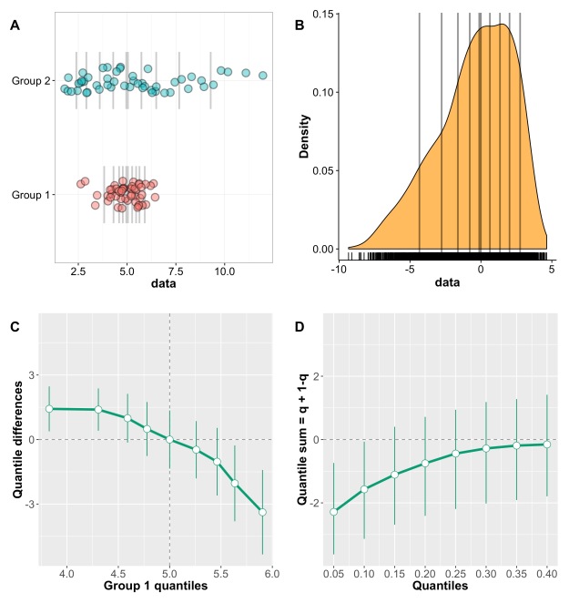
Figure 1. Independent groups: non-uniform shift. A Stripcharts of marginal distributions. Vertical lines mark the deciles, with a thick line for the median. B Kernel density representation of the distribution of difference scores. Vertical lines mark the deciles, with a thick line for the median. C Shift function. Group 1 – group 2 is plotted along the y-axis for each decile (white disks), as a function of group 1 deciles. For each decile difference, the vertical line indicates its 95% bootstrap confidence interval. When a confidence interval does not include zero, the difference is considered significant in a frequentist sense. The 95% confidence intervals are controlled for multiple comparisons. D Difference asymmetry plot with 95% confidence intervals. The family-wise error is controlled by adjusting the critical p values using Hochberg’s method; the confidence intervals are not adjusted.
This discrepancy between tests highlights an important point: if a t-test is not significant, one cannot conclude that the two distributions do not differ. A shift function helps us understand how the two distributions differ (Figure 1C): the overall profile corresponds to two centred distributions that differ in spread; for each decile, we can estimate by how much they differ, and with what uncertainty; finally, the differences appear asymmetric, with larger differences in the right tails.
Is this the end of the story? No, because so far we have only considered Q1, how the two marginal distributions compare. We can get a different but complementary perspective by considering Q2, the typical difference between any member of group 1 and any member of group 2. To address Q2, we compute all the pairwise differences between members of the two groups. In this case each group has n=50, so we end up with 2,500 differences. Figure 1B shows a kernel density representation of these differences. So what does the typical difference looks like? The median of the differences is very near zero, so it seems on average, if we randomly select one observation from each group, they will differ very little. However, the differences can be quite substantial, and with real data we would need to put these differences in context, to understand how large they are, and their physiological/psychological interpretation. The differences are also asymmetrically distributed, with negative skewness: negative scores extend to -10, whereas positive scores don’t even reach +5. This asymmetry relates to our earlier observation of asymmetric differences in the shift function.
Recently, Wilcox (2012) suggested a new approach to quantify asymmetries in difference distributions. To understand his approach, we first need to consider how difference scores are usually characterised. It helps to remember that for continuous distributions, the Mann—Whitney-Wilcoxon U statistics = sum(X>Y) for all pairwise comparisons, i.e. the sum of the number of times observations in group X are larger than observations in group Y. Concretely, to compute U we sum the number of times observations in group X are larger than observations on group Y. This calculation requires to compute all pairwise differences between X and Y, and then count the number of positive differences. So the MWW test assesses P(X>Y) = 0.5. Essentially, the MWW test is a non- parametric test of the hypothesis that the distributions are identical. The MWW test does not compare the medians of the marginal distributions as often stated; also, it estimates the wrong standard error (Cliff, 1996). A more powerful test is Cliff’s delta, which uses P(X>Y) – P(X<Y) as a measure of effect size. As expected, in our current example Cliff’s delta is not significant, because the difference distribution has a median very near zero.
Wilcox’s approach is an extension of the MWW test: the idea is to get a sense of the asymmetry of the difference distribution by computing a sum of quantiles = q + (1-q), for various quantiles estimated using the Harrell-Davis estimator. A percentile bootstrap technique is used to derive confidence intervals. Figure 1D shows the resulting difference asymmetry plot (Wilcox has not given a clear name to that new function, so I made one up). In this plot, 0.05 stands for the sum of quantile 0.05 + quantile 0.95; 0.10 stands for the sum of quantile 0.10 + quantile 0.90; and so on… The approach is not limited to these quantiles, so sparser or denser functions could be tested too. Figure 1D reveals negative sums of the extreme quantiles (0.05 + 0.95), and progressively smaller, converging to zero sums as we get closer to the centre of the distribution. So the q+(1-q) plot suggests that the two groups differ, with maximum differences in the tails, and no significant differences in central tendency. Contrary to the shift function, the q+(1-q) plot let us conclude that the difference distribution is asymmetric, based on the 95% confidence intervals. Other alpha levels can be assessed too.
In the case of two random samples from a normal population, one shifted by a constant compared to the other, the shift function and the difference asymmetry function should be about flat, as illustrated in Figure 2. In this case, because of random sampling and limited sample size, the two approaches provide different perspectives on the results: the shift function suggests a uniform shift, but fails to reject for the three highest deciles; the difference asymmetry function more strongly suggests a uniform shift, with all sums at about the same value. This shows that all estimated pairs of quantiles are asymmetric about zero, because the difference function is uniformly shifted away from zero.
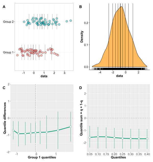
Figure 2. Independent groups: uniform shift. Two random samples of 50 observations were generated using rnorm. A constant of 1 was added to group 2.
When two distributions do not differ, both the shift function and the difference asymmetry function should be about flat and centred around zero – however this is not necessarily the case, as shown in Figure 3.

Figure 3. Independent groups: no shift – example 1. Two random samples of 50 observations were generated using rnorm.
Figure 4 shows another example in which no shift is present, and with n=100 in each group, instead of n=50 in the previous example.

Figure 4. Independent groups: no shift – example 2. Two random samples of 100 observations were generated using rnorm.
In practice, the asymmetry plot will often not be flat. Actually, it took me several attempts to generate two random samples associated with such flat asymmetry plots. So, before getting too excited about your results, it really pays to run a few simulations to get an idea of what random fluctuations can look like. This can’t be stressed enough: you might be looking at noise!
Dependent groups
Wilcox & Erceg-Hurn (2012) described a difference asymmetry function for dependent group. We’re going to apply the technique to the dataset presented in Figure 5. Panel A shows the two marginal distributions. However, we’re dealing with a paired design, so it is impossible to tell how observations are linked between conditions. This association is revealed in two different ways in panels B & C, which demonstrate a striking pattern: for participants with weak scores in condition 1, differences tend to be small and centred about zero; beyond a certain level, with increasing scores in condition 1, the differences get progressively larger. Finally, panel D shows the distribution of differences, which is shifted up from zero, with only 6 out of 35 differences inferior to zero.
At this stage, we’ve learnt a lot about our dataset – certainly much more than would be possible from current standard figures. What else do we need? Statistical tests?! I don’t think they are absolutely necessary. Certainly, providing a t-test is of no interest whatsoever if Figure 5 is provided, because it cannot provide information we already have.

Figure 5. Dependent groups: data visualisation. A Stripcharts of the two distributions. Horizontal lines mark the deciles, with a thick line for the median. B Stripcharts of paired observations. Scatter was introduced along the x axis to reveal overlapping observations. C Scatterplot of paired observations. The diagonal black reference line of no effect has slope one and intercept zero. The dashed grey lines mark the quartiles of the two conditions. In panel C, it would also be useful to plot the pairwise differences as a function of condition 1 results. D Stripchart of difference scores. Horizontal lines mark the deciles, with a thick line for the median.
Figure 6 provides quantifications and visualisations of the effects using the same layout as Figure 5. The shift function (Figure 6C) shows a non-uniform shift between the marginal distributions: the first three deciles do not differ significantly, the remaining deciles do, and there is an overall trend of growing differences as we progress towards the right tails of the distributions. The difference asymmetry function provides a different perspective. The function is positive and almost flat, demonstrating that the distribution of differences is uniformly shifted away from zero, a result that cannot be obtained by only looking at the marginal distributions. Of course, when using means comparing the marginals or assessing the difference scores give the same results, because the difference of the means is the same as the mean of the differences. That’s why a paired t-test is the same as a one-sample test on the pairwise differences. With robust estimators the two approaches differ: for instance the difference between the medians of the marginals is not the same as the median of the differences.

Figure 6. Dependent groups: uniform difference shift. A Stripcharts of marginal distributions. Vertical lines mark the deciles, with a thick line for the median. B Kernel density representation of the distribution of difference scores. Horizontal lines mark the deciles, with a thick line for the median. C Shift function. D Difference asymmetry plot with 95% confidence intervals.
As fancy as Figure 6 can be, it still misses an important point: nowhere do we see the relationship between condition 1 and condition 2 results, as shown in panels B & C of Figure 5. This is why detailed illustrations are absolutely necessary to make sense of even the simplest datasets.
If you want to make more inferences about the distribution of differences, as shown in Figure 6B, Figure 7 shows a complementary description of all the deciles with their 95% confidence intervals. These could be substituted with highest density intervals or credible intervals for instance.

Figure 7. Dependent groups: deciles of the difference distribution. Each disk marks a difference decile, and the horizontal green line makes its 95% percentile bootstrap confidence interval. The reference line of no effect appears as a continuous black line. The dashed black line marks the difference median.
Finally, in Figure 8 we look at an example of a non-uniform difference shift. Essentially, I took the data used in Figure 6, and multiplied the four largest differences by 1.5. Now we see that the 9th decile does not respect the linear progression suggested by previous deciles, (Figure 8, panels A & B), and the difference asymmetry function suggests an asymmetric shift of the difference distribution, with larger discrepancies between extreme quantiles.

Figure 8. Dependent groups: non-uniform difference shift. A Stripchart of difference scores. B Deciles of the difference distribution. C Difference asymmetry function.
Conclusion
The techniques presented here provide a very useful perspective on group differences, by combining detailed illustrations and quantifications of the effects. The different techniques address different questions, so which technique to use depends on the question you want to ask. This choice should be guided by experience: to get a good sense of the behaviour of these techniques will require a lot of practice with various datasets, both real and simulated. If you follow that path, you will soon realise that classic approaches such as t-tests on means combined with bar graphs are far too limited, and can hide rich information about a dataset.
I see three important developments for the approach outlined here:
- to make it Bayesian, or at least p value free using highest density intervals;
-
to extend it to multiple group comparisons (the current illustrations don’t scale up very easily);
-
to extend it to ANOVA type designs with interaction terms.
References
Cliff, N. (1996) Ordinal methods for behavioral data analysis. Erlbaum, Mahwah, N.J.
Wilcox, R.R. (2012a) Introduction to robust estimation and hypothesis testing. Academic Press, San Diego, CA.
Wilcox, R.R. (2012b) Comparing Two Independent Groups Via a Quantile Generalization of the Wilcoxon-Mann-Whitney Test. Journal of Modern Applied Statistical Methods, 11, 296-302.
Wilcox, R.R. & Erceg-Hurn, D.M. (2012) Comparing two dependent groups via quantiles. J Appl Stat, 39, 2655-2664.

Pingback: Problems with small sample sizes | basic statistics
Pingback: How to illustrate a 2×2 mixed ERP design | basic statistics
Pingback: A new shift function for dependent groups? | basic statistics