Tag Archives: dependent groups

Trimmed means

The R code for this post is on github.

Trimmed means are robust estimators of central tendency. To compute a trimmed mean, we remove a predetermined amount of observations on each side of a distribution, and average the remaining observations. If you think you’re not familiar with trimmed means, you already know one famous member of this family: the median. Indeed, the median is an extreme trimmed mean, in which all observations are removed except one or two.

Using trimmed means confers two advantages:

  • trimmed means provide a better estimation of the location of the bulk of the observations than the mean when sampling from asymmetric distributions;
  • the standard error of the trimmed mean is less affected by outliers and asymmetry than the mean, so that tests using trimmed means can have more power than tests using the mean.

Important point: if we use a trimmed mean in an inferential test (see below), we make inferences about the population trimmed mean, not the population mean. The same is true for the median or any other measure of central tendency. So each robust estimator is a tool to answer a specific question, and this is why different estimators can return different answers…

Here is how we compute a 20% trimmed mean.

Let’s consider a sample of 20 observations:

39 92 75 61 45 87 59 51 87 12  8 93 74 16 32 39 87 12 47 50

First we sort them:

8 12 12 16 32 39 39 45 47 50 51 59 61 74 75 87 87 87 92 93

The number of observations to remove is floor(0.2 * 20) = 4. So we trim 4 observations from each end:

(8 12 12 16) 32 39 39 45 47 50 51 59 61 74 75 87 (87 87 92 93)

And we take the mean of the remaining observations, such that our 20% trimmed mean = mean(c(32,39,39,45,47,50,51,59,61,74,75,87)) = 54.92

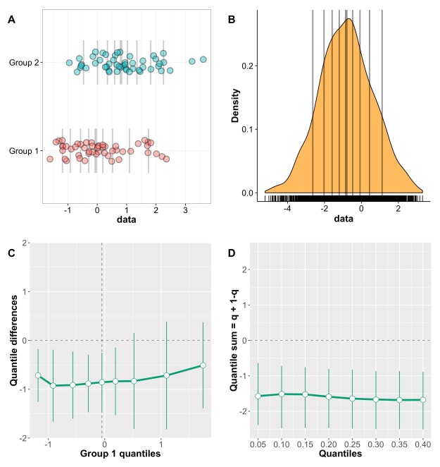
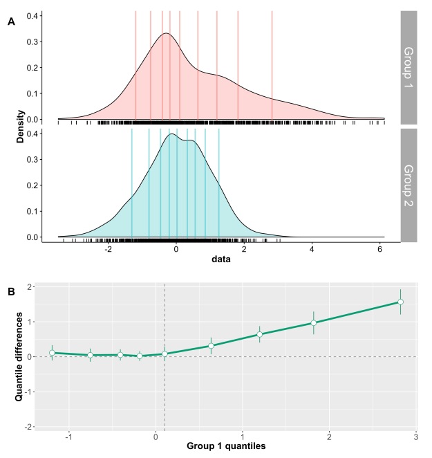
Let’s illustrate the trimming process with a normal distribution and 20% trimming:

normdist

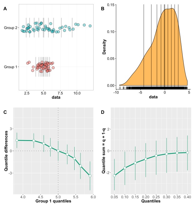
We can see how trimming gets rid of the tails of the distribution, to focus on the bulk of the observations. This behaviour is particularly useful when dealing with skewed distributions, as shown here:

fdist

In this skewed distribution (it’s an F distribution), there is more variability on the right side, which appears as stretched compared to the left side. Because we trim the same amount on each side, trimming removes a longer chunk of the distribution on the right side than the left side. As a consequence, the mean of the remaining points is more representative of the location of the bulk of the observations. This can be seen in the following examples.

figure_tm_demo

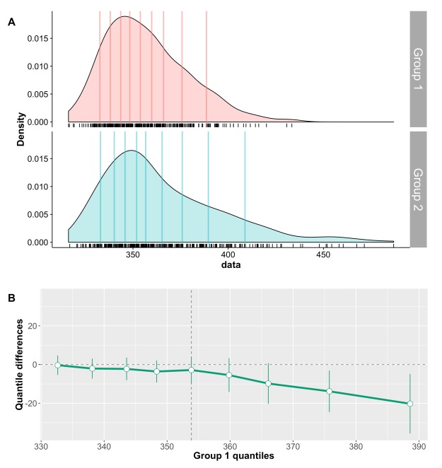
Panel A shows the kernel density estimate of 100 observations sampled from a standard normal distribution (MCT stands for measure of central tendency). By chance, the distribution is not perfectly symmetric, but the mean, 20% trimmed mean and median give very similar estimates, as expected. In panel B, however, the sample is from a lognormal distribution. Because of the asymmetry of the distribution, the mean is dragged towards the right side of the distribution, away from the bulk of the observations. The 20% trimmed mean is to the left of the mean, and the median further to the left, closer to the location of most observations. Thus, for asymmetric distributions, trimmed means provide more accurate information about central tendency than the mean.

**Q: “By trimming, don’t we loose information?”**

I have heard that question over and over. The answer depends on your goal. Statistical methods are only tools to answer specific questions, so it always depends on your goal. I have never met anyone with a true interest in the mean: the mean is always used, implicitly or explicitly, as a tool to indicate the location of the bulk of the observations. Thus, if your goal is to estimate central tendency, then no, trimming doesn’t discard information, it actually increases the quality of the information about central tendency.

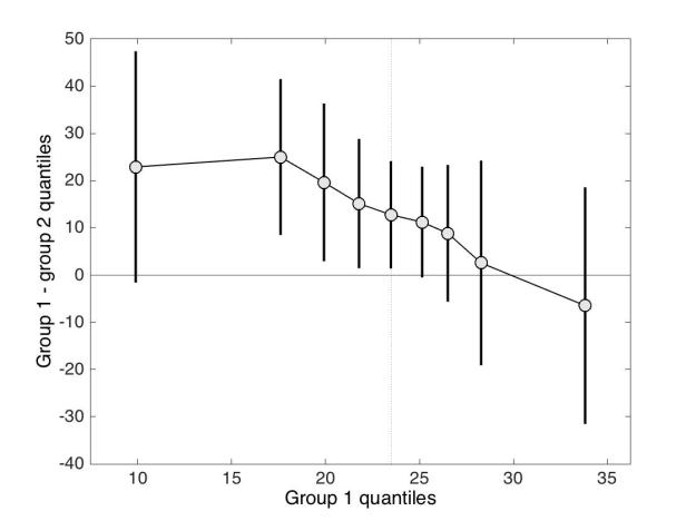
I have also heard that criticism: “I’m interested in the tails of the distributions and that’s why I use the mean, trimming gets rid of them”. Tails certainly have interesting stories to tell, but the mean is absolutely not the tool to study them because it mingles all observations into one value, so we have no way to tell why means differ among samples. If you want to study entire distributions, they are fantastic graphical tools available (Rousselet, Pernet & Wilcox 2017).

Implementation

Base R has trimmed means built in:

mean can be used by changing the trim argument to the desired amount of trimming:

mean(x, trim = 0.2) gives a 20% trimmed mean.

In Matlab, try the tm function available here.

In Python, try the scipy.stats.tmean function. More Python functions are listed here.

Inferences

There are plenty of R functions using trimmed means on Rand Wilcox’s website.

We can use trimmed means instead of means in t-tests. However, the calculation of the standard error is different from the traditional t-test formula. This is because after trimming observations, the remaining observations are no longer independent. The formula for the adjusted standard error was originally proposed by Karen Yuen in 1974, and it involves winsorization. To winsorize a sample, instead of removing observations, we replace them with the remaining extreme values. So in our example, a 20% winsorized sample is:

32 32 32 32 32 39 39 45 47 50 51 59 61 74 75 87 87 87 87 87

Taking the mean of the winsorized sample gives a winsorized mean; taking the variance of the winsorized sample gives a winsorized variance etc. I’ve never seen anyone using winsorized means, however the winsorized variance is used to compute the standard error of the trimmed mean (Yuen 1974). There is also a full mathematical explanation in Wilcox (2012).

You can use all the functions below to make inferences about means too, by setting tr=0. How much trimming to use is an empirical question, depending on the type of distributions you deal with. By default, all functions set tr=0.2, 20% trimming, which has been studied a lot and seems to provide a good compromise. Most functions will return an error with an alternative function suggestion if you set tr=0.5: the standard error calculation is inaccurate for the median and often the only satisfactory solution is to use a percentile bootstrap.

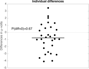
**Q: “With trimmed means, isn’t there a danger of users trying different amounts of trimming and reporting the one that give them significant results?”**

This is indeed a possibility, but dishonesty is a property of the user, not a property of the tool. In fact, trying different amounts of trimming could be very informative about the nature of the effects. Reporting the different results, along with graphical representations, could help provide a more detailed description of the effects.

The Yuen t-test performs better than the t-test on means in many situations. For even better results, Wilcox recommends to use trimmed means with a percentile-t bootstrap or a percentile bootstrap. With small amounts of trimming, the percentile-t bootstrap performs better; with at least 20% trimming, the percentile bootstrap is preferable. Details about these choices are available for instance in Wilcox (2012) and Wilcox & Rousselet (2017).

Yuen’s approach

1-alpha confidence interval for the trimmed mean: trimci(x,tr=.2,alpha=0.05)

Yuen t-test for 2 independent groups: yuen(x,y,tr=.2)

Yuen t-test for 2 dependent groups: yuend(x,y,tr=.2)

Bootstrap percentile-t method

One group: trimcibt(x,tr=.2,alpha=.05,nboot=599)

Two independent groups: yuenbt(x,y,tr=.2,alpha=.05,nboot=599)

Two dependent groups: ydbt(x,y,tr=.2,alpha=.05,nboot=599)

Percentile bootstrap approach

One group: trimpb(x,tr=.2,alpha=.05,nboot=2000)

Two independent groups: trimpb2(x,y,tr=.2,alpha=.05,nboot=2000)

Two dependent groups: dtrimpb(x,y=NULL,alpha=.05,con=0,est=mean)

Matlab

There are some Matlab functions here:

tm – trimmed mean

yuen – t-test for 2 independent groups

yuend – t-test for 2 dependent groups

winvar – winsorized variance

winsample – winsorized sample

wincov – winsorized covariance

These functions can be used with several estimators including  trimmed means:

pb2dg – percentile bootstrap for 2 dependent groups

pb2ig– percentile bootstrap for 2 independent groups

pbci– percentile bootstrap for 1 group

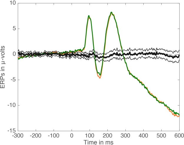
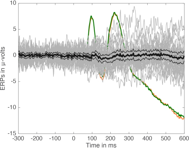
Several functions for trimming large arrays and computing confidence intervals are available in the LIMO EEG toolbox.

References

Karen K. Yuen. The two-sample trimmed t for unequal population variances, Biometrika, Volume 61, Issue 1, 1 April 1974, Pages 165–170, https://doi.org/10.1093/biomet/61.1.165

Rousselet, Guillaume; Pernet, Cyril; Wilcox, Rand (2017): Beyond differences in means: robust graphical methods to compare two groups in neuroscience. figshare. https://doi.org/10.6084/m9.figshare.4055970.v7

Rand R. Wilcox, Guillaume A. Rousselet. A guide to robust statistical methods in neuroscience bioRxiv 151811; doi: https://doi.org/10.1101/151811

Wilcox, R.R. (2012) Introduction to robust estimation and hypothesis testing. Academic Press, San Diego, CA.

Matlab code for the shift function: a powerful tool to compare two entire marginal distributions

Recently, I presented R code for the shift function, a powerful tool to compare two entire marginal distributions.

The Matlab code is now available on github.

shifthd has the same name as its R version, which was originally programmed by Rand Wilcox and first documented in 1995 (see details ). It computes a shift function for independent groups, using a percentile bootstrap estimation of the SE of the quantiles to compute confidence intervals.

shiftdhd is the version for dependent groups.

More recently, Wilcox introduced a new version of the shift function in which a straightforward percentile bootstrap is used to compute the confidence intervals, without estimation of the SE of the quantiles. This is implemented in Matlab as shifthd_pbci for independent groups (equivalent to qcomhd in R); as shiftdhd_pbci for dependent groups (equivalent to Dqcomhd in R).

A demo file shift_function_demo is available here, along with the function shift_fig and dependencies cmu and UnivarScatter.

For instance, if we use the ozone data covered in the previous shift function post, a call to shifthd looks like this:

[xd, yd, delta, deltaCI] = shifthd(control,ozone,200,1);

producing this figure:

figure1

The output of shifthd, or any of the other 3 sf functions, can be used as input into shift_fig:

shift_fig(xd, yd, delta, deltaCI,control,ozone,1,5);

producing this figure:

figure2

This is obviously work in progress, and shift_fig is meant as a starting point.

Have fun exploring how your distributions differ!

And if you have any question, don’t hesitate to get in touch.

A few simple steps to improve the description of neuroscience group results


This post is a draft of an editorial letter I’m writing for the European Journal of Neuroscience. It builds on previous posts on visualisation of behavioural and ERP data.


Update 2016-09-16: the editorial is now accepted:

Rousselet, G. A., Foxe, J. J. and Bolam, J. P. (2016), A few simple steps to improve the description of group results in neuroscience. Eur J Neurosci. Accepted Author Manuscript. doi:10.1111/ejn.13400

The final illustrations are available on Figshare: Rousselet, G.A. (2016): A few simple steps to improve the description of group results in neuroscience. figshare. https://dx.doi.org/10.6084/m9.figshare.3806487


There are many changes necessary to improve the quality of neuroscience research. Suggestions abound to increase openness, promote better experimental designs and analyses, and educate researchers about statistical inferences. These changes are necessary and will take time to implement. As part of this process, here, we would like to propose a few simple steps to improve the assessment of statistical results in neuroscience, by focusing on detailed graphical representations.

Despite a potentially sophisticated experimental design, in a typical neuroscience experiment, raw continuous data tend to undergo drastic simplifications. As a result, it is common for the main results of an article to be summarised in a few figures and a few statistical tests. Unfortunately, graphical representations in many scientific journals, including neuroscience journals, tend to hide underlying distributions, with their excessive use of line and bar graphs (Allen et al., 2012; Weissgerber et al., 2015). This is problematic because common basic summary statistics, such as mean and standard deviation are not robust and do not provide enough information about a distribution, and can thus give misleading impressions about a dataset, particularly for the small sample sizes we are accustomed to in neuroscience (Anscombe, 1973; Wilcox, 2012). As a consequence of poor data representation, there can be a mismatch between the outcome of statistical tests, their interpretations, and the information available in the raw data distributions.

Let’s consider a general and familiar scenario in which observations from two groups of participants are summarised using a bar graph, and compared using a t-test on means. If the p value is inferior to 0.05, we might conclude that we have a significant effect, with one group having larger values than the other one; if the p value is not inferior to 0.05, we might conclude that the two distributions do not differ. What is wrong with this description? In addition to the potentially irrational use of p values (Gigerenzer, 2004; Wagenmakers, 2007; Wetzels et al., 2011), the situation above highlights many caveats in current practices. Indeed, using bar graphs and an arbitrary p<0.05 cut-off turns a potentially rich pattern of results into a simplistic, binary outcome, in which effect sizes and individual differences are ignored. For instance, a more fruitful approach to describing a seemingly significant group effect would be to answer these questions as well:

  • how many participants show an effect in the same direction as the group? It is possible to get significant group effects with very few individual participants showing a significant effect themselves. Actually, with large enough sample sizes you can pretty much guarantee significant group effects (Wagenmakers, 2007);

  • how many participants show no effect, or an effect in the opposite direction as the group?

  • is there a smooth continuum of effects across participants, or can we identify sub-clusters of participants who appear to behave differently from the rest?

  • how large are the individual effects?

These questions can only be answered by using scatterplots or other detailed graphical representations of the results, and by reporting other quantities than the mean and standard deviation of each group. Essentially, a significant t-test is neither necessary nor sufficient to understand how two distributions differ (Wilcox, 2006). And because t-tests and ANOVAs on means are not robust (for instance to skewness & outliers), failure to reach the 0.05 cut-off should not be used to claim that distributions do not differ: first, the lack of significance (p<0.05) is not the same as evidence for the lack of effect (Kruschke, 2013); second, robust statistical tests should be considered (Wilcox, 2012); third, distributions can potentially differ in their left or right tails, but not in their central tendency, for instance when only weaker animals respond to a treatment (Doksum, 1974; Doksum & Sievers, 1976; Wilcox, 2006; Wilcox et al., 2014). Essentially, if an article reports bar graphs and non-significant statistical analyses of the mean, not much can be concluded at all. Without detailed and informative illustrations of the results, it is impossible to tell if the distributions truly do not differ.

Let’s consider the example presented in Figure 1, in which two groups of participants were tested in two conditions (2 independent x 2 dependent factor design). Panel A illustrates the results using a mean +/- SEM bar graph. An ANOVA on these data reveals a non-significant group effect, a significant main effect of condition, and a significant group x condition interaction. Follow-up paired t-tests reveal a significant condition effect in group 1, but not in group 2. These results seem well supported by the bar graph in Figure 1A. Based on this evidence, it is very common to conclude that group 1 is sensitive to the experimental manipulation, but not group 2. The discussion of the article might even pitch the results in more general terms, making claims about the brain in general.

figure1

Figure 1. Different representations of the same behavioural data. Results are in arbitrary units. A Bar graph with mean +/- SEM. B Stripcharts (1D scatterplots) of difference scores. C Stripcharts of linked observations. D Scatterplot of paired observations. The diagonal line has slope 1 and intercept 0. This figure is licensed CC-BY and available on Figshare, along with data and R code to reproduce it (Rousselet 2016a).

Although the scenario just described is very common in the literature, the conclusions are unwarranted. First, the lack of significance (p<0.05) does not necessarily provide evidence for the lack of effect (Wetzels et al., 2011; Kruschke, 2013). Second, without showing the content of the bars, no conclusion should be drawn at all. So let’s look inside the bars. Figure 1B shows the results from the two independent groups: participants in each group were tested in two conditions, so the pairwise differences are illustrated to reveal the effect sizes and their distributions across participants. The data show large individual differences and overlap between the two distributions. In group 2, except for 2 potential outliers showing large negative effects, the remaining observations are within the range observed in group 1. Six participants from group 2 have differences suggesting an effect in the same direction as group 1, two are near zero, three go in the opposite direction. So, clearly, the lack of significant difference in group 2 is not supported by the data: yes group 2 has overall smaller differences than group 1, but if group 1 is used as a control group, then most participants in group 2 appear to have standard effects. Or so it seems, until we explore the nature of the difference scores by visualising paired observations in each group (Figure 1C). In group 1, as already observed, results in condition 2 are overall larger than in condition 1. In addition, participants with larger scores in condition 1 tend to have proportionally larger differences between conditions 1 and 2. Such relationship seems to be absent in group 2, which suggests that the two groups differ not only in the overall sensitivity to the experimental manipulation, but that other factors could be at play in group 1, and not in group 2. Thus, the group differences might actually be much subtler than suggested by our first analyses. The group dichotomy is easier to appreciate in Figure 1D, which shows a scatterplot of the paired observations in the two groups. In group 1, the majority of paired observations are above the unity line, demonstrating an overall group effect; there is also a positive relationship between the scores in condition 2 and the scores in condition 1. Again, no such relationship seems to be present in group 2. In particular, the two larger negative scores in group 2 are not associated with participants who scored particularly high or low in condition 1, giving us no clue as to the origin of these seemingly outlier scores.

At this stage, we’ve learnt a great deal more about our dataset using detailed graphical representations than relying only on a bar graph and an ANOVA. However, we would need many more than n = 11 participants in both groups to quantify the effects and understand how they differ across groups. We have also not exhausted all the representations that could help us make sense of the results. There is also potentially more to the data, because we haven’t considered the full distribution of single-trials/repetitions. For instance, it is very common to summarise a reaction time distribution of potentially hundreds of trials using a single number, which is then used to perform group analyses. An alternative is to study these distributions in each participant, to understand exactly how they differ between conditions. This single-participant approach would be necessary here to understand how the two groups of participants respond to the experimental manipulation.

In sum, there is much more to the data than what we could conclude from the bar graphs and the ANOVA and t-tests. Once bar graphs and their equivalents are replaced by scatterplots (or boxplots etc.) the story can get much more interesting, subtle, convincing, or the opposite… It depends what surprises the bars are holding. Showing scatterplots is the start of a discussion about the nature of the results, an invitation to go beyond the significant vs. non-significant dichotomy. For the particular results presented in Figure 1, it is rather unclear what is gained by the ANOVA at all compared to detailed graphical representations. Instead of blind statistical significance testing, it would of course be beneficial to properly model the data to make predictions (Kuhn & Johnson, 2013), and to allow integration across subsequent experiments and replication attempts – a critical step that requires Bayesian inference (Verhagen & Wagenmakers, 2014).

The problems described so far are not limited to relatively simple one dimensional data: they are present in more complex datasets as well, such as EEG and MEG time-series. For instance, it is common to see EEG and MEG evoked responses illustrated using solely the mean across participants (Figure 2A). Although common, this representation is equivalent to a bar graph without error bars/whiskers, and is therefore unacceptable. At a minimum, some measure of uncertainty should be provided, for instance so-called confidence intervals (Figure 2B). Also, because it can be difficult to mentally subtract two time-courses, it is important to illustrate the time-course of the difference as well (Figure 2C). In particular, showing the difference helps to consider all the data, not just large peaks, to avoid underestimating potentially large effects occurring before or after the main peaks. In addition, Figure 2C illustrates ERP differences for every participant – an ERP version of a scatterplot. This more detailed illustration is essential to allow readers to assess effect sizes, inter-participant differences, and ultimately to interpret significant and non-significant results. For instance, in Figure 2C, there is a non-significant group negative difference 100 ms, and a large positive difference 120 to 280 ms. What do they mean? The individual traces reveal a small number of participants with relatively large differences 100 ms despite the lack of significant group effect, and all participants have a positive difference 120 to 250 ms post-stimulus. There are also large individual differences at most time points. So Figure 2C, although certainly not the ultimate representation, offers a much richer and compelling description than the group averages on their own; Figure 2C also suggests that more detailed group analyses would be beneficial, as well as single-participant analyses (Pernet et al., 2011; Rousselet & Pernet, 2011).

MATLAB Handle Graphics

MATLAB Handle Graphics

Figure 2. Different representations of the same ERP data.  Paired design in which the same participants saw two image categories. A Standard ERP figure showing the mean across participants for two conditions. B Mean ERPs with 95% confidence intervals. The black dots along the x-axis mark time points at which there is a significant paired t-test (p<0.05).  C Time course of the ERP differences. Differences from individual participants are shown in grey. The mean difference is superimposed using a thick black curve. The thinner black curves mark the mean’s 95% confidence interval. This figure is licensed CC-BY and available on Figshare, along with data and Matlab code to reproduce it (Rousselet 2016b).

To conclude, we urge authors, reviewers and editors to promote and implement these guidelines to achieve higher standards in reporting neuroscience research:

  • as much as possible, do not use line and bar graphs; use scatterplots instead, or, if you have large sample sizes, histograms, kernel density plots, or boxplots;

  • for paired designs, show distributions of pairwise differences, so that readers can assess how many comparisons go in the same direction as the group, their size, and their variability; this recommendation also applies to brain imaging data, for instance MEEG and fMRI BOLD time-courses;

  • report how many participants show an effect in the same direction as the group;

  • only draw conclusions about what was assessed: for instance, if you perform a t-test on means, you should only conclude about differences in means, not about group differences in general;

  • don’t use a star system to dichotomise p values: p values do not measure effect sizes or the amount of evidence against or in favour of the null hypothesis (Wagenmakers, 2007);

  • don’t agonise over p values: focus on detailed graphical representations and robust effect sizes instead (Wilcox, 2006; Wickham, 2009; Allen et al., 2012; Wilcox, 2012; Weissgerber et al., 2015);

  • consider Bayesian statistics, to get the tools to align statistical and scientific reasoning (Cohen, 1994; Goodman, 1999; 2016).

Finally, we cannot ignore that using detailed illustrations for potentially complex designs, or designs involving many group comparisons, is not straightforward: research in that direction, including the creation of open-access toolboxes, is of great value to the community, and should be encouraged by funding agencies.

References

Allen, E.A., Erhardt, E.B. & Calhoun, V.D. (2012) Data visualization in the neurosciences: overcoming the curse of dimensionality. Neuron, 74, 603-608.

Anscombe, F.J. (1973) Graphs in Statistical Analysis. Am Stat, 27, 17-21.

Cohen, D. (1994) The earth is round (p<.05). American Psychologist, 49, 997-1003.

Doksum, K. (1974) Empirical Probability Plots and Statistical Inference for Nonlinear Models in the two-Sample Case. Annals of Statistics, 2, 267-277.

Doksum, K.A. & Sievers, G.L. (1976) Plotting with Confidence – Graphical Comparisons of 2 Populations. Biometrika, 63, 421-434.

Gigerenzer, G. (2004) Mindless statistics. Journal of Behavioral and Experimental Economics (formerly The Journal of Socio-Economics), 33, 587-606.

Goodman, S.N. (1999) Toward evidence-based medical statistics. 1: The P value fallacy. Ann Intern Med, 130, 995-1004.

Goodman, S.N. (2016) Aligning statistical and scientific reasoning. Science, 352, 1180-1181.

Kruschke, J.K. (2013) Bayesian estimation supersedes the t test. J Exp Psychol Gen, 142, 573-603.

Kuhn, M. & Johnson, K. (2013) Applied predictive modeling. Springer, New York.

Pernet, C.R., Sajda, P. & Rousselet, G.A. (2011) Single-trial analyses: why bother? Frontiers in psychology, 2, doi: 10.3389-fpsyg.2011.00322.

Rousselet, G.A. & Pernet, C.R. (2011) Quantifying the Time Course of Visual Object Processing Using ERPs: It’s Time to Up the Game. Front Psychol, 2, 107.

Rousselet, G. (2016a). Different representations of the same behavioural data. figshare.
https://dx.doi.org/10.6084/m9.figshare.3504539

Rousselet, G. (2016b). Different representations of the same ERP data. figshare.
https://dx.doi.org/10.6084/m9.figshare.3504566

Verhagen, J. & Wagenmakers, E.J. (2014) Bayesian tests to quantify the result of a replication attempt. J Exp Psychol Gen, 143, 1457-1475.

Wagenmakers, E.J. (2007) A practical solution to the pervasive problems of p values. Psychonomic bulletin & review, 14, 779-804.

Weissgerber, T.L., Milic, N.M., Winham, S.J. & Garovic, V.D. (2015) Beyond bar and line graphs: time for a new data presentation paradigm. PLoS Biol, 13, e1002128.

Wetzels, R., Matzke, D., Lee, M.D., Rouder, J.N., Iverson, G.J. & Wagenmakers, E.J. (2011) Statistical Evidence in Experimental Psychology: An Empirical Comparison Using 855 t Tests. Perspectives on Psychological Science, 6, 291-298.

Wickham, H. (2009) ggplot2 : elegant graphics for data analysis. Springer, New York ; London.

Wilcox, R.R. (2006) Graphical methods for assessing effect size: Some alternatives to Cohen’s d. Journal of Experimental Education, 74, 353-367.

Wilcox, R.R. (2012) Introduction to robust estimation and hypothesis testing. Academic Press, San Diego, CA.

Wilcox, R.R., Erceg-Hurn, D.M., Clark, F. & Carlson, M. (2014) Comparing two independent groups via the lower and upper quantiles. J Stat Comput Sim, 84, 1543-1551.

How to quantify typical differences between distributions

In this post, I describe two complementary lines of enquiry for group comparisons:

(1) How do typical levels compare between groups?

(2.1) for independent groups What is the typical difference between randomly selected members of the two groups?

(2.2) for dependent groups What is the typical pairwise difference?

These two questions can be answered by exploring entire distributions, not just one measure of central tendency.


The R code for this post is available on github, and is based on Rand Wilcox’s WRS R package, with extra visualisation functions written using ggplot2. I will describe Matlab code in another post.


Independent groups

When comparing two independent groups, the typical approach consists in comparing the marginal distributions using a proxy: each distribution is summarised using one value, usually the non-robust mean. The difference between means is then normalised by some measure of variability – usually involving the non-robust variance, in which case we get the usual t-test. There is of course no reason to use only the mean as a measure of central tendency: robust alternatives such as trimmed means and M-estimators are more appropriate in many situations (Wilcox, 2012a). However, whether we compare the means or the medians or the 20% trimmed means of two groups, we focus on one question:

“How does the typical level/participant in one group compares to the typical level/participant in the other group?” Q1

There is no reason to limit our questioning of the data to the average Joe in each distribution: to go beyond differences in central tendency, we can perform systematic group comparisons using shift functions. Nevertheless, shift functions are still based on a comparison of the two marginal distributions, even if a more complete one.

An interesting alternative approach consists in asking:

“What is the typical difference between any member of group 1 and any member of group 2?” Q2

This approach involves computing all the pairwise differences between groups, as covered previously.

Let’s look at an example. Figure 1A illustrates two independent samples. The scatterplots indicate large differences in spread between the two groups, and also suggest larger differences in the right than the left tails of the distributions. The medians of the two groups appear very similar, so the two distributions do not seem to differ in central tendency. In keeping with these observations, a t-test and a Mann-Whitney-Wilcoxon test are non-significant, but a Kolmogorov-Smirnov test is.

typ_diff_fig1_ind

Figure 1. Independent groups: non-uniform shift. A Stripcharts of marginal distributions. Vertical lines mark the deciles, with a thick line for the median. B Kernel density representation of the distribution of difference scores. Vertical lines mark the deciles, with a thick line for the median. C Shift function. Group 1 – group 2 is plotted along the y-axis for each decile (white disks), as a function of group 1 deciles. For each decile difference, the vertical line indicates its 95% bootstrap confidence interval. When a confidence interval does not include zero, the difference is considered significant in a frequentist sense. The 95% confidence intervals are controlled for multiple comparisons. D Difference asymmetry plot with 95% confidence intervals. The family-wise error is controlled by adjusting the critical p values using Hochberg’s method; the confidence intervals are not adjusted.

This discrepancy between tests highlights an important point: if a t-test is not significant, one cannot conclude that the two distributions do not differ. A shift function helps us understand how the two distributions differ (Figure 1C): the overall profile corresponds to two centred distributions that differ in spread; for each decile, we can estimate by how much they differ, and with what uncertainty; finally, the differences appear asymmetric, with larger differences in the right tails.

Is this the end of the story? No, because so far we have only considered Q1, how the two marginal distributions compare. We can get a different but complementary perspective by considering Q2, the typical difference between any member of group 1 and any member of group 2. To address Q2, we compute all the pairwise differences between members of the two groups. In this case each group has n=50, so we end up with 2,500 differences. Figure 1B shows a kernel density representation of these differences. So what does the typical difference looks like? The median of the differences is very near zero, so it seems on average, if we randomly select one observation from each group, they will differ very little. However, the differences can be quite substantial, and with real data we would need to put these differences in context, to understand how large they are, and their physiological/psychological interpretation. The differences are also asymmetrically distributed, with negative skewness: negative scores extend to -10, whereas positive scores don’t even reach +5. This asymmetry relates to our earlier observation of asymmetric differences in the shift function.

Recently, Wilcox (2012) suggested a new approach to quantify asymmetries in difference distributions. To understand his approach, we first need to consider how difference scores are usually characterised. It helps to remember that for continuous distributions, the Mann—Whitney-Wilcoxon U statistics = sum(X>Y) for all pairwise comparisons, i.e. the sum of the number of times observations in group X are larger than observations in group Y. Concretely, to compute U we sum the number of times observations in group X are larger than observations on group Y. This calculation requires to compute all pairwise differences between X and Y, and then count the number of positive differences. So the MWW test assesses P(X>Y) = 0.5. Essentially, the MWW test is a non- parametric test of the hypothesis that the distributions are identical. The MWW test does not compare the medians of the marginal distributions as often stated; also, it estimates the wrong standard error (Cliff, 1996). A more powerful test is Cliff’s delta, which uses P(X>Y) – P(X<Y) as a measure of effect size. As expected, in our current example Cliff’s delta is not significant, because the difference distribution has a median very near zero.

Wilcox’s approach is an extension of the MWW test: the idea is to get a sense of the asymmetry of the difference distribution by computing a sum of quantiles = q + (1-q), for various quantiles estimated using the Harrell-Davis estimator. A percentile bootstrap technique is used to derive confidence intervals. Figure 1D shows the resulting difference asymmetry plot  (Wilcox has not given a clear name to that new function, so I made one up). In this plot, 0.05 stands for the sum of quantile 0.05 + quantile 0.95; 0.10 stands for the sum of quantile 0.10 + quantile 0.90; and so on… The approach is not limited to these quantiles, so sparser or denser functions could be tested too. Figure 1D reveals negative sums of the extreme quantiles (0.05 + 0.95), and progressively smaller, converging to zero sums as we get closer to the centre of the distribution. So the q+(1-q) plot suggests that the two groups differ, with maximum differences in the tails, and no significant differences in central tendency. Contrary to the shift function, the q+(1-q) plot let us conclude that the difference distribution is asymmetric, based on the 95% confidence intervals. Other alpha levels can be assessed too.

In the case of two random samples from a normal population, one shifted by a constant compared to the other, the shift function and the difference asymmetry function should be about flat, as illustrated in Figure 2. In this case, because of random sampling and limited sample size, the two approaches provide different perspectives on the results: the shift function suggests a uniform shift, but fails to reject for the three highest deciles; the difference asymmetry function more strongly suggests a uniform shift, with all sums at about the same value. This shows that all estimated pairs of quantiles are asymmetric about zero, because the difference function is uniformly shifted away from zero.

typ_diff_fig2_ind_linear_effect

Figure 2. Independent groups: uniform shift. Two random samples of 50 observations were generated using rnorm. A constant of 1 was added to group 2.

When two distributions do not differ, both the shift function and the difference asymmetry function should be about flat and centred around zero – however this is not necessarily the case, as shown in Figure 3.

typ_diff_fig3_ind_no_effect

Figure 3. Independent groups: no shift – example 1. Two random samples of 50 observations were generated using rnorm.

Figure 4 shows another example in which no shift is present, and with n=100 in each group, instead of n=50 in the previous example.

typ_diff_fig4_ind_no_effect2

Figure 4. Independent groups: no shift – example 2.  Two random samples of 100 observations were generated using rnorm.

In practice, the asymmetry plot will often not be flat. Actually, it took me several attempts to generate two random samples associated with such flat asymmetry plots. So, before getting too excited about your results, it really pays to run a few simulations to get an idea of what random fluctuations can look like. This can’t be stressed enough: you might be looking at noise!

Dependent groups

Wilcox & Erceg-Hurn (2012) described a difference asymmetry function for dependent group. We’re going to apply the technique to the dataset presented in Figure 5. Panel A shows the two marginal distributions. However, we’re dealing with a paired design, so it is impossible to tell how observations are linked between conditions. This association is revealed in two different ways in panels B & C, which demonstrate a striking pattern: for participants with weak scores in condition 1, differences tend to be small and centred about zero; beyond a certain level, with increasing scores in condition 1, the differences get progressively larger. Finally, panel D shows the distribution of differences, which is shifted up from zero, with only 6 out of 35 differences inferior to zero.

At this stage, we’ve learnt a lot about our dataset – certainly much more than would be possible from current standard figures. What else do we need? Statistical tests?! I don’t think they are absolutely necessary. Certainly, providing a t-test is of no interest whatsoever if Figure 5 is provided, because it cannot provide information we already have.

typ_diff_fig5_dep1

Figure 5. Dependent groups: data visualisation. A Stripcharts of the two distributions. Horizontal lines mark the deciles, with a thick line for the median. B Stripcharts of paired observations. Scatter was introduced along the x axis to reveal overlapping observations. C Scatterplot of paired observations. The diagonal black reference line of no effect has slope one and intercept zero. The dashed grey lines mark the quartiles of the two conditions. In panel C, it would also be useful to plot the pairwise differences as a function of condition 1 results. D Stripchart of difference scores. Horizontal lines mark the deciles, with a thick line for the median.

Figure 6 provides quantifications and visualisations of the effects using the same layout as Figure 5. The shift function (Figure 6C) shows a non-uniform shift between the marginal distributions: the first three deciles do not differ significantly, the remaining deciles do, and there is an overall trend of growing differences as we progress towards the right tails of the distributions. The difference asymmetry function provides a different perspective. The function is positive and almost flat, demonstrating that the distribution of differences is uniformly shifted away from zero, a result that cannot be obtained by only looking at the marginal distributions. Of course, when using means comparing the marginals or assessing the difference scores give the same results, because the difference of the means is the same as the mean of the differences. That’s why a paired t-test is the same as a one-sample test on the pairwise differences. With robust estimators the two approaches differ: for instance the difference between the medians of the marginals is not the same as the median of the differences.

typ_diff_fig6_dep2

Figure 6. Dependent groups: uniform difference shift. A Stripcharts of marginal distributions. Vertical lines mark the deciles, with a thick line for the median. B Kernel density representation of the distribution of difference scores. Horizontal lines mark the deciles, with a thick line for the median. C Shift function. D Difference asymmetry plot with 95% confidence intervals.

As fancy as Figure 6 can be, it still misses an important point: nowhere do we see the relationship between condition 1 and condition 2 results, as shown in panels B & C of Figure 5. This is why detailed illustrations are absolutely necessary to make sense of even the simplest datasets.

If you want to make more inferences about the distribution of differences, as shown in Figure 6B, Figure 7 shows a complementary description of all the deciles with their 95% confidence intervals. These could be substituted with highest density intervals or credible intervals for instance.

typ_diff_fig7_dep3_decile_plot

Figure 7. Dependent groups: deciles of the difference distribution. Each disk marks a difference decile, and the horizontal green line makes its 95% percentile bootstrap confidence interval. The reference line of no effect appears as a continuous black line. The dashed black line marks the difference median.

Finally, in Figure 8 we look at an example of a non-uniform difference shift. Essentially, I took the data used in Figure 6, and multiplied the four largest differences by 1.5. Now we see that the 9th decile does not respect the linear progression suggested by previous deciles, (Figure 8, panels A & B), and the difference asymmetry function suggests an asymmetric shift of the difference distribution, with larger discrepancies between extreme quantiles.

typ_diff_fig8_dep4_larger_diff

Figure 8. Dependent groups: non-uniform difference shift. A Stripchart of difference scores. B Deciles of the difference distribution. C Difference asymmetry function.

Conclusion

The techniques presented here provide a very useful perspective on group differences, by combining detailed illustrations and quantifications of the effects. The different techniques address different questions, so which technique to use depends on the question you want to ask. This choice should be guided by experience: to get a good sense of the behaviour of these techniques will require a lot of practice with various datasets, both real and simulated. If you follow that path, you will soon realise that classic approaches such as t-tests on means combined with bar graphs are far too limited, and can hide rich information about a dataset.

I see three important developments for the approach outlined here:

  • to make it Bayesian, or at least p value free using highest density intervals;

  • to extend it to multiple group comparisons (the current illustrations don’t scale up very easily);

  • to extend it to ANOVA type designs with interaction terms.

References

Cliff, N. (1996) Ordinal methods for behavioral data analysis. Erlbaum, Mahwah, N.J.

Wilcox, R.R. (2012a) Introduction to robust estimation and hypothesis testing. Academic Press, San Diego, CA.

Wilcox, R.R. (2012b) Comparing Two Independent Groups Via a Quantile Generalization of the Wilcoxon-Mann-Whitney Test. Journal of Modern Applied Statistical Methods, 11, 296-302.

Wilcox, R.R. & Erceg-Hurn, D.M. (2012) Comparing two dependent groups via quantiles. J Appl Stat, 39, 2655-2664.

the shift function: a powerful tool to compare two entire distributions


The R code for this post is available on github, and is based on Rand Wilcox’s WRS R package, with extra visualisation functions written using ggplot2. The R code for the 2013 percentile bootstrap version of the shift function was also covered here and here. Matlab code is described in another post.


UPDATE: The shift function and its cousin the difference asymmetry function are described in a review article with many examples. And a Bayesian shift function is now available! The hierarchical shift function provides a powerful alternative to the t-test.


In neuroscience & psychology, group comparison is usually an exercise that involves comparing two typical observations. This is most of the time achieved using a t-test on means. This standard procedure makes very strong assumptions:

  • the distributions differ only in central tendency, not in other aspects;
  • the typical observation in each distribution can be summarised by the mean;
  • the t-test is sufficient to detect changes in location.

As we saw previously, t-tests on means are not robust. In addition, there is no reason a priori to assume that two distributions differ only in the location of the bulk of the observations. Effects can occur in the tails of the distributions too: for instance a particular intervention could have an effect only in animals with a certain hormonal level at baseline; a drug could help participants with severe symptoms, but not others with milder symptoms… Because effects are not necessarily homogenous among participants, it is useful to have appropriate tools at hand, to determine how, and by how much, two distributions differ. Here we’re going to consider a powerful family of tools that are robust and let us compare entire distributions: shift functions.

A more systematic way to characterise how two independent distributions differ was originally proposed by Doksum (Doksum, 1974; Doksum & Sievers, 1976; Doksum, 1977): to plot the difference between the quantiles of two distributions as a function of the quantiles of one group. The original shift function approach is implemented in the functions sband and wband in Rand Wilcox’s WRS R package.

In 1995, Wilcox proposed an alternative technique which has better probability coverage and potentially more power than Doksum & Sievers’ approach. Wilcox’s technique:

  • uses the Harrell-Davis quantile estimator;
  • computes confidence intervals of the decile differences with a bootstrap estimation of the standard error of the deciles;
  • controls for multiple comparisons so that the type I error rate remains around 0.05 across the 9 confidence intervals. This means that the confidence intervals are a bit larger than what they would be if only one decile was compared, so that the long-run probability of a type I error across all 9 comparisons remains near 0.05;
  • is implemented in the shifthd function.

Let’s start with an extreme and probably unusual example, in which two distributions differ in spread, not in location (Figure 1). In that case, any test of central tendency will fail to reject, but it would be wrong to conclude that the two distributions do not differ. In fact, a Kolmogorov-Smirnov test reveals a significant effect, and several measures of effect sizes would suggest non-trivial effects. However, a significant KS test just tells us that the two distributions differ, not how.

shift_function_ex1_arrows

Figure 1. Two distributions that differ in spread A Kernel density estimates for the groups. B Shift function. Group 1 – group 2 is plotted along the y-axis for each decile (white disks), as a function of group 1 deciles. For each decile difference, the vertical line indicates its 95% bootstrap confidence interval. When a confidence interval does not include zero, the difference is considered significant in a frequentist sense.

The shift function can help us understand and quantify how the two distributions differ. The shift function describes how one distribution should be re-arranged to match the other one: it estimates how and by how much one distribution must be shifted. In Figure 1, I’ve added annotations to help understand the link between the KDE in panel A and the shift function in panel B. The shift function shows the decile differences between group 1 and group 2, as a function of group 1 deciles. The deciles for each group are marked by coloured vertical lines in panel A. The first decile of group 1 is slightly under 5, which can be read in the top KDE of panel A, and on the x-axis of panel B. The first decile of group 2 is lower. As a result, the first decile difference between group 1 and group 2 is positive, as indicated by a positive value around 0.75 in panel B, as marked by an upward arrow and a + symbol. The same symbol appears in panel A, linking the deciles from the two groups: it shows that to match the first deciles, group 2’s first decile needs to be shifted up. Deciles 2, 3 & 4 show the same pattern, but with progressively weaker effect sizes. Decile 5 is well centred, suggesting that the two distributions do not differ in central tendency. As we move away from the median, we observe progressively larger negative differences, indicating that to match the right tails of the two groups, group 2 needs to be shifted to the left, towards smaller values – hence the negative sign.

To get a good understanding of the shift function, let’s look at its behaviour in several other clear-cut situations. First, let’s consider a  situation in which two distributions differ in location (Figure 2). In that case, a t-test is significant, but again, it’s not the full story. The shift function looks like this:

shift_function_ex2_complete

Figure 2. Complete shift between two distributions

What’s happening? All the differences between deciles are negative and around -0.45. Wilcox (2012) defines such systematic effect has the hallmark of a completely effective method. In other words, there is a complete and seemingly uniform shift between the two distributions.

In the next example (Figure 3), only the right tails differ, which is captured by significant differences for deciles 6 to 9. This is a case described by Wilcox (2012) as involving a partially effective experimental manipulation.

shift_function_ex3_onesided1

Figure 3. Positive right tail shift

Figure 4 also shows a right tail shift, this time in the negative direction. I’ve also scaled the distributions so they look a bit like reaction time distributions. It would be much more informative to use shift functions in individual participants to study how RT distributions differ between conditions, instead of summarising each distribution by its mean (sigh)!

shift_function_ex4_onesided2

Figure 4. Negative right tail shift

Figure 5 shows two large samples drawn from a standard normal population. As expected, the shift function suggests that we do not have enough evidence to conclude that the two distributions differ. The shift function does look bumpy tough, potentially suggesting local differences – so keep that in mind when you plug-in your own data.

shift_function_ex5_nochange

Figure 5. No difference?

And be careful not to over-interpret the shift function: the lack of significant differences should not be used to conclude that we have evidence for the lack of effect; indeed, failure to reject in the frequentist sense can still be associated with non-trivial evidence against the null – it depends on prior results (Wagenmakers, 2007).

So far, we’ve looked at simulated examples involving large sample sizes. We now turn to a few real-data examples.

Doksum & Sievers (1976) describe an example in which two groups of rats were kept in an environment with or without ozone for 7 days and their weight gains measured (Figure 6). The shift function suggests two results: overall, ozone reduces weight gain; ozone might promote larger weight gains in animals gaining the most weight. However, these conclusions are only tentative given the small sample size, which explains the large confidence intervals.

shift_function_ex6_ozone

Figure 6. Weight gains A Because the sample sizes are much smaller than in the previous examples, the distributions are illustrated using 1D scatterplots. The deciles are marked by grey vertical lines, with lines for the 0.5 quantiles. B Shift function.

Let’s consider another example used in (Doksum, 1974; Doksum, 1977), concerning the survival time in days of 107 control guinea pigs and 61 guinea pigs treated with a heavy dose of tubercle bacilli (Figure 7). Relative to controls, the animals that died the earliest tended to live longer in the treatment group, suggesting that the treatment was beneficial to the weaker animals (decile 1). However, the treatment was harmful to animals with control survival times larger than about 200 days (deciles 4-9). Thus, this is a case where the treatment has very different effects on different animals. As noted by Doksum, the same experiment was actually performed 4 times, each time giving similar results.

shift_function_ex7_guineapigs

Figure 7. Survival time

Shift function for dependent groups

All the previous examples were concerned with independent groups. There is a version of the shift function for dependent groups implemented in shiftdhd. We’re going to apply it to ERP onsets from an object detection task (Bieniek et al., 2015). In that study, 74 of our 120 participants were tested twice, to assess the test-retest reliability of different measurements, including onsets. Typically, test-retest assessment is performed using a correlation. However, we care about the units (ms), which a correlation would get rid of, and we had a more specific hypothesis, which a correlation cannot test; so we used a shift function (Figure 8). If you look at the distributions of onsets across participants, you will see that it is overall positively skewed, and with a few participants with particularly early or late onsets. With the shift function, we wanted to test for the overall reliability of the results, but also in particular the reliability of the left and right tails: if early onsets in session 1 were due to chance, we would expect session 2 estimates to be overall larger (shifted to the right); similarly, if late onsets in session 1 were due to chance, we would expect session 2 estimates to be overall smaller (shifted to the left). The shift function does not provide enough evidence to suggest a uniform or non-uniform shift – but we would probably need many more observations to make a strong claim.

shift_function_ex8_onsets

Figure 8. ERP onsets

Because we’re dealing with a paired design, the illustration of the marginal distributions in Figure 8 is insufficient: we should illustrate the distribution of pairwise differences too, as shown in Figure 9.

shift_function_ex9_onsets_diff

Figure 9. ERP onsets with KDE of pairwise differences

Figure 10 provides an alternative representation of the distribution of pairwise differences using a violin plot.

shift_function_ex10_onsets_diff_violin

Figure 10. ERP onsets with violin plot of pairwise differences

Figure 11 uses a 1D scatterplot (strip chart).

shift_function_ex11_onsets_diff_scatter

Figure 11. ERP onsets with 1D scatterplot of pairwise differences

Shift function for other quantiles

Although powerful, Wilcox’s 1995 technique is not perfect, because it:

  • is limited to the deciles;
  • can only be used with alpha = 0.05;
  • does not work well with tied values.

More recently, Wilcox’s proposed a new version of the shift function that uses a straightforward percentile bootstrap (Wilcox & Erceg-Hurn, 2012; Wilcox et al., 2014). This new approach:

  • allows tied values;
  • can be applied to any quantile;
  • can have more power when looking at extreme quantiles (<=0.1, or >=0.9).
  • is implemented in qcomhd for independent groups;
  • is implemented in Dqcomhd for dependent groups.

Examples are provided in the R script for this post.

In the percentile bootstrap version of the shift function, p values are corrected, but not the confidence intervals. For dependent variables, Wilcox & Erceg-Hurn (2012) recommend at least 30 observations to compare the .1 or .9 quantiles. To compare the quartiles, 20 observations appear to be sufficient. For independent variables, Wilcox et al. (2014) make the same recommendations made for dependent groups; in addition, to compare the .95 quantiles, they suggest at least 50 observations per group.

Conclusion

The shift function is a powerful tool that can help you better understand how two distributions differ, and by how much. It provides much more information than the standard t-test approach.

Although currently the shift function only applies to two groups, it can in theory be extended to more complex designs, for instance to quantify interaction effects.

Finally, it would be valuable to make a Bayesian version of the shift function, to focus on effect sizes, model the data, and integrate them with other results.

References

Bieniek, M.M., Bennett, P.J., Sekuler, A.B. & Rousselet, G.A. (2015) A robust and representative lower bound on object processing speed in humans. The European journal of neuroscience.

Doksum, K. (1974) Empirical Probability Plots and Statistical Inference for Nonlinear Models in the two-Sample Case. Annals of Statistics, 2, 267-277.

Doksum, K.A. (1977) Some graphical methods in statistics. A review and some extensions. Statistica Neerlandica, 31, 53-68.

Doksum, K.A. & Sievers, G.L. (1976) Plotting with Confidence – Graphical Comparisons of 2 Populations. Biometrika, 63, 421-434.

Wagenmakers, E.J. (2007) A practical solution to the pervasive problems of p values. Psychonomic bulletin & review, 14, 779-804.

Wilcox, R.R. (1995) Comparing Two Independent Groups Via Multiple Quantiles. Journal of the Royal Statistical Society. Series D (The Statistician), 44, 91-99.

Wilcox, R.R. (2012) Introduction to robust estimation and hypothesis testing. Academic Press, Amsterdam; Boston.

Wilcox, R.R. & Erceg-Hurn, D.M. (2012) Comparing two dependent groups via quantiles. J Appl Stat, 39, 2655-2664.

Wilcox, R.R., Erceg-Hurn, D.M., Clark, F. & Carlson, M. (2014) Comparing two independent groups via the lower and upper quantiles. J Stat Comput Sim, 84, 1543-1551.

How to chase ERP monsters hiding behind bars

I think detailed and informative illustrations of results is the most important step in the statistical analysis process, whether we’re looking at a single distribution, comparing groups, or dealing with more complex brain imaging data. Without careful illustrations, it can be difficult, sometimes impossible, to understand our results and to convey them to an audience. Yet, from specialty journals to Science & Nature, the norm is still to hide rich distributions behind bar graphs or one of their equivalents. For instance, in ERP (event-related potential) research, the equivalent of a bar graph looks like this:

figure1

Figure 1. ERP averages in 2 conditions. Paired design, n=30, cute little red star indicates p<0.05.

All the figures in this post can be reproduced using Matlab code available on github.

Figure 1 is very much standard in the field. It comes with a little star to attract your attention to one time point that has reached the magic p<0.05 threshold. Often, the ERP figure will be complemented with a bar graph:

figure1b

Figure 1b. Bar graph of means +/- SEM for conditions 1 & 2.

Ok, what’s wrong with this picture? You might argue that the difference is small, and that the statistical tests have probably not been corrected for multiple comparisons. And in many cases, you would be right. But many ERP folks would reply that because they focus their analyses on peaks, they do not need to correct for multiple comparisons. Well, unless you have a clear hypothesis for each peak, then you should at least correct for the number of peaks or time windows of interest tested if you’re willing to flag any effect p<0.05. I would also add that looking at peaks is wasteful and defeats the purpose of using EEG: it is much more informative to map the full time-course of the effects across all sensors, instead of throwing valuable data away (Rousselet & Pernet, 2011).

Another problem with Figure 1 is the difficulty in mentally subtracting two time-courses, which can lead to underestimating differences occurring between peaks. So, in the next figure, we show the mean difference as well:

figure2

Figure 2. Mean ERPs + mean difference. The black vertical line marks the time of the largest absolute difference between conditions.

Indeed, there is a modest bump in the difference time-course around the time of the significant effect marked by the little star. The effect looks actually more sustained than it appears by just looking at the time-courses of the two original conditions – so we learn something by looking at the difference time-course. The effect is much easier to interpret by adding some measure of accuracy, for instance a 95% confidence interval:

figure3

Figure 3. Mean ERPs + mean difference + confidence interval.

We could also show confidence intervals for condition 1 and condition 2 mean ERPs, but we are primarily interested in how they differ, so the focus should be on the difference. Figure 3 reveals that the significant effect is associated with a confidence interval only very slightly off the zero mark. Although p<0.05, the confidence interval suggests a weak effect, and Bayesian estimation might actually suggest no evidence against the null (Wetzels et al. 2011). And this is why the focus should be on robust effect sizes and their illustration, instead of binary outcomes resulting from the application of arbitrary thresholds. How do we proceed in this case? A simple measure of effect size is to report the difference, which in our case can be illustrated by showing the time-course of the difference for every participant (see a nice example in Kovalenko et al. 2012). And what’s lurking under the hood here? Monsters?

figure4

Figure 4. Mean ERPs + mean difference + confidence interval + individual differences.

Yep, it’s a mess of spaghetti monsters!

After contemplating a figure like that, I would be very cautious about my interpretation of the results. For instance, I would try to put the results into context, looking carefully at effect sizes and how they compare to other manipulations, etc. I would also be very tempted to run a replication of the experiment. This can be done in certain experimental situations on the same participants, to see if effect sizes are similar across sessions (Bieniek et al. 2015). But I would certainly not publish a paper making big claims out of these results, just because p<0.05.

So what can we say about the results? If we look more closely at the distribution of differences at the time of the largest group difference (marked by a vertical line in Figure 2), we can make another observation:

figure5

Figure 5. Distribution of individual differences at the time of the maximum absolute group difference.

About 2/3 of participants show an effect in the same direction as the group effect (difference < 0). So, in addition to the group effect, there are large individual differences. This is not surprising. What is surprising is the usual lack of consideration for individual differences in most neuroscience & psychology papers I have come across. Typically, results portrayed in Figure 1 would be presented like this:

“We measured our favourite peak in two conditions. It was larger in condition 1 than in condition 2 (p<0.05), as predicted by our hypothesis. Therefore, when subjected to condition 1, our brains process (INSERT FAVOURITE STIMULUS, e.g. faces) more (INSERT FAVOURITE PROCESS, e.g. holistically).”

Not only this is a case of bad reverse inference, it is also inappropriate to generalise the effect to the entire human population, or even to all participants in the sample – 1/3 showed an effect in the opposite direction after all. Discrepancies between group statistics and single-participant statistics are not unheard of, if you dare to look (Rousselet et al. 2011).

Certainly, more subtle and honest data description would go a long way towards getting rid of big claims, ghost effects and dodgy headlines. But how many ERP papers have you ever seen with figures such as Figure 4 and Figure 5? How many papers contain monsters behind bars? Certainly, “my software does not have that option” doesn’t cut it; these figures are easy to make in Matlab, R or Python. If you don’t know how, ask a colleague, post questions on online forums, there are plenty of folks eager to help. For Matlab code, you could start here for instance.

Now: the final blow. The original ERP data used for this post are real and have huge effect sizes (check Figure A2 here for instance). However, the effect marked by a little star in Figure 1 is a false positive: there are no real effects in this dataset! The current data were generated by sampling trials with replacement from a pool of 7680 trials, to which pink noise was added, to create 30 fake participants and 2 fake conditions. I ran the fake data making process several times and selected the version that gave me a significant peak difference, because, you know, I love peaks. So yes, we’ve been looking at noise all along. And I’m sure there is plenty of noise out there in published papers. But it is very difficult to tell, because standard ERP figures are so poor.

How do we fix this?

  • make detailed, honest figures of your effects;
  • post your data to an online repository for other people to scrutinise them;
  • conclude honestly about what you’ve measured (e.g. “I only analyse the mean, I don’t know how other aspects of the distributions behave”), without unwarranted generalisation (“1/3 of my participants did not show the group effect”);
  • replicate new effects;
  • report p values if you want, but do not obsess over the 0.05 threshold, it is arbitrary, and continuous distributions should not be dichotomised (MacCallum et al. 2002);
  • focus on effect sizes.

References

Bieniek, M.M., Bennett, P.J., Sekuler, A.B. & Rousselet, G.A. (2015) A robust and representative lower bound on object processing speed in humans. The European journal of neuroscience.

Kovalenko, L.Y., Chaumon, M. & Busch, N.A. (2012) A pool of pairs of related objects (POPORO) for investigating visual semantic integration: behavioral and electrophysiological validation. Brain Topogr, 25, 272-284.

MacCallum RC, Zhang S, Preacher KJ, Rucker DD. 2002. On the practice of dichotomization of quantitative variables. Psychological Methods 7: 19-40

Rousselet, G.A. & Pernet, C.R. (2011) Quantifying the Time Course of Visual Object Processing Using ERPs: It’s Time to Up the Game. Front Psychol, 2, 107.

Rousselet, G.A., Gaspar, C.M., Wieczorek, K.P. & Pernet, C.R. (2011) Modeling Single-Trial ERP Reveals Modulation of Bottom-Up Face Visual Processing by Top-Down Task Constraints (in Some Subjects). Front Psychol, 2, 137.

Wetzels, R., Matzke, D., Lee, M.D., Rouder, J.N., Iverson, G.J. & Wagenmakers, E.J. (2011) Statistical Evidence in Experimental Psychology: An Empirical Comparison Using 855 t Tests. Perspectives on Psychological Science, 6, 291-298.