I think detailed and informative illustrations of results is the most important step in the statistical analysis process, whether we’re looking at a single distribution, comparing groups, or dealing with more complex brain imaging data. Without careful illustrations, it can be difficult, sometimes impossible, to understand our results and to convey them to an audience. Yet, from specialty journals to Science & Nature, the norm is still to hide rich distributions behind bar graphs or one of their equivalents. For instance, in ERP (event-related potential) research, the equivalent of a bar graph looks like this:
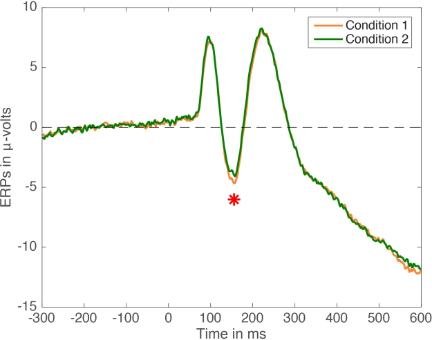
Figure 1. ERP averages in 2 conditions. Paired design, n=30, cute little red star indicates p<0.05.
All the figures in this post can be reproduced using Matlab code available on github.
Figure 1 is very much standard in the field. It comes with a little star to attract your attention to one time point that has reached the magic p<0.05 threshold. Often, the ERP figure will be complemented with a bar graph:
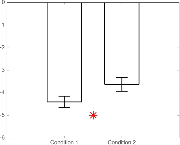
Figure 1b. Bar graph of means +/- SEM for conditions 1 & 2.
Ok, what’s wrong with this picture? You might argue that the difference is small, and that the statistical tests have probably not been corrected for multiple comparisons. And in many cases, you would be right. But many ERP folks would reply that because they focus their analyses on peaks, they do not need to correct for multiple comparisons. Well, unless you have a clear hypothesis for each peak, then you should at least correct for the number of peaks or time windows of interest tested if you’re willing to flag any effect p<0.05. I would also add that looking at peaks is wasteful and defeats the purpose of using EEG: it is much more informative to map the full time-course of the effects across all sensors, instead of throwing valuable data away (Rousselet & Pernet, 2011).
Another problem with Figure 1 is the difficulty in mentally subtracting two time-courses, which can lead to underestimating differences occurring between peaks. So, in the next figure, we show the mean difference as well:
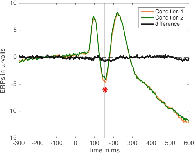
Figure 2. Mean ERPs + mean difference. The black vertical line marks the time of the largest absolute difference between conditions.
Indeed, there is a modest bump in the difference time-course around the time of the significant effect marked by the little star. The effect looks actually more sustained than it appears by just looking at the time-courses of the two original conditions – so we learn something by looking at the difference time-course. The effect is much easier to interpret by adding some measure of accuracy, for instance a 95% confidence interval:
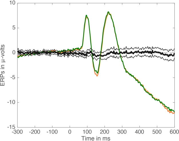
Figure 3. Mean ERPs + mean difference + confidence interval.
We could also show confidence intervals for condition 1 and condition 2 mean ERPs, but we are primarily interested in how they differ, so the focus should be on the difference. Figure 3 reveals that the significant effect is associated with a confidence interval only very slightly off the zero mark. Although p<0.05, the confidence interval suggests a weak effect, and Bayesian estimation might actually suggest no evidence against the null (Wetzels et al. 2011). And this is why the focus should be on robust effect sizes and their illustration, instead of binary outcomes resulting from the application of arbitrary thresholds. How do we proceed in this case? A simple measure of effect size is to report the difference, which in our case can be illustrated by showing the time-course of the difference for every participant (see a nice example in Kovalenko et al. 2012). And what’s lurking under the hood here? Monsters?
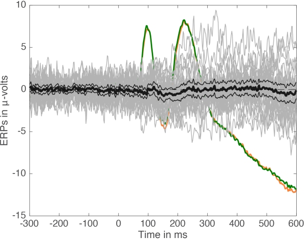
Figure 4. Mean ERPs + mean difference + confidence interval + individual differences.
Yep, it’s a mess of spaghetti monsters!
After contemplating a figure like that, I would be very cautious about my interpretation of the results. For instance, I would try to put the results into context, looking carefully at effect sizes and how they compare to other manipulations, etc. I would also be very tempted to run a replication of the experiment. This can be done in certain experimental situations on the same participants, to see if effect sizes are similar across sessions (Bieniek et al. 2015). But I would certainly not publish a paper making big claims out of these results, just because p<0.05.
So what can we say about the results? If we look more closely at the distribution of differences at the time of the largest group difference (marked by a vertical line in Figure 2), we can make another observation:
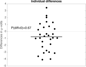
Figure 5. Distribution of individual differences at the time of the maximum absolute group difference.
About 2/3 of participants show an effect in the same direction as the group effect (difference < 0). So, in addition to the group effect, there are large individual differences. This is not surprising. What is surprising is the usual lack of consideration for individual differences in most neuroscience & psychology papers I have come across. Typically, results portrayed in Figure 1 would be presented like this:
“We measured our favourite peak in two conditions. It was larger in condition 1 than in condition 2 (p<0.05), as predicted by our hypothesis. Therefore, when subjected to condition 1, our brains process (INSERT FAVOURITE STIMULUS, e.g. faces) more (INSERT FAVOURITE PROCESS, e.g. holistically).”
Not only this is a case of bad reverse inference, it is also inappropriate to generalise the effect to the entire human population, or even to all participants in the sample – 1/3 showed an effect in the opposite direction after all. Discrepancies between group statistics and single-participant statistics are not unheard of, if you dare to look (Rousselet et al. 2011).
Certainly, more subtle and honest data description would go a long way towards getting rid of big claims, ghost effects and dodgy headlines. But how many ERP papers have you ever seen with figures such as Figure 4 and Figure 5? How many papers contain monsters behind bars? Certainly, “my software does not have that option” doesn’t cut it; these figures are easy to make in Matlab, R or Python. If you don’t know how, ask a colleague, post questions on online forums, there are plenty of folks eager to help. For Matlab code, you could start here for instance.
Now: the final blow. The original ERP data used for this post are real and have huge effect sizes (check Figure A2 here for instance). However, the effect marked by a little star in Figure 1 is a false positive: there are no real effects in this dataset! The current data were generated by sampling trials with replacement from a pool of 7680 trials, to which pink noise was added, to create 30 fake participants and 2 fake conditions. I ran the fake data making process several times and selected the version that gave me a significant peak difference, because, you know, I love peaks. So yes, we’ve been looking at noise all along. And I’m sure there is plenty of noise out there in published papers. But it is very difficult to tell, because standard ERP figures are so poor.
How do we fix this?
- make detailed, honest figures of your effects;
- post your data to an online repository for other people to scrutinise them;
- conclude honestly about what you’ve measured (e.g. “I only analyse the mean, I don’t know how other aspects of the distributions behave”), without unwarranted generalisation (“1/3 of my participants did not show the group effect”);
- replicate new effects;
- report p values if you want, but do not obsess over the 0.05 threshold, it is arbitrary, and continuous distributions should not be dichotomised (MacCallum et al. 2002);
- focus on effect sizes.
References
Bieniek, M.M., Bennett, P.J., Sekuler, A.B. & Rousselet, G.A. (2015) A robust and representative lower bound on object processing speed in humans. The European journal of neuroscience.
Kovalenko, L.Y., Chaumon, M. & Busch, N.A. (2012) A pool of pairs of related objects (POPORO) for investigating visual semantic integration: behavioral and electrophysiological validation. Brain Topogr, 25, 272-284.
MacCallum RC, Zhang S, Preacher KJ, Rucker DD. 2002. On the practice of dichotomization of quantitative variables. Psychological Methods 7: 19-40
Rousselet, G.A. & Pernet, C.R. (2011) Quantifying the Time Course of Visual Object Processing Using ERPs: It’s Time to Up the Game. Front Psychol, 2, 107.
Rousselet, G.A., Gaspar, C.M., Wieczorek, K.P. & Pernet, C.R. (2011) Modeling Single-Trial ERP Reveals Modulation of Bottom-Up Face Visual Processing by Top-Down Task Constraints (in Some Subjects). Front Psychol, 2, 137.
Wetzels, R., Matzke, D., Lee, M.D., Rouder, J.N., Iverson, G.J. & Wagenmakers, E.J. (2011) Statistical Evidence in Experimental Psychology: An Empirical Comparison Using 855 t Tests. Perspectives on Psychological Science, 6, 291-298.

Your description of the 1/3 of participants with an effect in the opposite direction appears wrong to me. If you have an effect with some average mean and some noise, then, by chance, some of the participants will show an effect in the opposite direction just because of the noise. There is nothing special about these participants, just noise drew them on the other side of the effect. They are not worth discussing.
Imagine you have a treatment with no effect. Then, half of your population will show a positive effect of treatment due to noise. Are these worth characterizing? No, they are there just because you have a noisy measurement. I believe you have the same problem here. The 1/3 of the participants that you highlight are not interesting and not worth discussing. Noise put them there.
LikeLike
The situation you describe implies that you know whether an effect truly is there or not, and how big it is. This is obviously not the case when you perform an experiment, and teasing apart signal from noise is not trivial. And there is absolutely no reason to believe that individual participants should show the same effect, whether you’re measuring behaviour or brain activity. Also, when researchers describe for the first time a significant effect, they can’t know for sure if the effect is real, if it will replicate, and with the same effect size. But typically researchers tend to describe a significant group effect as if it applied to all members of the group, which is not necessarily the case. The example was just a reminder of potential discrepancies between group and single-participant analyses. But conversely, they are cases in which all participants show the group effect – see my previous ERP post for instance.
LikeLike