This post is a draft of an editorial letter I’m writing for the European Journal of Neuroscience. It builds on previous posts on visualisation of behavioural and ERP data.
Update 2016-09-16: the editorial is now accepted:
Rousselet, G. A., Foxe, J. J. and Bolam, J. P. (2016), A few simple steps to improve the description of group results in neuroscience. Eur J Neurosci. Accepted Author Manuscript. doi:10.1111/ejn.13400
The final illustrations are available on Figshare: Rousselet, G.A. (2016): A few simple steps to improve the description of group results in neuroscience. figshare. https://dx.doi.org/10.6084/m9.figshare.3806487
There are many changes necessary to improve the quality of neuroscience research. Suggestions abound to increase openness, promote better experimental designs and analyses, and educate researchers about statistical inferences. These changes are necessary and will take time to implement. As part of this process, here, we would like to propose a few simple steps to improve the assessment of statistical results in neuroscience, by focusing on detailed graphical representations.
Despite a potentially sophisticated experimental design, in a typical neuroscience experiment, raw continuous data tend to undergo drastic simplifications. As a result, it is common for the main results of an article to be summarised in a few figures and a few statistical tests. Unfortunately, graphical representations in many scientific journals, including neuroscience journals, tend to hide underlying distributions, with their excessive use of line and bar graphs (Allen et al., 2012; Weissgerber et al., 2015). This is problematic because common basic summary statistics, such as mean and standard deviation are not robust and do not provide enough information about a distribution, and can thus give misleading impressions about a dataset, particularly for the small sample sizes we are accustomed to in neuroscience (Anscombe, 1973; Wilcox, 2012). As a consequence of poor data representation, there can be a mismatch between the outcome of statistical tests, their interpretations, and the information available in the raw data distributions.
Let’s consider a general and familiar scenario in which observations from two groups of participants are summarised using a bar graph, and compared using a t-test on means. If the p value is inferior to 0.05, we might conclude that we have a significant effect, with one group having larger values than the other one; if the p value is not inferior to 0.05, we might conclude that the two distributions do not differ. What is wrong with this description? In addition to the potentially irrational use of p values (Gigerenzer, 2004; Wagenmakers, 2007; Wetzels et al., 2011), the situation above highlights many caveats in current practices. Indeed, using bar graphs and an arbitrary p<0.05 cut-off turns a potentially rich pattern of results into a simplistic, binary outcome, in which effect sizes and individual differences are ignored. For instance, a more fruitful approach to describing a seemingly significant group effect would be to answer these questions as well:
- how many participants show an effect in the same direction as the group? It is possible to get significant group effects with very few individual participants showing a significant effect themselves. Actually, with large enough sample sizes you can pretty much guarantee significant group effects (Wagenmakers, 2007);
-
how many participants show no effect, or an effect in the opposite direction as the group?
-
is there a smooth continuum of effects across participants, or can we identify sub-clusters of participants who appear to behave differently from the rest?
-
how large are the individual effects?
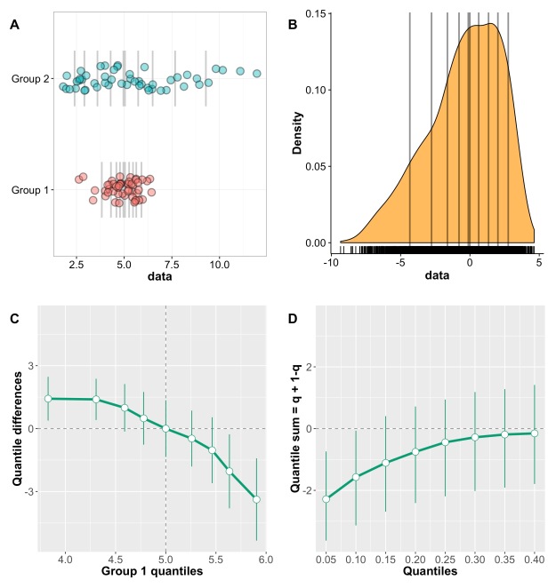
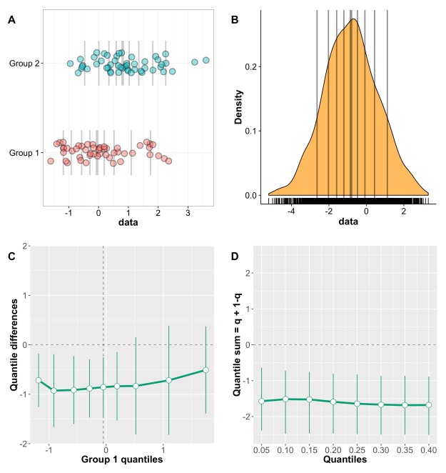
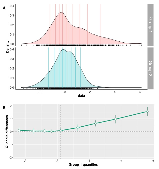
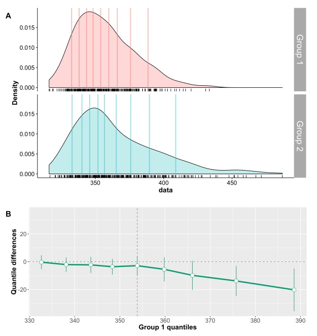
These questions can only be answered by using scatterplots or other detailed graphical representations of the results, and by reporting other quantities than the mean and standard deviation of each group. Essentially, a significant t-test is neither necessary nor sufficient to understand how two distributions differ (Wilcox, 2006). And because t-tests and ANOVAs on means are not robust (for instance to skewness & outliers), failure to reach the 0.05 cut-off should not be used to claim that distributions do not differ: first, the lack of significance (p<0.05) is not the same as evidence for the lack of effect (Kruschke, 2013); second, robust statistical tests should be considered (Wilcox, 2012); third, distributions can potentially differ in their left or right tails, but not in their central tendency, for instance when only weaker animals respond to a treatment (Doksum, 1974; Doksum & Sievers, 1976; Wilcox, 2006; Wilcox et al., 2014). Essentially, if an article reports bar graphs and non-significant statistical analyses of the mean, not much can be concluded at all. Without detailed and informative illustrations of the results, it is impossible to tell if the distributions truly do not differ.
Let’s consider the example presented in Figure 1, in which two groups of participants were tested in two conditions (2 independent x 2 dependent factor design). Panel A illustrates the results using a mean +/- SEM bar graph. An ANOVA on these data reveals a non-significant group effect, a significant main effect of condition, and a significant group x condition interaction. Follow-up paired t-tests reveal a significant condition effect in group 1, but not in group 2. These results seem well supported by the bar graph in Figure 1A. Based on this evidence, it is very common to conclude that group 1 is sensitive to the experimental manipulation, but not group 2. The discussion of the article might even pitch the results in more general terms, making claims about the brain in general.

Figure 1. Different representations of the same behavioural data. Results are in arbitrary units. A Bar graph with mean +/- SEM. B Stripcharts (1D scatterplots) of difference scores. C Stripcharts of linked observations. D Scatterplot of paired observations. The diagonal line has slope 1 and intercept 0. This figure is licensed CC-BY and available on Figshare, along with data and R code to reproduce it (Rousselet 2016a).
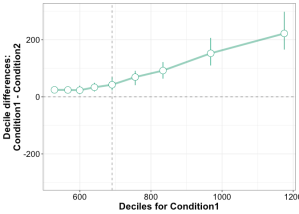
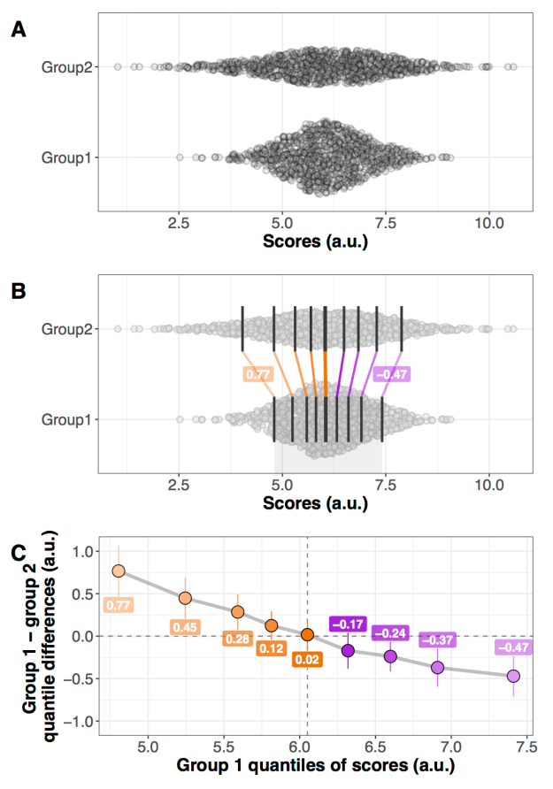
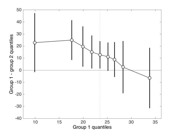
Although the scenario just described is very common in the literature, the conclusions are unwarranted. First, the lack of significance (p<0.05) does not necessarily provide evidence for the lack of effect (Wetzels et al., 2011; Kruschke, 2013). Second, without showing the content of the bars, no conclusion should be drawn at all. So let’s look inside the bars. Figure 1B shows the results from the two independent groups: participants in each group were tested in two conditions, so the pairwise differences are illustrated to reveal the effect sizes and their distributions across participants. The data show large individual differences and overlap between the two distributions. In group 2, except for 2 potential outliers showing large negative effects, the remaining observations are within the range observed in group 1. Six participants from group 2 have differences suggesting an effect in the same direction as group 1, two are near zero, three go in the opposite direction. So, clearly, the lack of significant difference in group 2 is not supported by the data: yes group 2 has overall smaller differences than group 1, but if group 1 is used as a control group, then most participants in group 2 appear to have standard effects. Or so it seems, until we explore the nature of the difference scores by visualising paired observations in each group (Figure 1C). In group 1, as already observed, results in condition 2 are overall larger than in condition 1. In addition, participants with larger scores in condition 1 tend to have proportionally larger differences between conditions 1 and 2. Such relationship seems to be absent in group 2, which suggests that the two groups differ not only in the overall sensitivity to the experimental manipulation, but that other factors could be at play in group 1, and not in group 2. Thus, the group differences might actually be much subtler than suggested by our first analyses. The group dichotomy is easier to appreciate in Figure 1D, which shows a scatterplot of the paired observations in the two groups. In group 1, the majority of paired observations are above the unity line, demonstrating an overall group effect; there is also a positive relationship between the scores in condition 2 and the scores in condition 1. Again, no such relationship seems to be present in group 2. In particular, the two larger negative scores in group 2 are not associated with participants who scored particularly high or low in condition 1, giving us no clue as to the origin of these seemingly outlier scores.
At this stage, we’ve learnt a great deal more about our dataset using detailed graphical representations than relying only on a bar graph and an ANOVA. However, we would need many more than n = 11 participants in both groups to quantify the effects and understand how they differ across groups. We have also not exhausted all the representations that could help us make sense of the results. There is also potentially more to the data, because we haven’t considered the full distribution of single-trials/repetitions. For instance, it is very common to summarise a reaction time distribution of potentially hundreds of trials using a single number, which is then used to perform group analyses. An alternative is to study these distributions in each participant, to understand exactly how they differ between conditions. This single-participant approach would be necessary here to understand how the two groups of participants respond to the experimental manipulation.
In sum, there is much more to the data than what we could conclude from the bar graphs and the ANOVA and t-tests. Once bar graphs and their equivalents are replaced by scatterplots (or boxplots etc.) the story can get much more interesting, subtle, convincing, or the opposite… It depends what surprises the bars are holding. Showing scatterplots is the start of a discussion about the nature of the results, an invitation to go beyond the significant vs. non-significant dichotomy. For the particular results presented in Figure 1, it is rather unclear what is gained by the ANOVA at all compared to detailed graphical representations. Instead of blind statistical significance testing, it would of course be beneficial to properly model the data to make predictions (Kuhn & Johnson, 2013), and to allow integration across subsequent experiments and replication attempts – a critical step that requires Bayesian inference (Verhagen & Wagenmakers, 2014).
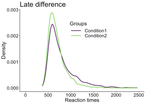
The problems described so far are not limited to relatively simple one dimensional data: they are present in more complex datasets as well, such as EEG and MEG time-series. For instance, it is common to see EEG and MEG evoked responses illustrated using solely the mean across participants (Figure 2A). Although common, this representation is equivalent to a bar graph without error bars/whiskers, and is therefore unacceptable. At a minimum, some measure of uncertainty should be provided, for instance so-called confidence intervals (Figure 2B). Also, because it can be difficult to mentally subtract two time-courses, it is important to illustrate the time-course of the difference as well (Figure 2C). In particular, showing the difference helps to consider all the data, not just large peaks, to avoid underestimating potentially large effects occurring before or after the main peaks. In addition, Figure 2C illustrates ERP differences for every participant – an ERP version of a scatterplot. This more detailed illustration is essential to allow readers to assess effect sizes, inter-participant differences, and ultimately to interpret significant and non-significant results. For instance, in Figure 2C, there is a non-significant group negative difference 100 ms, and a large positive difference 120 to 280 ms. What do they mean? The individual traces reveal a small number of participants with relatively large differences 100 ms despite the lack of significant group effect, and all participants have a positive difference 120 to 250 ms post-stimulus. There are also large individual differences at most time points. So Figure 2C, although certainly not the ultimate representation, offers a much richer and compelling description than the group averages on their own; Figure 2C also suggests that more detailed group analyses would be beneficial, as well as single-participant analyses (Pernet et al., 2011; Rousselet & Pernet, 2011).

MATLAB Handle Graphics
Paired design in which the same participants saw two image categories.
A Standard ERP figure showing the mean across participants for two conditions.
B Mean ERPs with 95% confidence intervals. The black dots along the x-axis mark time points at which there is a significant paired t-test (p<0.05).
C Time course of the ERP differences. Differences from individual participants are shown in grey. The mean difference is superimposed using a thick black curve. The thinner black curves mark the mean’s 95% confidence interval.
This figure is licensed CC-BY and available on Figshare, along with data and Matlab code to reproduce it (Rousselet 2016b).
To conclude, we urge authors, reviewers and editors to promote and implement these guidelines to achieve higher standards in reporting neuroscience research:
- as much as possible, do not use line and bar graphs; use scatterplots instead, or, if you have large sample sizes, histograms, kernel density plots, or boxplots;
-
for paired designs, show distributions of pairwise differences, so that readers can assess how many comparisons go in the same direction as the group, their size, and their variability; this recommendation also applies to brain imaging data, for instance MEEG and fMRI BOLD time-courses;
-
report how many participants show an effect in the same direction as the group;
-
only draw conclusions about what was assessed: for instance, if you perform a t-test on means, you should only conclude about differences in means, not about group differences in general;
-
don’t use a star system to dichotomise p values: p values do not measure effect sizes or the amount of evidence against or in favour of the null hypothesis (Wagenmakers, 2007);
-
don’t agonise over p values: focus on detailed graphical representations and robust effect sizes instead (Wilcox, 2006; Wickham, 2009; Allen et al., 2012; Wilcox, 2012; Weissgerber et al., 2015);
-
consider Bayesian statistics, to get the tools to align statistical and scientific reasoning (Cohen, 1994; Goodman, 1999; 2016).
Finally, we cannot ignore that using detailed illustrations for potentially complex designs, or designs involving many group comparisons, is not straightforward: research in that direction, including the creation of open-access toolboxes, is of great value to the community, and should be encouraged by funding agencies.
References
Allen, E.A., Erhardt, E.B. & Calhoun, V.D. (2012) Data visualization in the neurosciences: overcoming the curse of dimensionality. Neuron, 74, 603-608.
Anscombe, F.J. (1973) Graphs in Statistical Analysis. Am Stat, 27, 17-21.
Cohen, D. (1994) The earth is round (p<.05). American Psychologist, 49, 997-1003.
Doksum, K. (1974) Empirical Probability Plots and Statistical Inference for Nonlinear Models in the two-Sample Case. Annals of Statistics, 2, 267-277.
Doksum, K.A. & Sievers, G.L. (1976) Plotting with Confidence – Graphical Comparisons of 2 Populations. Biometrika, 63, 421-434.
Gigerenzer, G. (2004) Mindless statistics. Journal of Behavioral and Experimental Economics (formerly The Journal of Socio-Economics), 33, 587-606.
Goodman, S.N. (1999) Toward evidence-based medical statistics. 1: The P value fallacy. Ann Intern Med, 130, 995-1004.
Goodman, S.N. (2016) Aligning statistical and scientific reasoning. Science, 352, 1180-1181.
Kruschke, J.K. (2013) Bayesian estimation supersedes the t test. J Exp Psychol Gen, 142, 573-603.
Kuhn, M. & Johnson, K. (2013) Applied predictive modeling. Springer, New York.
Pernet, C.R., Sajda, P. & Rousselet, G.A. (2011) Single-trial analyses: why bother? Frontiers in psychology, 2, doi: 10.3389-fpsyg.2011.00322.
Rousselet, G.A. & Pernet, C.R. (2011) Quantifying the Time Course of Visual Object Processing Using ERPs: It’s Time to Up the Game. Front Psychol, 2, 107.
Rousselet, G. (2016a). Different representations of the same behavioural data. figshare.
https://dx.doi.org/10.6084/m9.figshare.3504539
Rousselet, G. (2016b). Different representations of the same ERP data. figshare.
https://dx.doi.org/10.6084/m9.figshare.3504566
Verhagen, J. & Wagenmakers, E.J. (2014) Bayesian tests to quantify the result of a replication attempt. J Exp Psychol Gen, 143, 1457-1475.
Wagenmakers, E.J. (2007) A practical solution to the pervasive problems of p values. Psychonomic bulletin & review, 14, 779-804.
Weissgerber, T.L., Milic, N.M., Winham, S.J. & Garovic, V.D. (2015) Beyond bar and line graphs: time for a new data presentation paradigm. PLoS Biol, 13, e1002128.
Wetzels, R., Matzke, D., Lee, M.D., Rouder, J.N., Iverson, G.J. & Wagenmakers, E.J. (2011) Statistical Evidence in Experimental Psychology: An Empirical Comparison Using 855 t Tests. Perspectives on Psychological Science, 6, 291-298.
Wickham, H. (2009) ggplot2 : elegant graphics for data analysis. Springer, New York ; London.
Wilcox, R.R. (2006) Graphical methods for assessing effect size: Some alternatives to Cohen’s d. Journal of Experimental Education, 74, 353-367.
Wilcox, R.R. (2012) Introduction to robust estimation and hypothesis testing. Academic Press, San Diego, CA.
Wilcox, R.R., Erceg-Hurn, D.M., Clark, F. & Carlson, M. (2014) Comparing two independent groups via the lower and upper quantiles. J Stat Comput Sim, 84, 1543-1551.