I read, review and edit a lot of ERP papers. A lot of these papers have in common shockingly poor figures. Here I’d like to go over a few simple steps that can help to produce much more informative figures. The data and the code to reproduce all the examples are available on github.
Let’s first consider what I would call the standard ERP figure, the one available in so many ERP papers (Figure 1). It presents two paired group averages for one of the largest ERP effect on the market: the contrast between ERP to noise textures (in black) and ERP to face images (in grey). This standard figure is essentially equivalent to a bar graph without error bars: it is simply unacceptable. At least, in this one, positive values are plotted up, not down, as can still be seen in some papers.
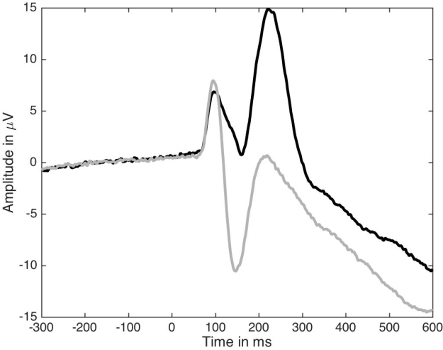
Figure 1. Standard ERP figure.
How can we improve this figure? As a first step, one could add some symbols to indicate at which time points the two ERPs differ significantly. So in Figure 2 I’ve added red dots marking time points at which a paired t-test gave p<0.05. The red dots appear along the x-axis so their timing is easy to read. This is equivalent to a bar graph without error bars but with little stars to mark p<0.05.
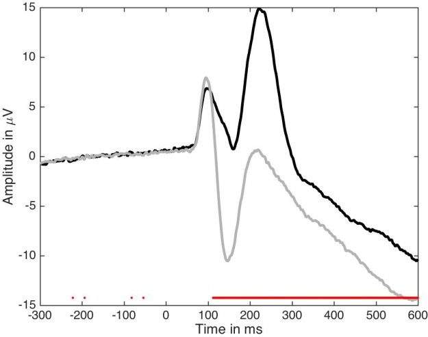
Figure 2. Standard figure with significant time points.
You know where this is going: next we will add confidence intervals, and then more. But it’s important to consider why Figure 2 is not good enough.
First, are significant effects that interesting? We can generate noise in Matlab or R for instance, perform t-tests, and find significant results – doesn’t mean we should write papers about these effects. Although no one would question that significant effects can be obtained by chance, I am yet to see a single paper in which an effect is described as potential false positive. Anyway, more information is required about significant effects:
- do they make sense physiologically? For instance, you might find a significant ERP difference between 2 object categories at 20 ms, but that does not mean that the retina performs object categorisation;
-
how many participants actually show the group effect? It is possible to get significant group effects with very few individual participants showing a significant effect themselves. Actually, with large enough sample sizes you can pretty much guarantee significant group effects;
-
what is the group effect size, e.g. how large is the difference between two conditions?
-
how large are effect sizes in individual participants?
-
how do effect sizes compare to other known effects, or to effects observed at other time points, such as in the baseline, before stimulus presentation?
Second, because an effect is not statistically significant (p<0.05), it does not mean it is not there, or that you have evidence for the lack of effect. Similarly to the previous point, we should be able to answer these questions about seemingly non-significant effects:
- how many participants do not show the effect?
-
how many participants actually show an effect?
-
how large are the effects in individual participants?
-
is the group effect non-significant because of the lack of statistical power, e.g. due to skewness, outliers, heavy tails?
Third, most ERP papers report inferences on means using non-robust statistics. Typically, results are then discussed in very general terms as showing effects or not, following a p<0.05 cutoff. What is assumed, at least implicitly, is that the lack of significant mean differences implies that the distributions do not differ. This is clearly unwarranted because distributions can differ in other aspects than the mean, e.g. in dispersion, in the tails, and the mean is not a robust estimator of central tendency. Thus, interpretations should be limited to what was measured: group differences in means, probably using a non-robust statistical test. That’s right, if you read an ERP paper in which the authors report:
“condition A did not differ from condition B”
the sub-title really is:
“we only measured a few time-windows or peaks of interest, and we only tested group means using non-robust statistics and used poor illustrations, so there could well be interesting effects in the data, but we don’t know”.
Some of the points raised above can be addressed by making more informative figures. A first step is to add confidence intervals, which is done in Figure 3. Confidence intervals can provide a useful indication of the dispersion around the average given the inter-participant variability. But be careful with the classic confidence interval formula: it uses mean and standard deviation and is therefore not robust. I’ll demonstrate Bayesian highest density intervals in another post.

Figure 3. ERPs with confidence intervals.
Ok, Figure 3 would look nicer with shaded areas, an example of which is provided in Figure 4 – but this is rather cosmetic. The important point is that Figures 3 and 4 are not sufficient because the difference is sometimes difficult to assess from the original conditions.

Figure 4. ERPs with nicer confidence intervals.
So in Figure 5 we present the time-course of the average difference, along with a confidence interval. This is a much more useful representation of the results. I learnt that trick in 1997, when I first visited the lab of Michele Fabre-Thorpe & Simon Thorpe in Toulouse. In that lab, we mostly looked at differences – ERP peaks were deemed un-interpretable and not really worth looking at…

Figure 5. ERP time-courses for each condition and their difference.
In Figure 5, the two vertical red lines mark the latency of the two difference peaks. They coincide with a peak from one of the two ERP conditions, which might be reassuring for folks measuring peaks. However, between the two difference peaks, there is a discrepancy between the top and bottom representations: whereas the top plot suggests small differences between the two conditions around ~180 ms, the bottom plot reveals a strong difference with a narrow confidence interval. The apparent discrepancy is due the difficulty in mentally subtracting two time-courses. It seems that in the presence of large peaks, we tend to focus on them and neglect other aspects of the data. Figure 6 uses fake data to illustrate the relationship between two ERPs and their difference in several situations. In row 1, try to imagine the time-course of the difference from the two conditions, without looking at the solution in row 2 – it’s not as trivial as it seems.

Figure 6. Fake ERP time-courses and their differences.
Because it can be difficult to mentally subtract two time-courses, it is critical to always plot the time-course of the difference. More generally, you should plot the time-course of the effect you are trying to quantify, whatever that is.
We can make another important observation from Figure 5: there are large differences before the ERP peaks ~140-180 ms shown in the top plot. Without showing the time-course of the difference, it is easy to underestimate potentially large effects occurring before or after peaks.
So, are we done? Well, as much as Figure 5 is a great improvement on the standard figure, in a lot of situations it is not sufficient, because it does not portray individual results. This is essential to interpret significant and non-significant results. For instance, in Figure 5, there is non-significant group negative difference ~100 ms, and a large positive difference ~120 to 280 ms. What do they mean? The answer is in Figure 7: a small number of participants seem to have clear differences ~100 ms despite the lack of significant group effect, and all participants have a positive difference ~120 to 250 ms post-stimulus. There are also large individual differences at most time points. So Figure 7 presents a much richer and compelling story than the group averages on their own.

Figure 7. A more detailed look at the group results. In the middle panel, individual differences are shown in grey and the group mean and its confidence interval are superimposed in red. The lower panel shows at every time point the proportion of participants with a positive difference.
Given the presence of a few participants with differences ~100 ms but the lack of significant group effects, it is interesting to consider participants individually, as shown in Figure 8. There, we can see that participants 6, 13, 16, 17 and 19 have a negative difference ~100 ms, unlike the rest of the participants. These individual differences are wiped out by the group statistics. Of course, in this example we cannot conclude that there is something special about these participants, because we only looked at one electrode: other participants could show similar effects at other electrodes. I’ll demonstrate how to assess effects potentially spread across electrodes in another post.

Figure 8. ERP differences with 95% confidence intervals for every participant.
To conclude: in my own research, I have seen numerous examples of large discrepancies between plots of individual results and plots of group results, such that in certain cases group averages do not represent any particular participant. For this reason, and because most ERP papers do not illustrate individual participants and use non-robust statistics, I simply do not trust them.
Finally, I do not see the point of measuring ERP peaks. It is trivial to perform analyses at all time points and sensors to map the full spatial-temporal distribution of the effects. Limiting analyses to peaks is a waste of data and defeats the purpose of using EEG or MEG for their temporal resolution.
References
Allen et al. 2012 is a very good reference for making better figures overall and with an ERP example, although they do not make the most crucial recommendation of plotting the time-course of the difference.
For one of the best example of clear ERP figures, including figures showing individual participants, check out Kovalenko, Chaumon & Busch 2012.
I have discussed issues with ERP figures and analyses here and here. And here are probably some of the most detailed figures of ERP results you can find in the literature – brace yourself for figure overkill.

Hallelujah that someone is at last tackling the inadequacy of the conventional visual representations of ERP data!
One difficulty with ERP data is the fact that waveform data are autocorrelated, which makes the ‘significant periods’ approach in Figure 2 problematic – that was noted by Guthrie and Buchwald back in 1991, and various statistical approaches have been proposed to determine whether a sequence of ‘significant’ t-values is reliable.
I find the most useful way of making people confront the inherent unreliability of differences between two autocorrelated wiggly lines is to include a dummy condition. I first saw this done in a paper by McGee et al in 1997, and it was a salutary experience – they found ‘mismatch negativity’ in many cases where the standard and deviant stimulus were identical. We adopted this approach in a couple of papers in 2010, and found it very useful.
refs:
Bishop DVM, and Hardiman MJ. 2010. Measurement of mismatch negativity in individuals: a study using single-trial analysis. Psychophysiology 47:697-705
Bishop DVM, Hardiman MJ, and Barry JG. 2010. Lower-frequency event-related desynchronization: a signature of late mismatch responses to sounds, which is reduced or absent in children with specific language impairment. Journal of Neuroscience 30:15578-15584.
Buchwald J-S, Erwin R, Van-Lancker D, Guthrie D, and et al. 1992. Midlatency auditory evoked responses: P1 abnormalities in adult autistic subjects. Electroencephalography and Clinical Neurophysiology: Evoked Potentials 84:164-171.
Guthrie D, and Buchwald J. 1991. Significance testing of difference potentials. Psychophysiology 28:240-244.
McGee T, Kraus N, and Nicol T. 1997. Is it really a mismatch negativity? An assessment of methds for determining response validity in individual subjects. Electroencephalography and Clinical Neurophysiology 104:359-368.
LikeLike
Excellent point Dorothy! And thank you for the references, they will come handy sooner than later. Your point is related to my question about comparing the effect size for a significant effect to that at other time points, including in particular the baseline, before stimulus onset. One has to be very suspicious when conditions seem to differ as much after as before stimulus presentation. The baseline can act as a good dummy condition in a lot of cases, provided it is long enough, and illustrated. Alternatively, as you suggest, it would be a good idea to demonstrate that a given effect is larger than effects obtained for contrasts that are not expected to yield significant differences. This point is very important because it highlights the need to consider more realistic and data driven null hypotheses. Finally, the autocorrelation across space and time can be explicitly taken into account to control for multiple comparisons by using a combination of random sampling procedure and cluster based statistics:
Maris, E. & Oostenveld, R. (2007) Nonparametric statistical testing of EEG- and MEG-data. Journal of neuroscience methods, 164, 177-190.
Pernet, C.R., Chauveau, N., Gaspar, C. & Rousselet, G.A. (2011) LIMO EEG: a toolbox for hierarchical LInear MOdeling of ElectroEncephaloGraphic data. Comput Intell Neurosci, 2011, 831409.
Pernet, C.R., Latinus, M., Nichols, T.E. & Rousselet, G.A. (2015) Cluster-based computational methods for mass univariate analyses of event-related brain potentials/fields: A simulation study. Journal of neuroscience methods, 250, 85-93.
LikeLike
Good to see somebody else ranting about this! I wrote a similar blog a few months ago:
LikeLiked by 1 person
Great post Gwilym! I’ve just posted a reply and a tweet.
LikeLike
Pingback: How to chase ERP monsters hiding behind bars | basic statistics
Pingback: Prettier plots in Matlab – Anne Urai
Pingback: ERP graph competition! | Talking Sense
Pingback: A few simple steps to improve the description of neuroscience group results | basic statistics